
This was U.S. Cellular's first mobile effort as a company. I drafted and presented two UI design directions to the client in wireframe format. The second round of UI design involved flushing out the chosen direction for both landscape and portrait mode. I worked closely with the visual designer, copywriter and developer through the end of the project and am proud of the end result.

Home screen, showing the swipe interaction model that flips through a rich set of featured content. In this case, the featured content is reasons to switch cell phone providers.
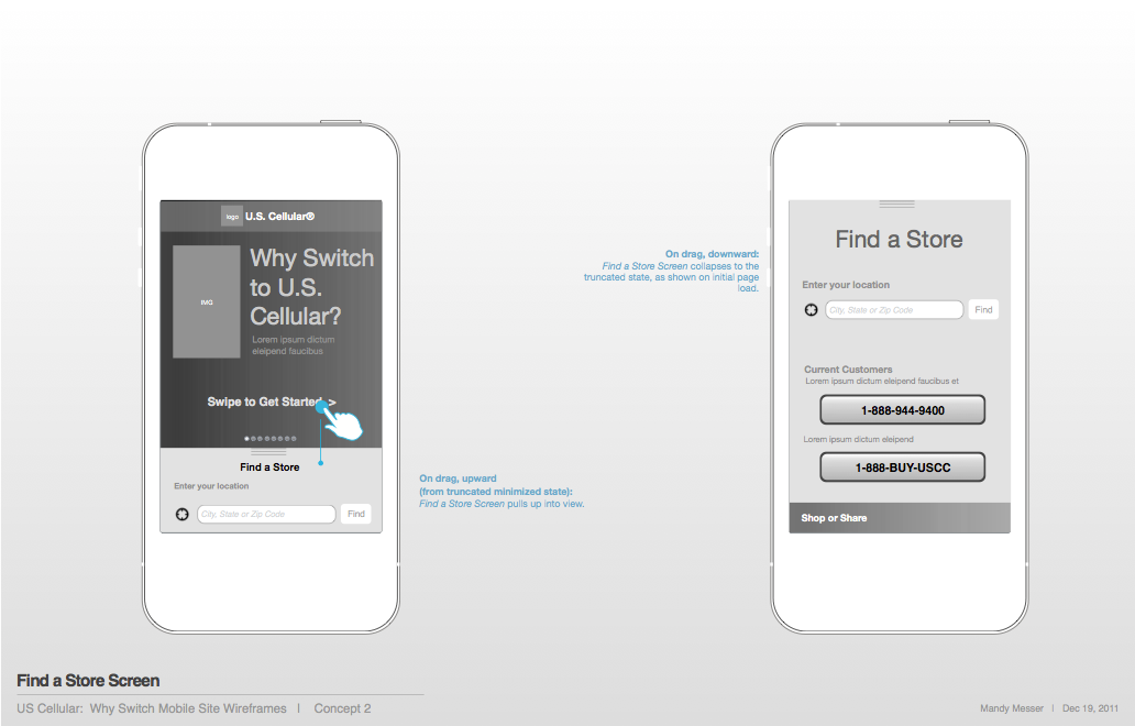
Find a Store screen, showing the gestural drag upward that reveals the entire page contents

Find a Store screen, on scroll

Find a Store screen, showing the GPS locator notification. This occurs on user initiation only because this site will be loaded in a mobile browser, and we did not want the GPS locator to slow down the load time of this screen. Had the platform been a mobile app, automating the GPS locator would have been a feasible option.

Find a Store screen, showing the location finder and keyboard pop-over state

Find a Store screen, showing the map interaction model

Find a Store screen, showing the 'Share' pop-over

Landscape orientation: Home screen

Landscape orientation: Find a Store screen, after the user's upward slide gesture

Landscape orientation: Find a Store screen, on scroll

Samples of the final design layout: homepage and swiping content.

Additional swiping content screens. Final design layout.

Find a Store screen that's shown on swipe upward, and current location prompt notification. Final design layout.


