

Areias Brancas
Redesign of Logo and Packaging
Redesign of Logo and Packaging
2011
BRIEF
To choose a Portuguese product that needs a change of look, a redesign, in terms of packaging.
I decided on a product that is very dear to me, the pastry "Areias Brancas", since it reminds me of my summer holidays at my grandmother's place in Lourinhã, Portugal.
They are delicious, but I don't think the packaging does them justice.
CURRENT LOOK
'Areias Brancas' are a local delicacy from Lourinhã, on the west coast of Portugal.
This treat was created in 1935 by Eugénia Perdigão, a housewife that found inspiration on the Areia Branca' Beach ("White Sand Beach").
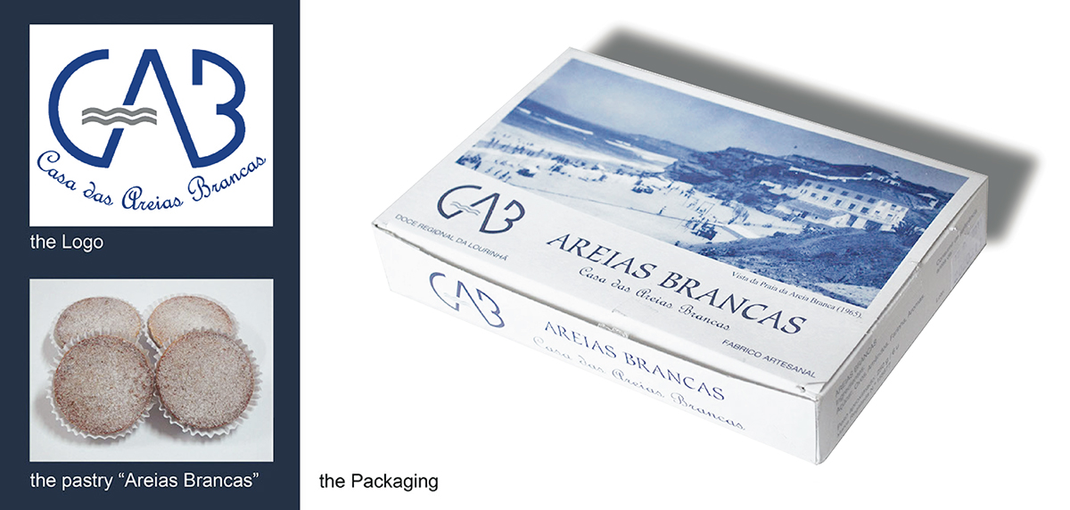
Chosen product: "Areias Brancas", a portuguese traditional pastry from Lourinhã
REBRANDING
The new logo is a graphic interpretation of a wave crashing on the sand,
as well as it represents the white granulated sugar on the Areias Brancas, the pastry the business is famous for.
'Areias Brancas' means White Sand in Portuguese and it gives name to a very famous beach in the area, which inspired the little pastry topped with white granulated sugar.
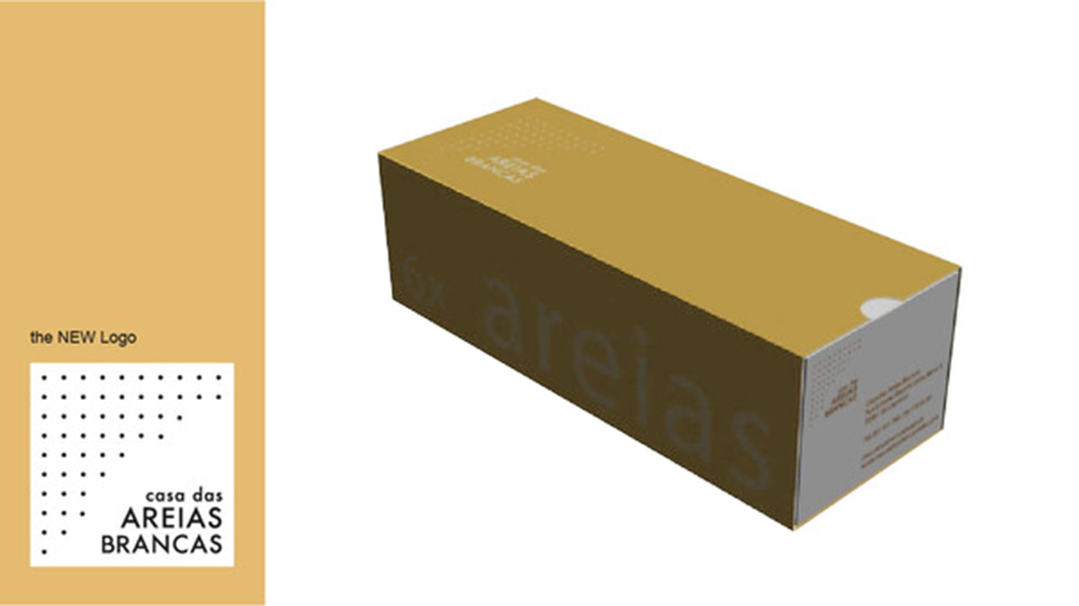
new logo
new packaging
BOTH SIDES OF THE BOX - Areias Brancas
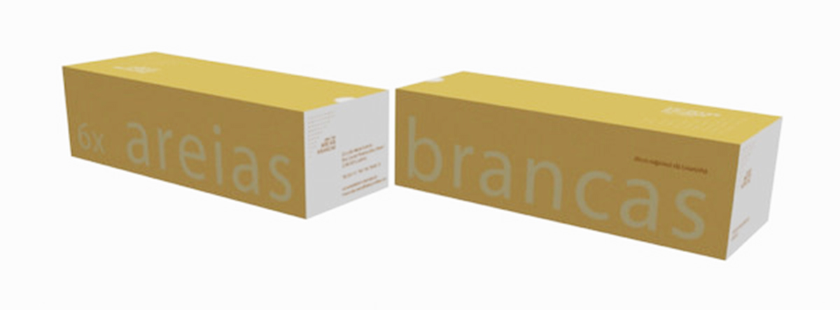
the two sides of the package outside sleeve, which changes according to the product
PROPOSAL OF COLLECTION
Casa das Areias Brancas is a small local business but quite famous for their pastries "Areias Brancas".
They also sell other products, equally delicious.

the company has 4 main products
the company' product box is always the same; only the outside sleeve graphics change
HOW THE BOX WORKS

the new box of Areias Brancas takes the same amount of pastries, but they are organized differently


