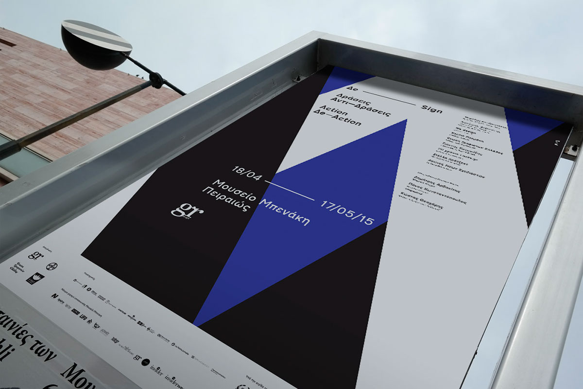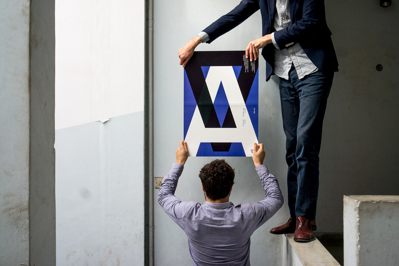
Gr design magazine asked us to design a cover for a brochure for there design exhibition organised in Benaki museum. The starting point was the title ‘Action’ and a typeface 'Dromon medium' a revisited ‘Transport’ released by Cannibal Fonts.
It did seem clear and very typical to us that when one says 'action’ that we also say ‘re-action’. We casted, instead of only focusing on one side of the things, this dialectical entity 'action-reaction' to express a reflection on this universal principe. The capital A is typographically a perfect and fair antagonist of the protagonist capital Δ ( from the Greek word Δράσεις Αντί-Δράσεις meaning action-reaction). It seems that here are no coincidences the one is challenging the other and visa versa. This scene reflect in our sens quite well the world history and simply human existence : a continuous struggle of seemingly opposite forces and statements, that are finely if we look well, closely related figures in need of each other.
By a deconstructivist gesture we observe finally that design should be read as : De-sign meaning de-sign-ification. In this process, that we call de-sign, we will never stop to turn and twist signs and types, upgrading or decreasing there value and meaning in order to confront us with a inexhaustible source of change inhabiting in our atoms.
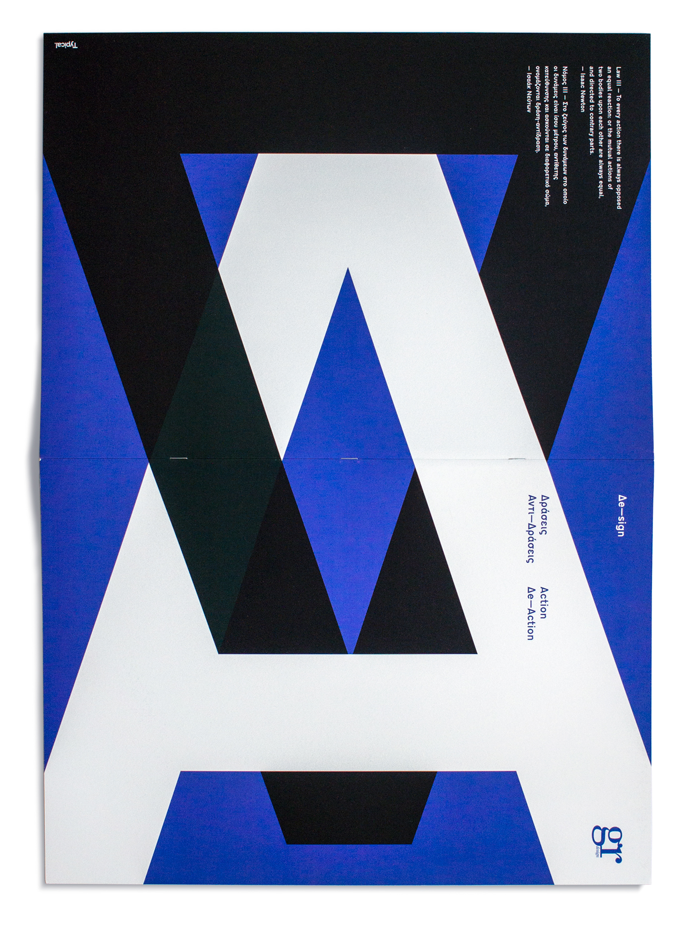


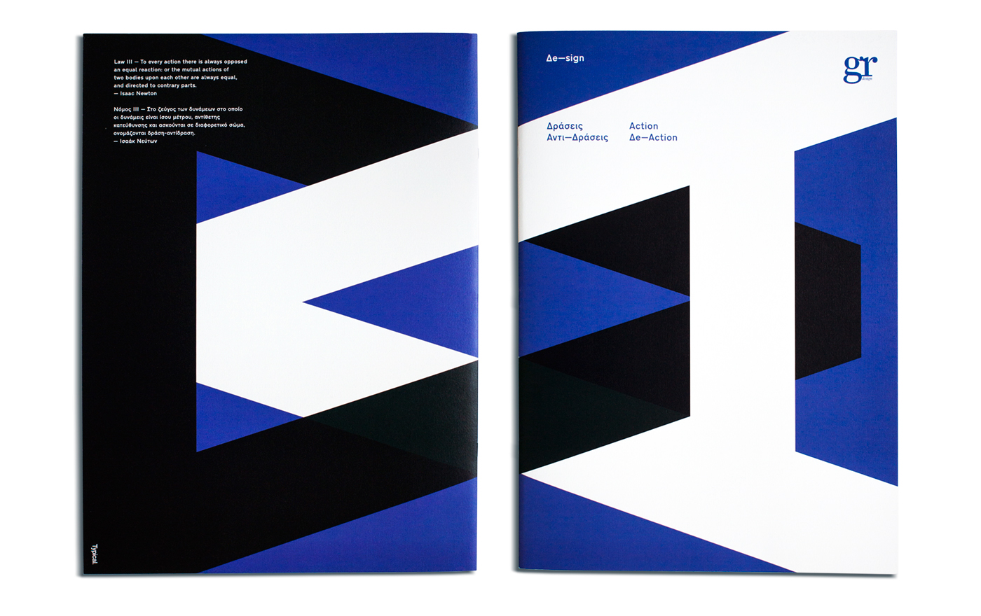

De—sign fiction