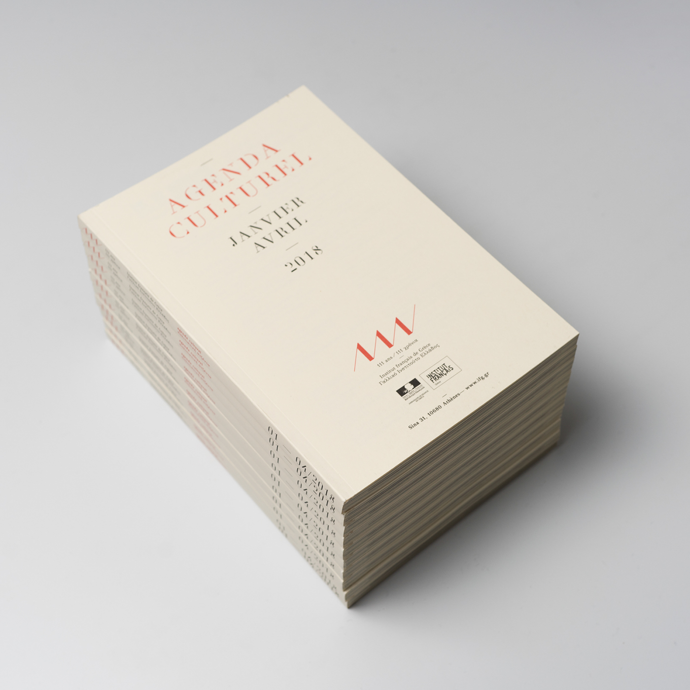
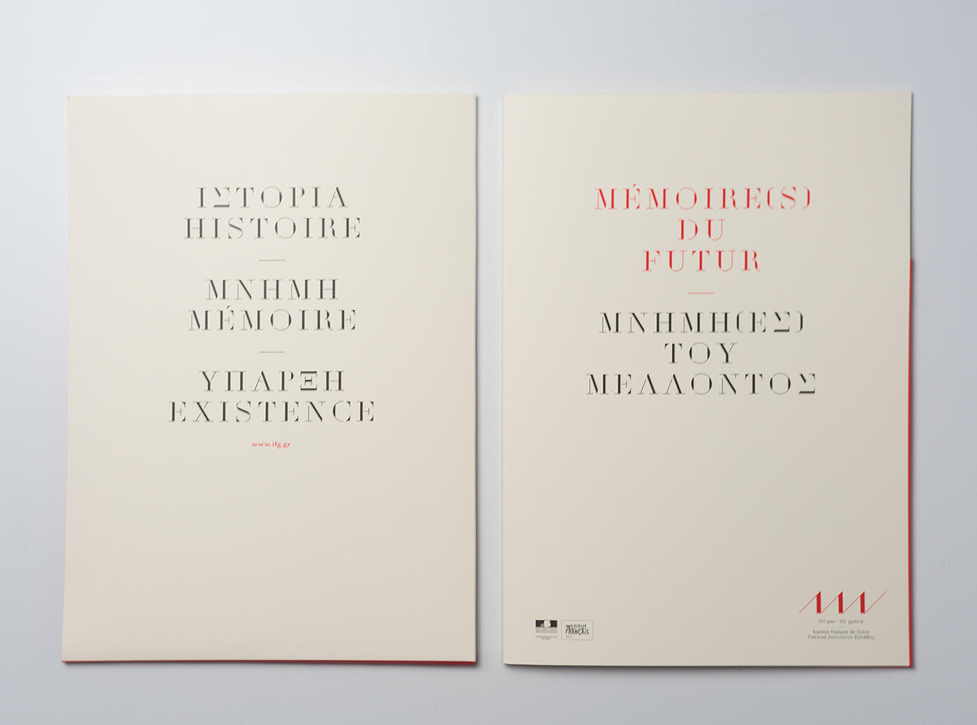
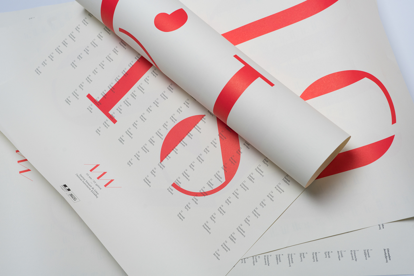
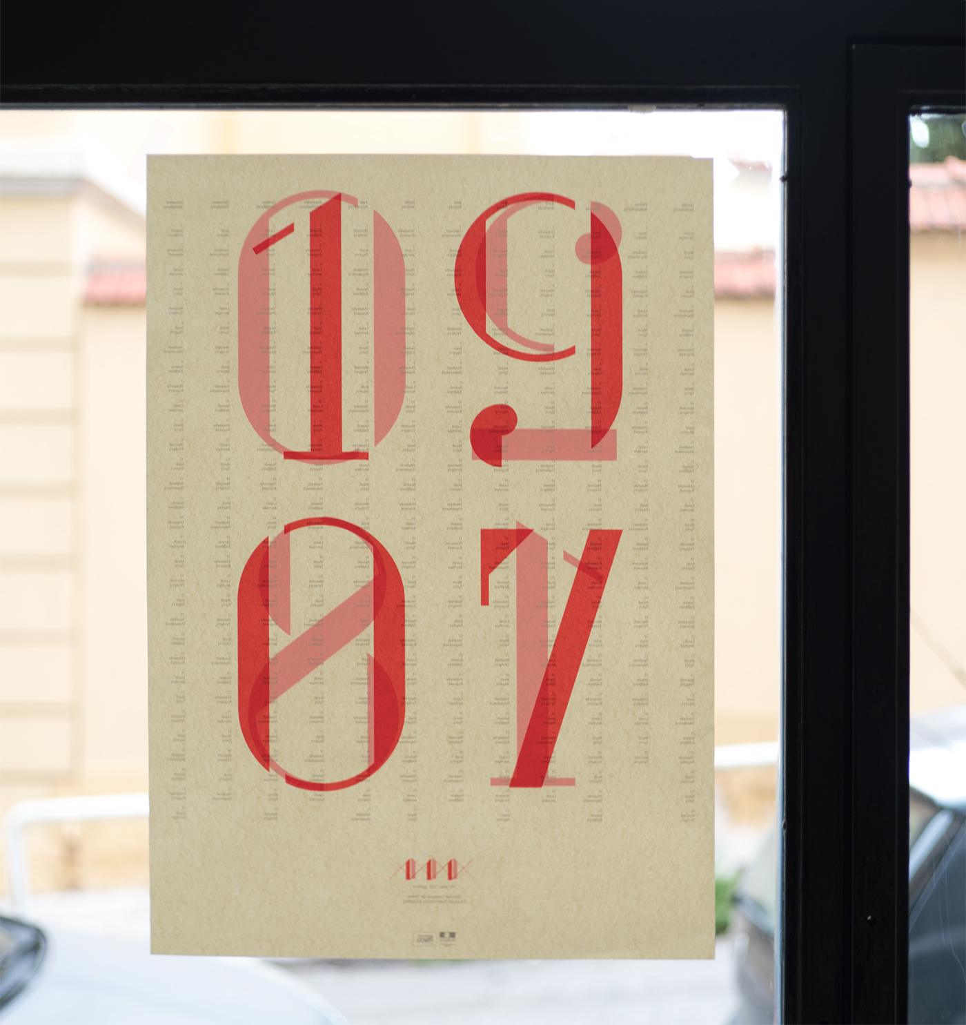
The visual identity for the 111 years of existence of the French Institute in Greece makes first of all a visual reference towards literature, or more exactly to a typical part of the french culture in edition. A reflection starting of from a very local point: Didotou Street (Οδος Διδοτου) witch borders the French institute in Athens and also funny enough our office. Didotou Street is to our knowledge the only Athenian street that honors a name of a Typography. Didotou or Διδοτου is the Greekification of “Didot” a group of typefaces named after the famous French printing and type producing Didot family. The most famous Didot typefaces were developed in the period 1784–1811. Didot is described as neoclassical, and evocative of the Age of Enlightenment. The Didot family were among the first to set up a printing press in the newly independent Greece, and typefaces in the style of Didot have remained popular in Greek since.(1) (2)
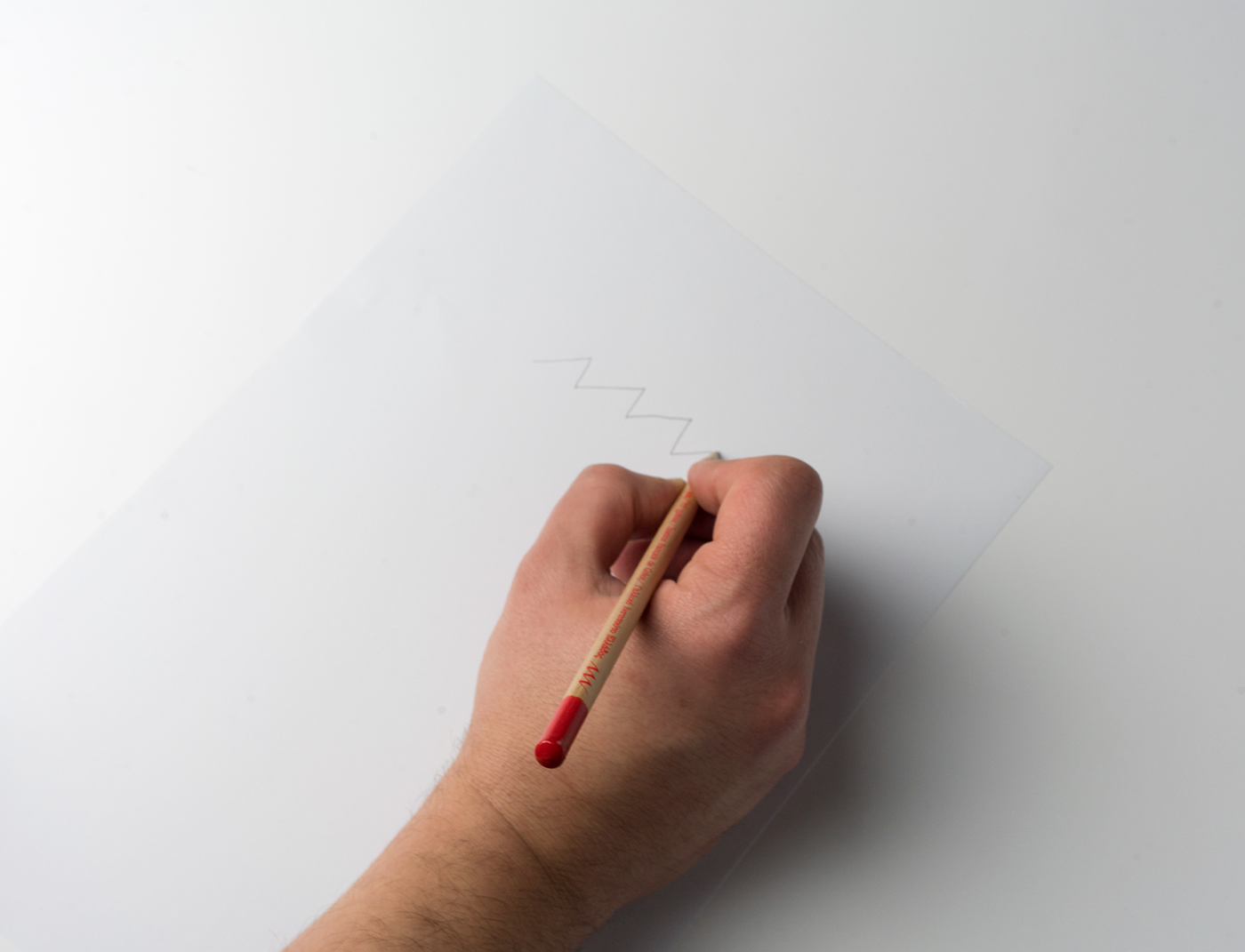
By using our own modernist interpretation of Didot TP Didotou Street in combination of some versions of GFS Didot we are linking a present locality (realty) with a historical one. Also here the typeface confirms or inact the cultural link between Greece and France. Celebrating the 111 years of “ancienneté” of this connection is for us and we believed also for our client, a moment the realise a continuity rather than an “établissement”. The embodied this thought we have connected the three ones of 111 with Ariadne’s thread, the necessary narrative element to be reinvented again and again, that links past, present and future in a meaningful ensemble.