byTiMo visual identity
Since 2004 byTiMo has gradually expanded and now counts almost 1000 stores in 22 countries, and we are still
growing. Tine Mollatt established clothing brand byTiMo in 2004.
byTiMo wanted a new identity that took into account the honest craftmanship, quality and details.
It was important to pay attention to textures and fabric material in the process, not too feminine or romantic but
byTiMo wanted a new identity that took into account the honest craftmanship, quality and details.
It was important to pay attention to textures and fabric material in the process, not too feminine or romantic but
rather a direction characterized by honest quality and passion to the work.
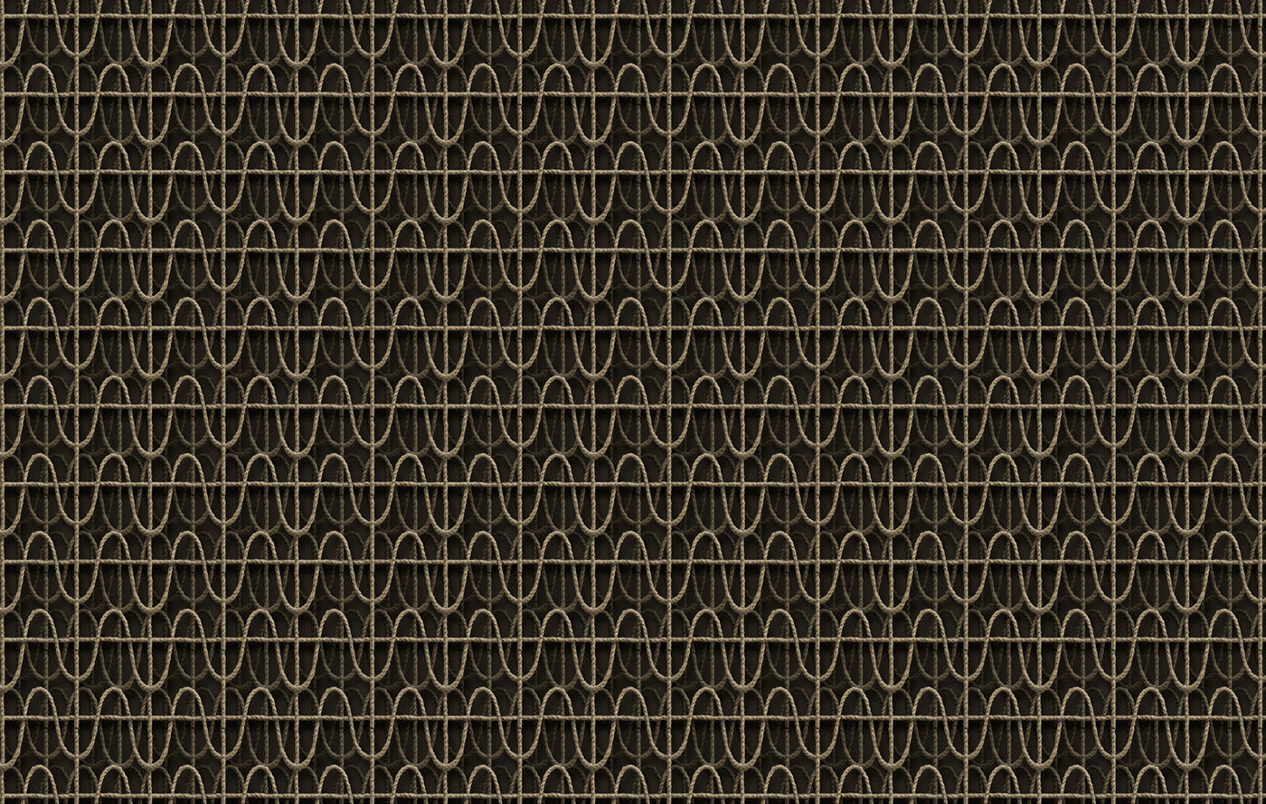
TM = Tine Mollatt. The quality lies in the details and the craftmanship.
The name "byTiMo" represents Tine Mollatt and the initials T and M forms a mesh that symbolically becomes
The name "byTiMo" represents Tine Mollatt and the initials T and M forms a mesh that symbolically becomes
part of the seams in the garment.
This provides a basis for the concept and the new logo depicting honesty and hand work in a premium way.
It was important that different textures and materials set the foundation for the color palette and the product
It was important that different textures and materials set the foundation for the color palette and the product
appears in a warm and honest manner.