Rebranding | ANARP
Associação Nova Aurora na Reabilitação e Reintegração Psicossocial | Portugal
Associação Nova Aurora na Reabilitação e Reintegração Psicossocial | Portugal
ANARP is a Private Institution of Social Solidarity (IPSS) declared to be of Public Interest.
In brief, it can be said that the institution has two main branches: one deals with mental illness rehabilitiation and psychosocial reintegration and, the other, works as a children's center, spread in three sub-branches (from childcare to educational activities).
Previous logos
When evaluating the former identities, it was obvious that the various logos weren't developed coherently or with a sense of bond, graphically and otherwise.

Brand revision and recreation
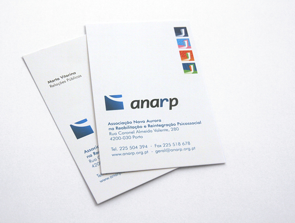
The logo for the Association (ANARP) was redesigned, expressing a more professional and contemporary look. It maintained a few graphical attributes regarding the previous logo so it would keep its "history" and have a minimal resemblance. The created symbol was shaped as a square, aiding to express attributes such as: strength, knowledgeability, professionalism, support, care, among others. The square is common with all other new logos representing each branch, which helps reinforce the overall brand.
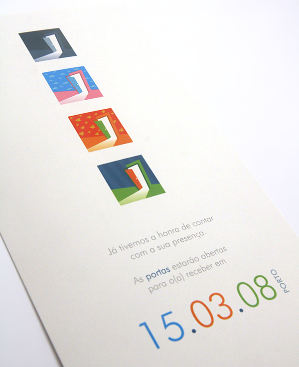
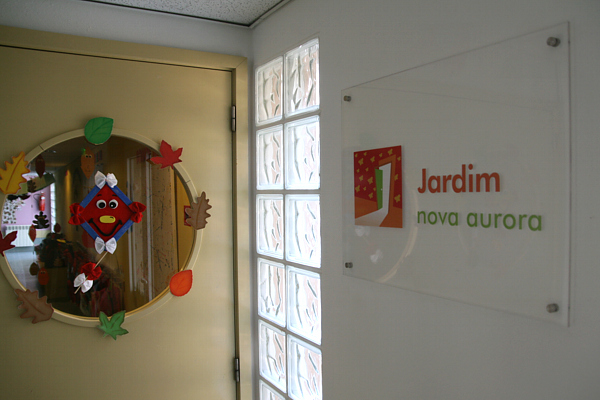
The "opened door" concept comes from the initial idea of shedding "light" on mental issues (room = mind), giving hope and rehabilitation. By using different colourful patterned walls for the children's center logos, we achieve a different theme, more lightful and connected to the different target groups.
The "opened door" concept comes from the initial idea of shedding "light" on mental issues (room = mind), giving hope and rehabilitation. By using different colourful patterned walls for the children's center logos, we achieve a different theme, more lightful and connected to the different target groups.
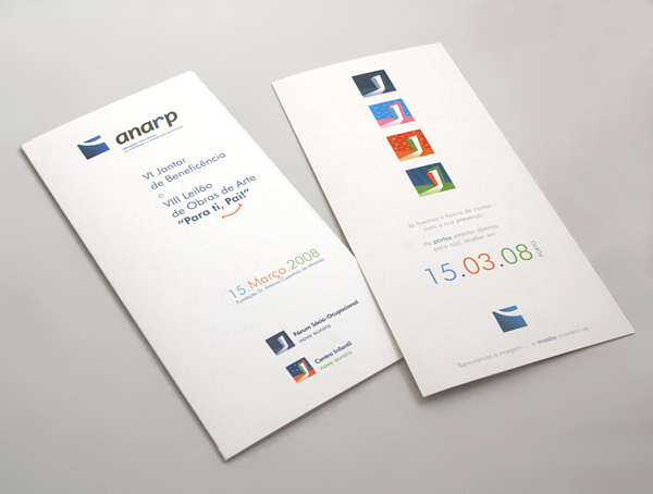
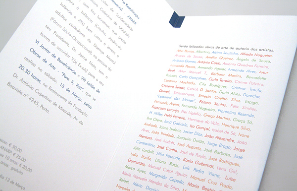
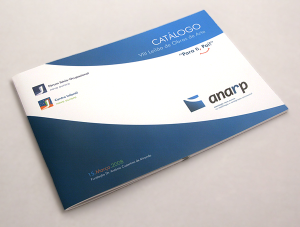
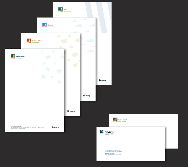
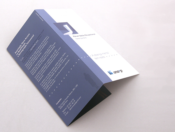


Besides the brand new logos (eight in total), I've been responsible for the creative concepts and development of: corporate identity, stationery, teasers, leaflets, interior and exterior signage (including façades), charity art auction catalogue, brochure design, presentation templates, tiled wallpapers (surfaces and desktop).


