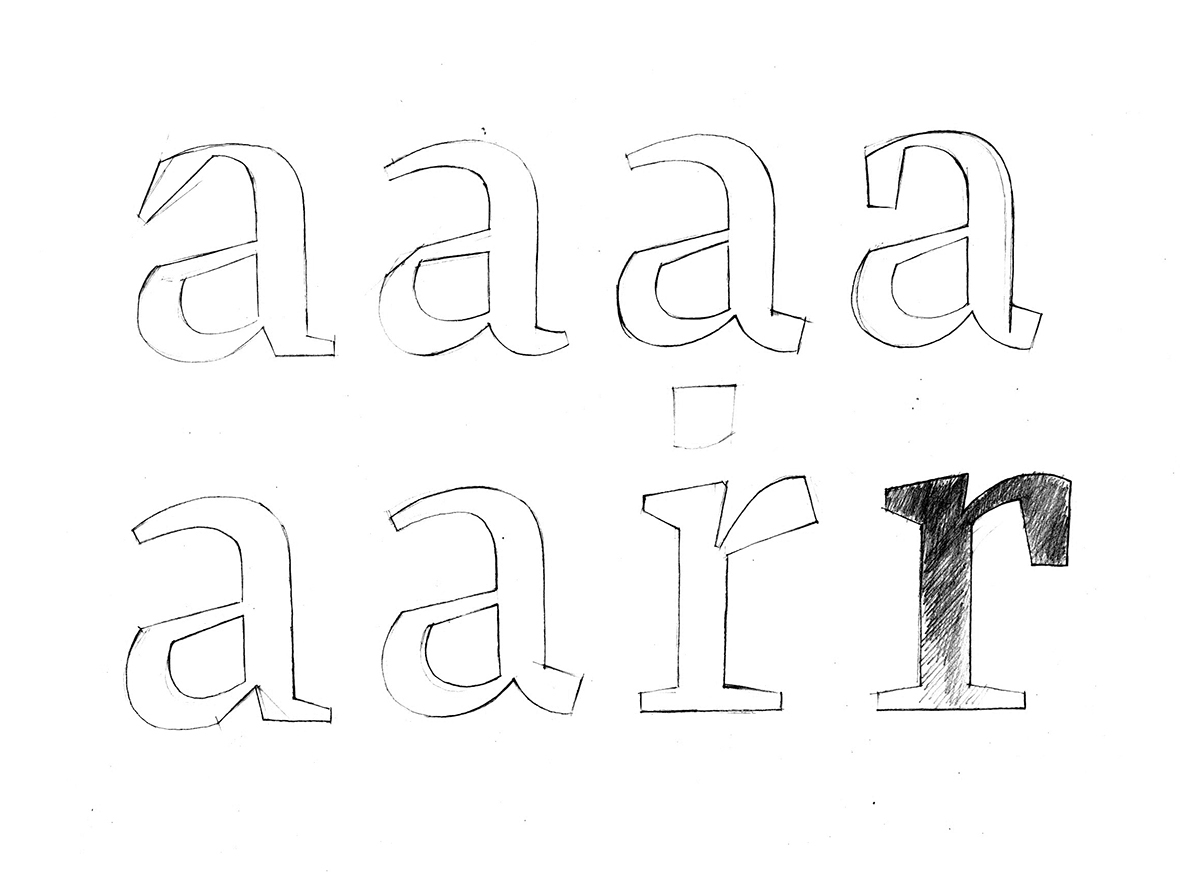
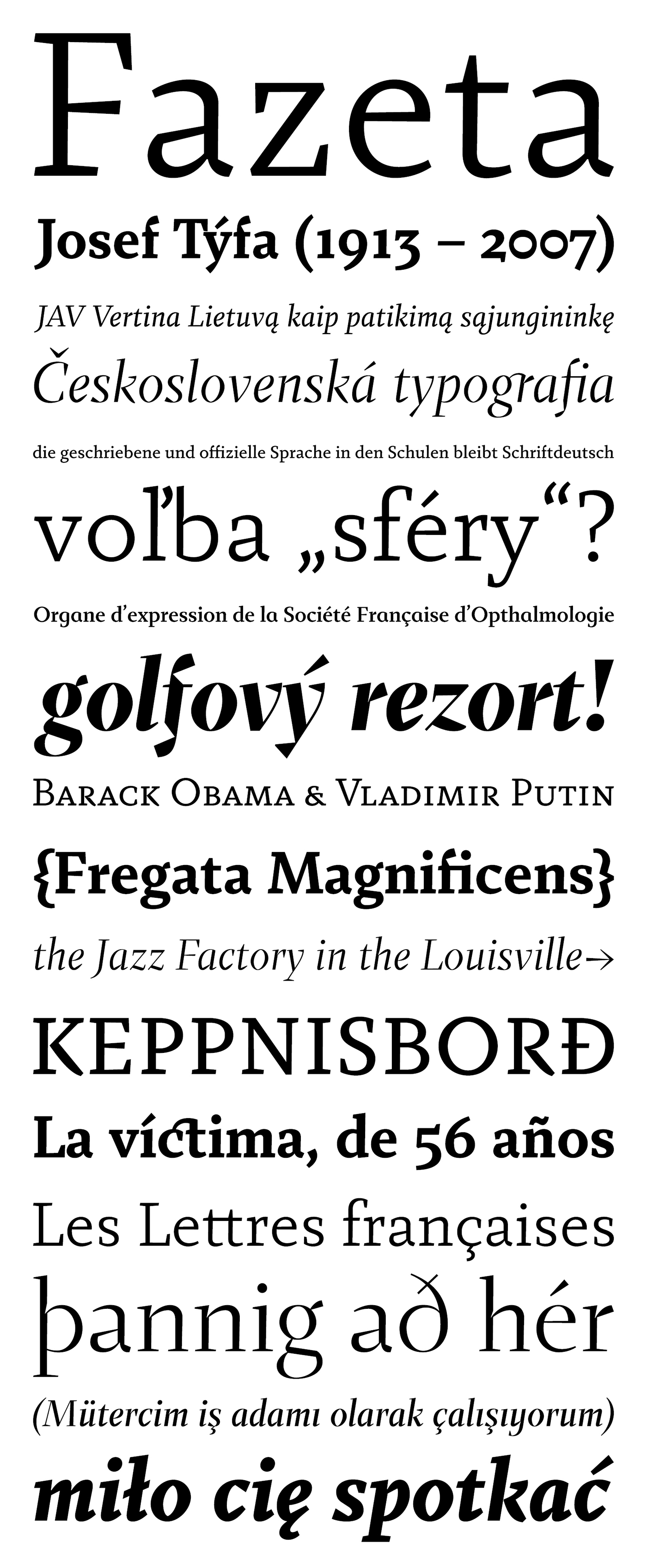
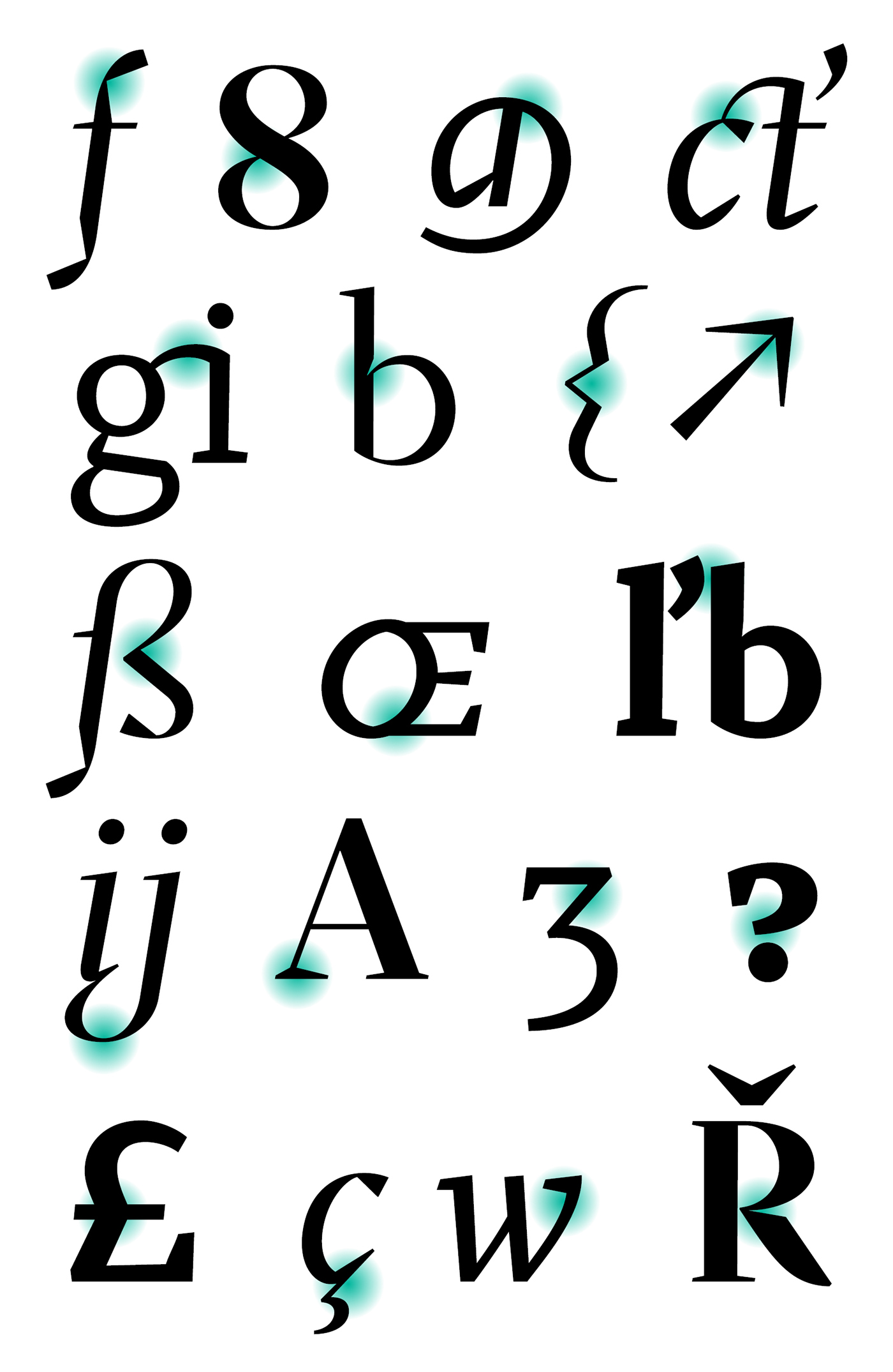
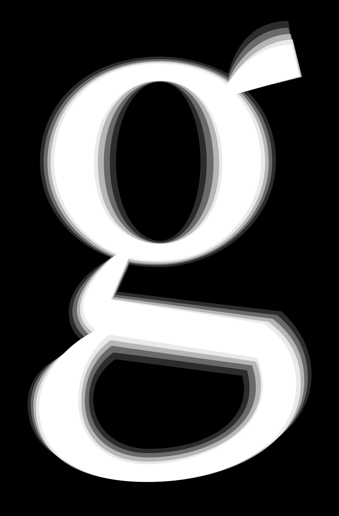
Fazeta is a type family uses the optical sections. It is a modern static antiqua (it has not obliqued axis, serifs without slopes) but distant from ceremonious and rigid look of this type category. Inspiration was typeproduction from Czechoslovakia 60's - J. Týfa, V. Preissig, J. Linzboth or A. Krátky. Common factor of this typefaces is vivid and sharp design with stable serifs, tend to rational construction rather than calligraphy and some sophisticated small details vitalized general impression. In this case are facetted asymmetrical arches (some abbreviation). Specific of this typeface is a short arch of glyph „f“ that allows comfortable typesetting without ligatures obligation. In character set are besides classical ligatures discretionary ligatures for special occasions. Another surprising element is that all vertical strokes are slightly expanded upwards. These details become invisible in small text but in larger sizes impressed the eye and fix attention to headline. For traditional text feeling are here alternative glyphs „a, c, f, j, k, r, y, K, R“ terminated with typical serif. Typeface is graded by optical size into 3 variants - caption (robust structure with low contrast, suitable for size 6 - 9 pt), text (medium contrast, suitable for ordinary text about 10 pt) and display (high contrast and subtle details for 20 pt and higher). Every variant has 5 weights (light, regular, medium, bold and black) with italics. Typeface is with their naked cold expression suitable for neutral text without emotional feelings. In contrast with most antique typefaces this is intended for modern glossy white paper where crisp details can excelled. Every font contains 1140 glyphs, between them original small capitals, various digits, fractions, indexes, matematical symbols, arrows and many alternative glyphs.

X-height is relative small - longer ascenders and descenders give into typeface an elegant impression.

Stylistic set 01 (ss01) add serifs and more traditional feeling.
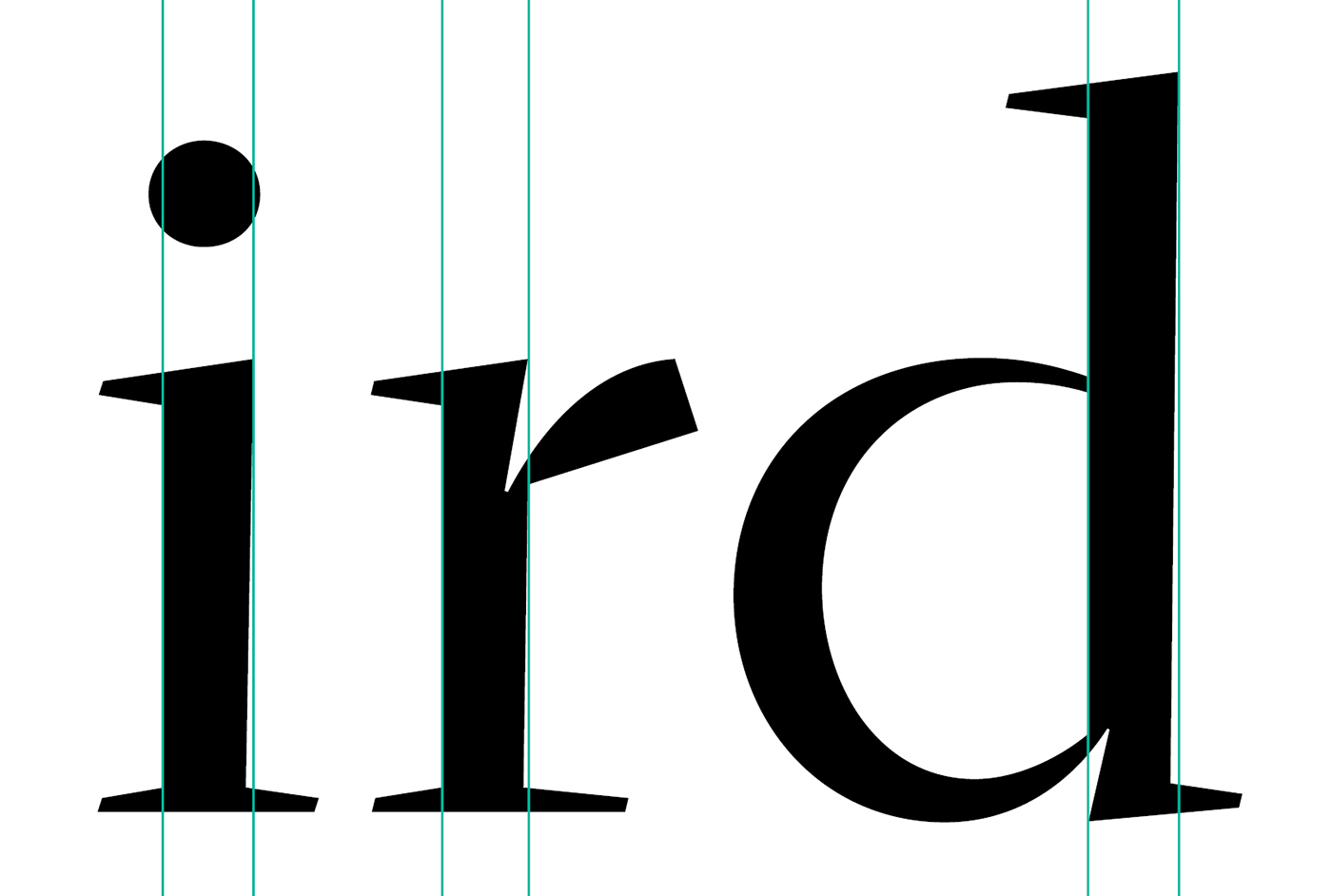
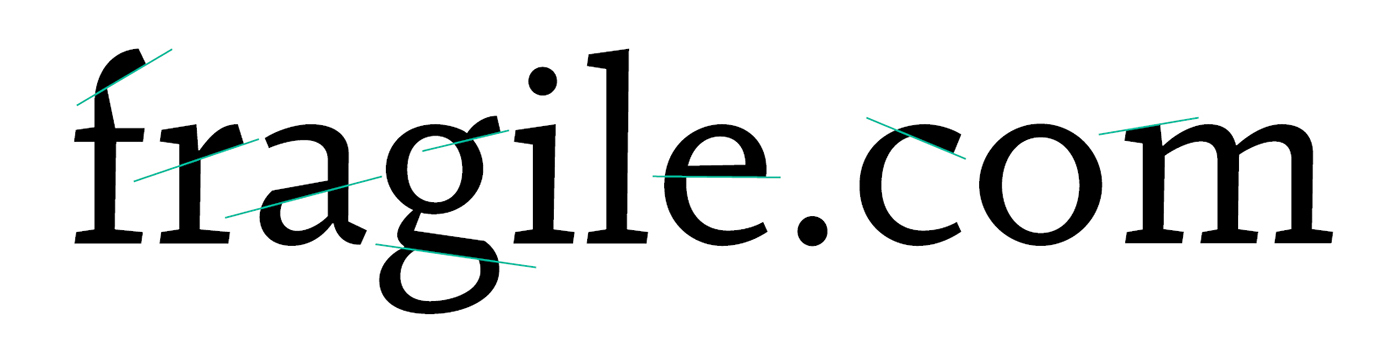
On the right side the letters slightly upwardly extending.
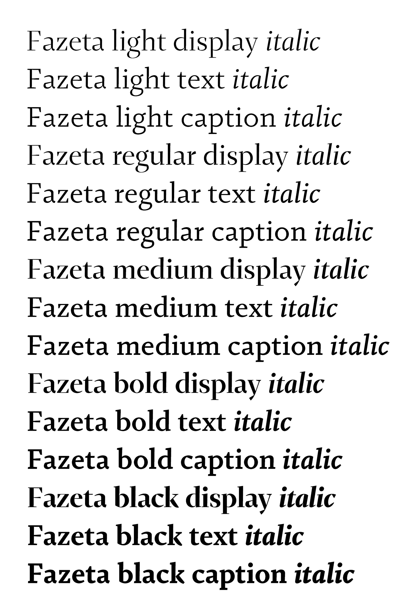
5 weights with 3 optical sizes and matching italics.

Standard ligatures works in stylistic sets too.
Straight lines set by different angles creates a wavy motion in text. It is a differentiating element from another text typefaces.

Arrows for lower and uppercase.

If vertical caron follows letter with ascender it have automatically cutted serif because better spacing and improve legibility.
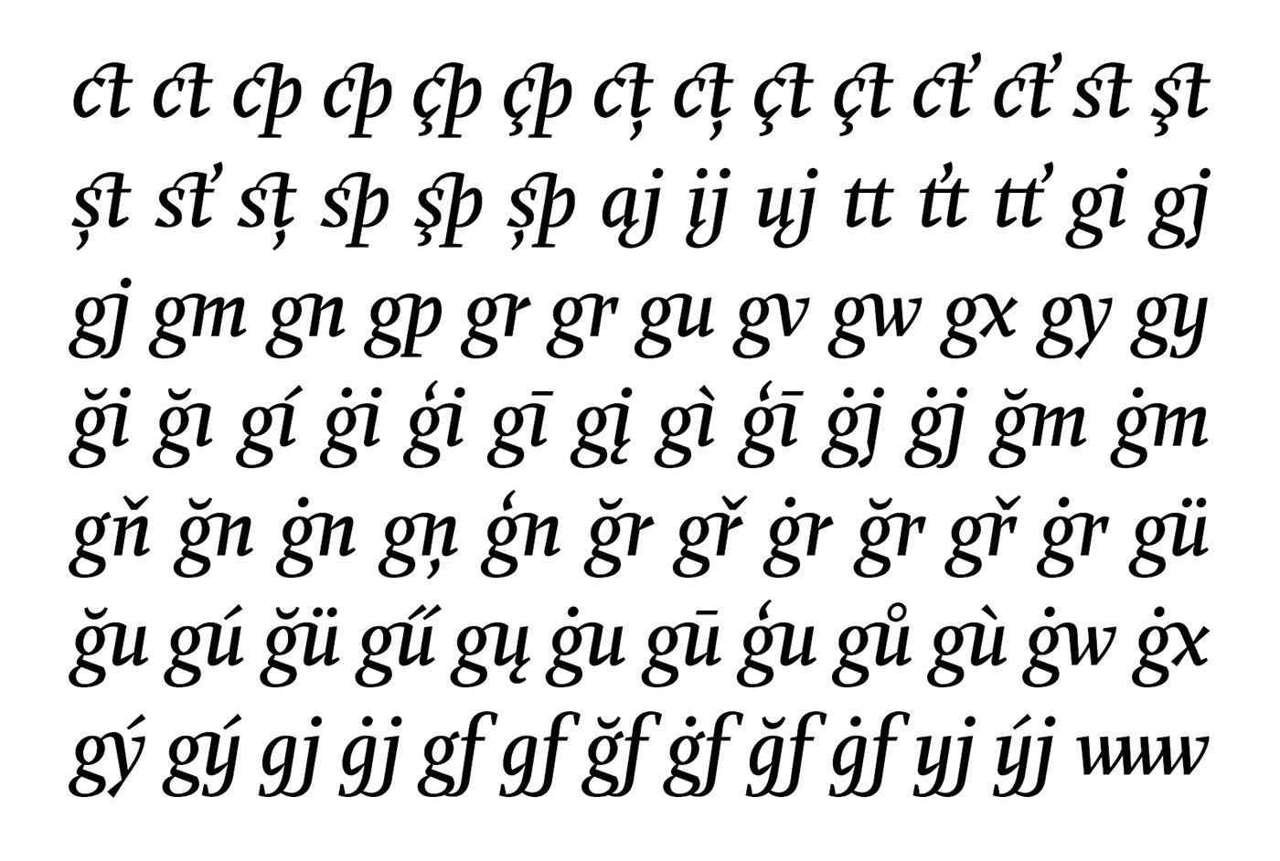
Specialty of Fazeta is the set of discretionary ligatures. These works in every style.

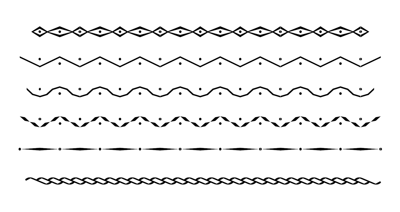
Some facetted borders inspired by slovak folk ornaments. They are activated by "ornm" feature.