


Residential Brand CASE1
Brand Identity Development
Brand Identity Development
Housing, one of the fundamental elements of life, is evolving to meet the demands of our ever-changing world.
The search for “High-End Living” is driven by the market’s heightened priority for services, convenience, and personal privacy.
While the allure of high-end living first ignited in trendsetting locales like Gangnam and quickly became the aspiration for many, the reality is that the term “high-end” has become a victim of its own success as it now connotes extravagance instead of the unique ambiance that once set it apart.
That’s why our project steers “High-End Living” back to its authentic essence and prioritizes a restoration of luxury living, so residents experience our modern standards of unparalleled sophistication.

Core Value
This new high-end residential brand does not seek to vie for attention with ever-more-extravagant amenities but create a distinct competitive edge by focusing on the fundamental elements of living and the residents who make these spaces their home.
The brand defines comfort as its mission by prioritizing elements such as valuable southern exposure for optimal natural lighting not otherwise accessible in the heart of Gangnam, and flexible and highly utilitarian layouts that adapt to residents' lifestyles. This living space offers a unique value that can only be experienced here, driven by the symbolism of the iconic Gangnam and Dosan-daero area and its continuously expanding infrastructure that transforms not just your surroundings but your daily life.
The brand also represents a space that offers stimulation and inspiration to the discerning individuals who are drawn to the best of what life has to offer. This high-end residential culture emphasizes the values associated with a commitment to excellence and a passion for living life to the fullest.
Brand Concept
The brand concept communicates the ultimate goal and singular vision that the brand conveys to its customers.
The new high-end residential brand aims to be the ultimate destination in Gangnam, where residents with exceptional taste converge.
The term "centerpiece," signifying the most important piece and a noteworthy presence, illustrates that the brand serves as a focal point where residents with discerning tastes will gather, leading the way in shaping a new era of high-end residential culture and setting an elevated benchmark for luxury living.
This concept is a commitment for the brand to deliver an overall experience that is luxurious and convenient in a community that is stimulating and supportive.
Brand Name
Simplicity and intuitiveness were key elements in the naming of the new high-end residential brand,
with the aim of easily conveying the brand story.
The name CASE1 combines CASE with the number 1, signifying "centerpiece," which is easily recognizable
The name CASE1 combines CASE with the number 1, signifying "centerpiece," which is easily recognizable
and has only one central meaning. The brand stands as a beacon among a sea of high-end offerings.

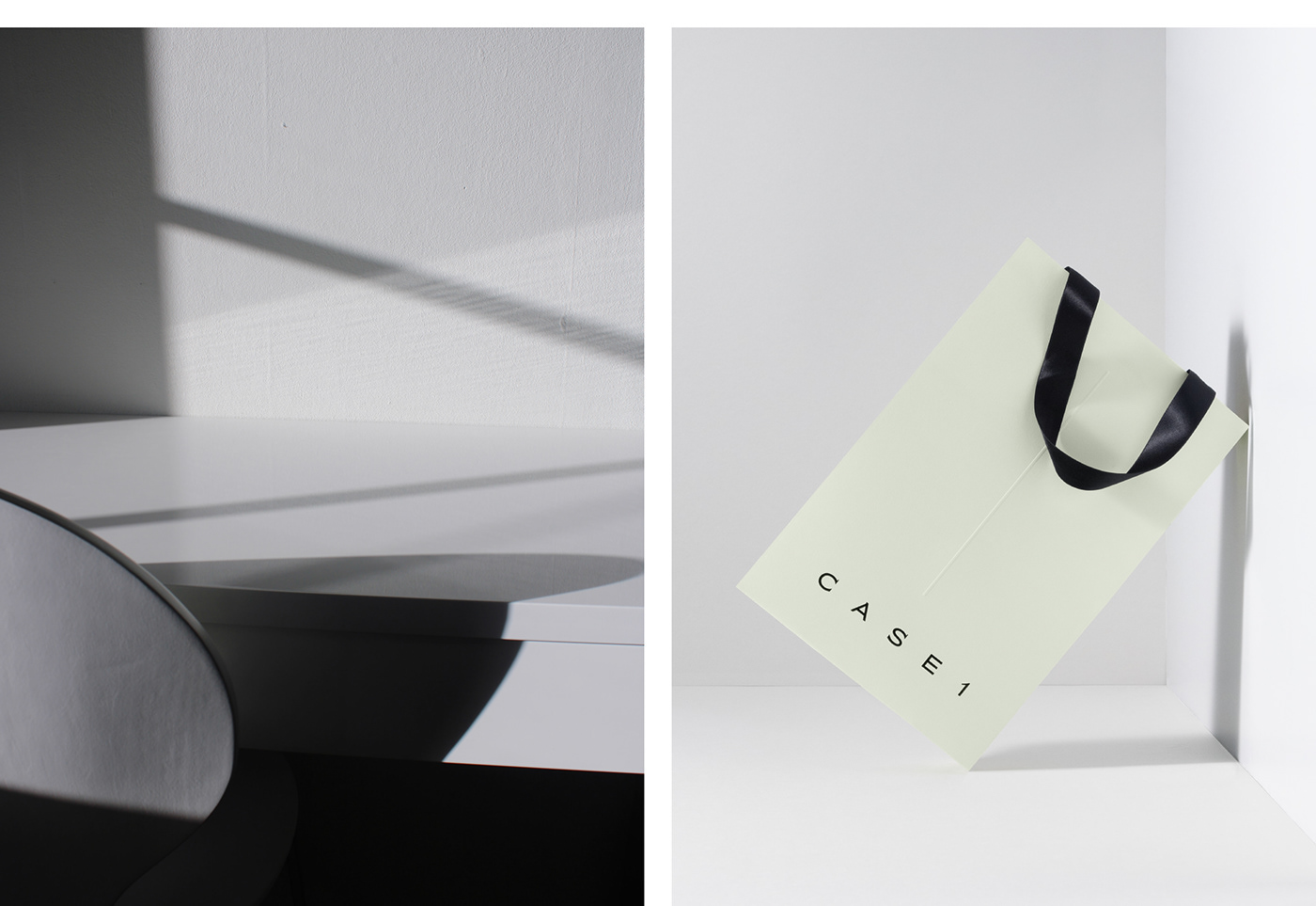
Brand Logo
The brand logo is designed to intuitively convey CASE1’s significance as a pillar in Gangnam, the new standard in high-end.
Squared serifs are incorporated into the letters C and S to express the pillar motif, with the entire logotype featuring wide strokes and generous spacing between letters to convey a sense of sophistication.
Squared serifs are incorporated into the letters C and S to express the pillar motif, with the entire logotype featuring wide strokes and generous spacing between letters to convey a sense of sophistication.

CASE1's brand identity is the core of a high-end residential
brand and a benchmark for luxury residential culture.
The primary logotype is intended for use in areas where
The primary logotype is intended for use in areas where
visual identification can be seamlessly achieved,
includingexterior signage, resident key cards, brochures,
and other touchpoints.
The recommended minimum font size for the logotype is
10 to 15 pixels, and 5 to 10 mm is recommended for
uniform embroidery. The logotype can be used optionally
in constrained circumstances, such as printed materials,
website footers, and other applications.


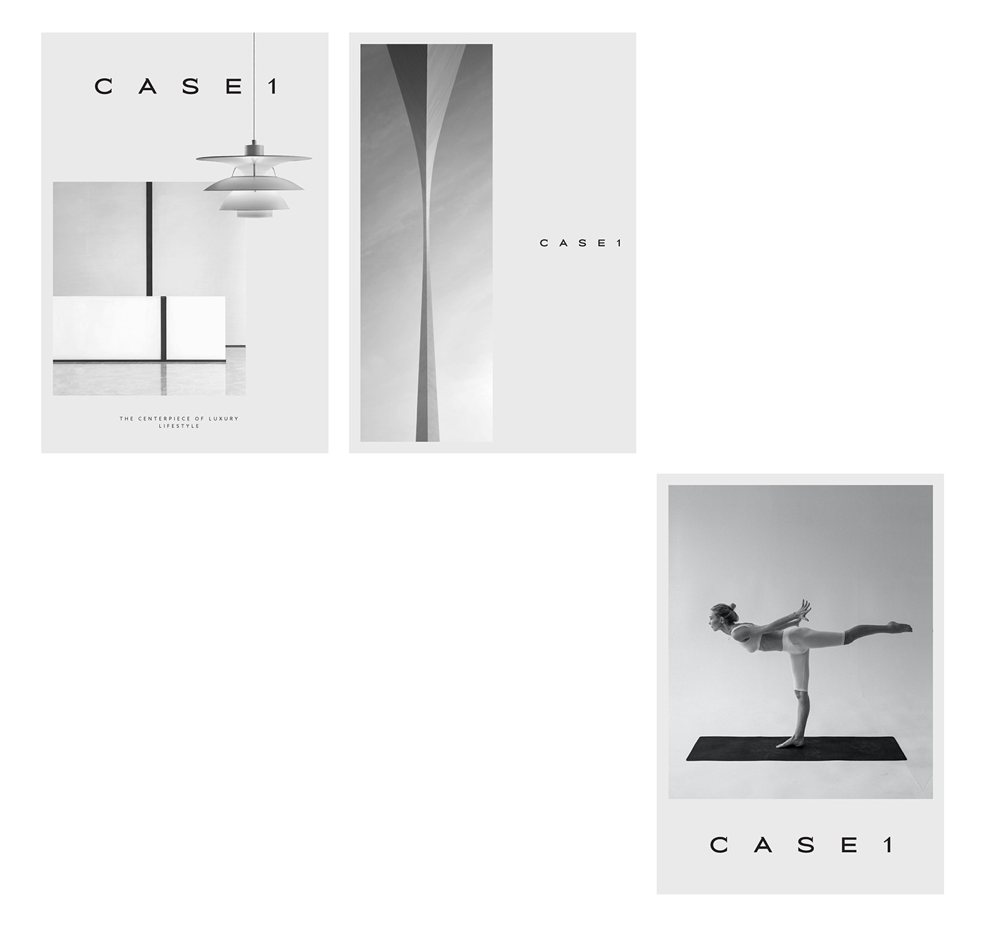
Key Visual
The key visual strikes a balance between subtlety and impact in conveying the brand concept across multiple environments for an informative and aesthetically pleasing delivery of information.
By using typography to express the central pillar motif and employing vertical text layouts, the image is fresh
By using typography to express the central pillar motif and employing vertical text layouts, the image is fresh
and unique.

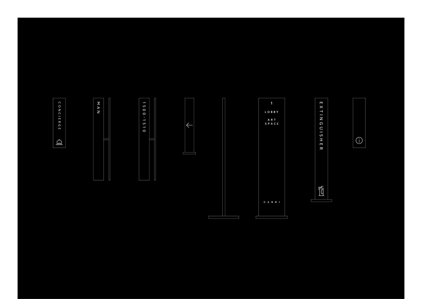
Signage
The signage used inside CASE1 residential facilities primarily utilizes elegant, vertically elongated panels,
and vertical text aligns with the panels to convey information in a refined, intuitive format.


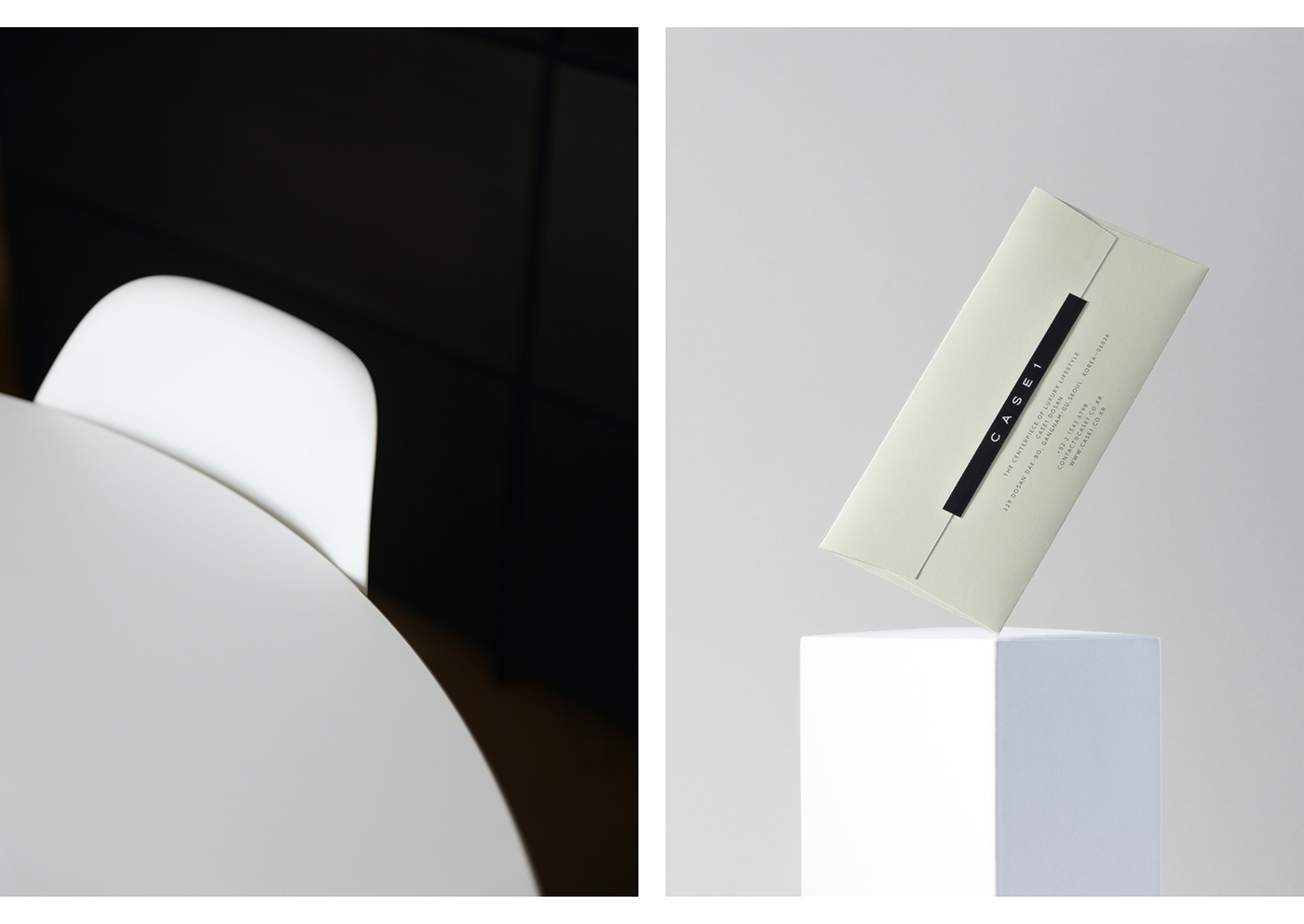
Application
CASE1's application delivers a seamless experience from paper to pixels. For physical media, refined typography and paper utilizes vertical lines to convey the pillar motif, providing a sense of luxury through
the texture unique to printed material.
Online media delivers image- and motion-rich content that elegantly depicts the "Centerpiece" concept.
Online media delivers image- and motion-rich content that elegantly depicts the "Centerpiece" concept.


Residential Brand CASE1
Brand Identity Development
Brand Identity Development
Jun. 2022 ― Oct 2022
Plus X Creative Partner
Creative Director: Tyodi Hyojin Lee
BX Strategist: Jeeyoung Song, Hyemin Oh
BX Design Director: Yoonseong Lee
BX Designer: Byeongkuk Jung, Hwan Kim, Soyeon Lee
Creative Director: Tyodi Hyojin Lee
BX Strategist: Jeeyoung Song, Hyemin Oh
BX Design Director: Yoonseong Lee
BX Designer: Byeongkuk Jung, Hwan Kim, Soyeon Lee
WE THE CORE
CEO: Hongjun Choi
CCO: Sabum Byun
Director: Sangmin Jung
CEO: Hongjun Choi
CCO: Sabum Byun
Director: Sangmin Jung
©2023 Plus X Creative Partner


