Contact Photography
Contact is a team composed of five photographers specialised in marriage coverage, christening ceremonies, social events and exhibitions. Operating in Athens, Contact Photography manages diverse creative results due to the combination of the five, who all derive from various backgrounds. A cultural, thoughtful and emotional approach is always predominant features in their work, with a keen eye for detail.
For the logotype we communicated the exact and direct meaning of the word. We unified the word by building a custom lettering in a way that visualises its meaning and at the same time the most important feature of the team, which is unity. No matter their diverse backgrounds the result is always solid and cohesive. Professionalism, elegance, balance and creativity are among the most important clues.
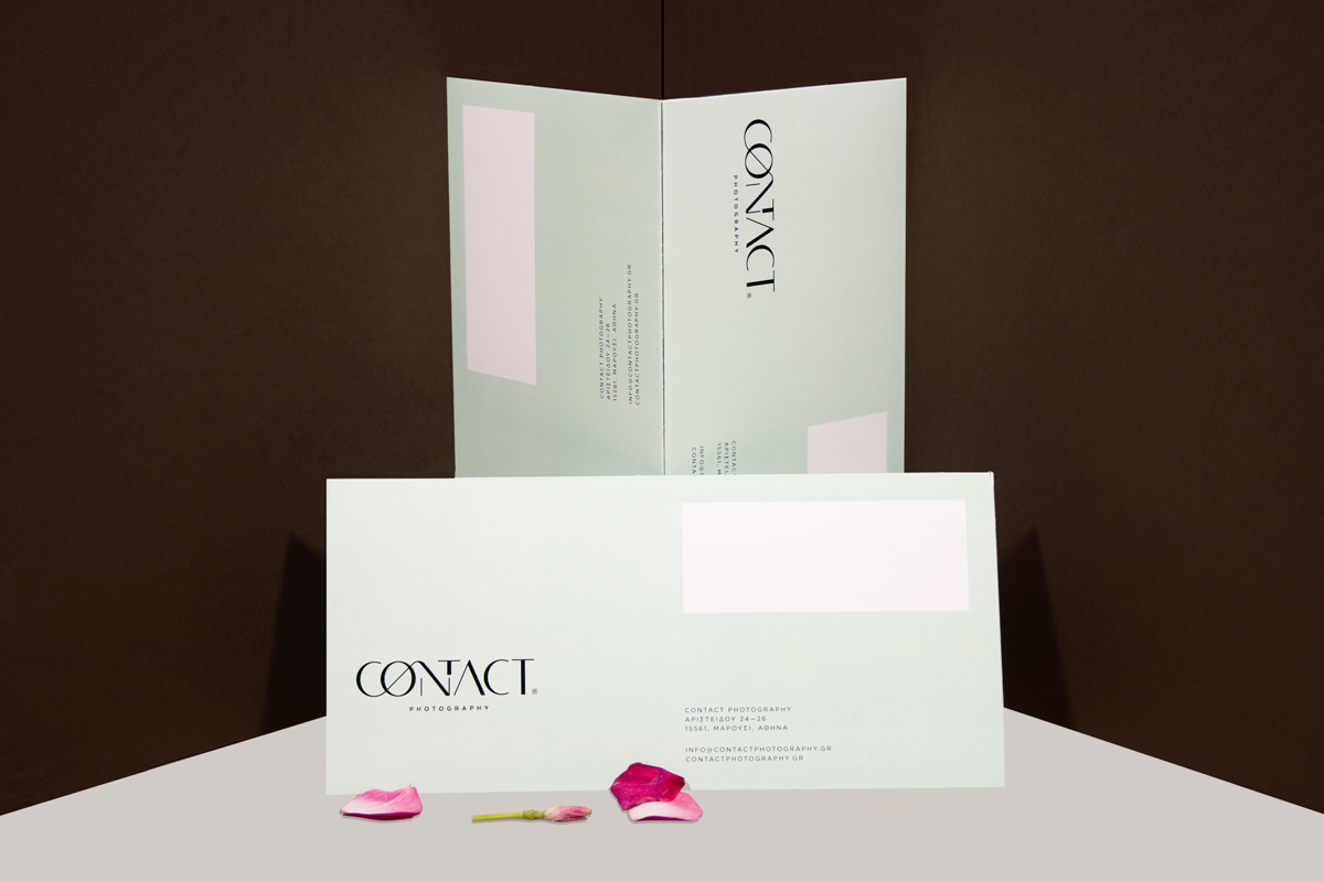
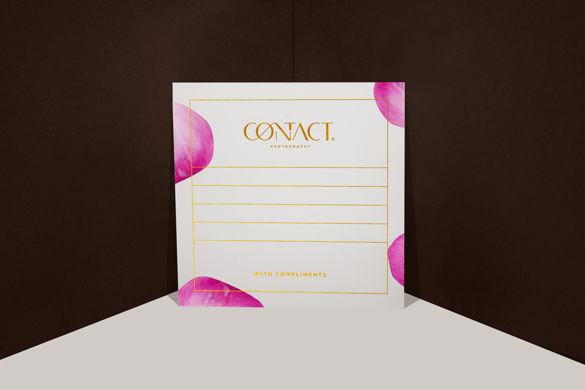
Soft-toned papers are used for the printing applications, such as skin for the business cards, natural pallette for the folders and exhibition cards, which is fresh but always timeless and a golden foil for the with compliments card for specific occasions. The taken by surprise message is being applied in an unexpected, compared to the overall identity, typographically way, and while the message is being balanced on the cards, one letter in each card seems incongruous. In this way the viewer of the card/visitor of an exhibition could not know what to expect from the team and this is something worth to remember.
Applications designed:
Logotype, Business Cards, Folders, Letterhead, Exhibition Cards,
Annual Book, Tote bag, With Compliments Card.
Applications designed:
Logotype, Business Cards, Folders, Letterhead, Exhibition Cards,
Annual Book, Tote bag, With Compliments Card.