


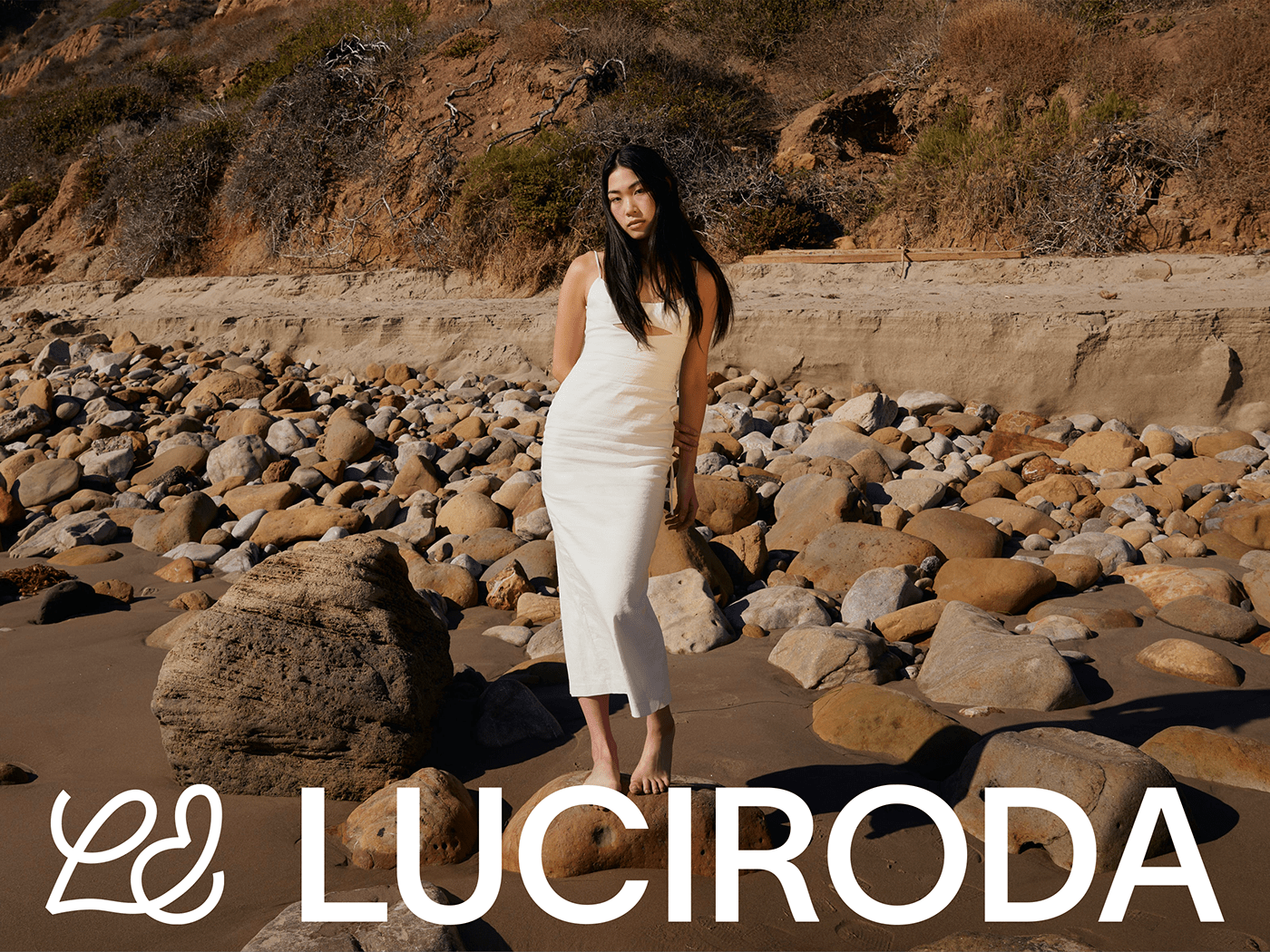
LUCIRODA RE-BRANDING PROJECT (2023)
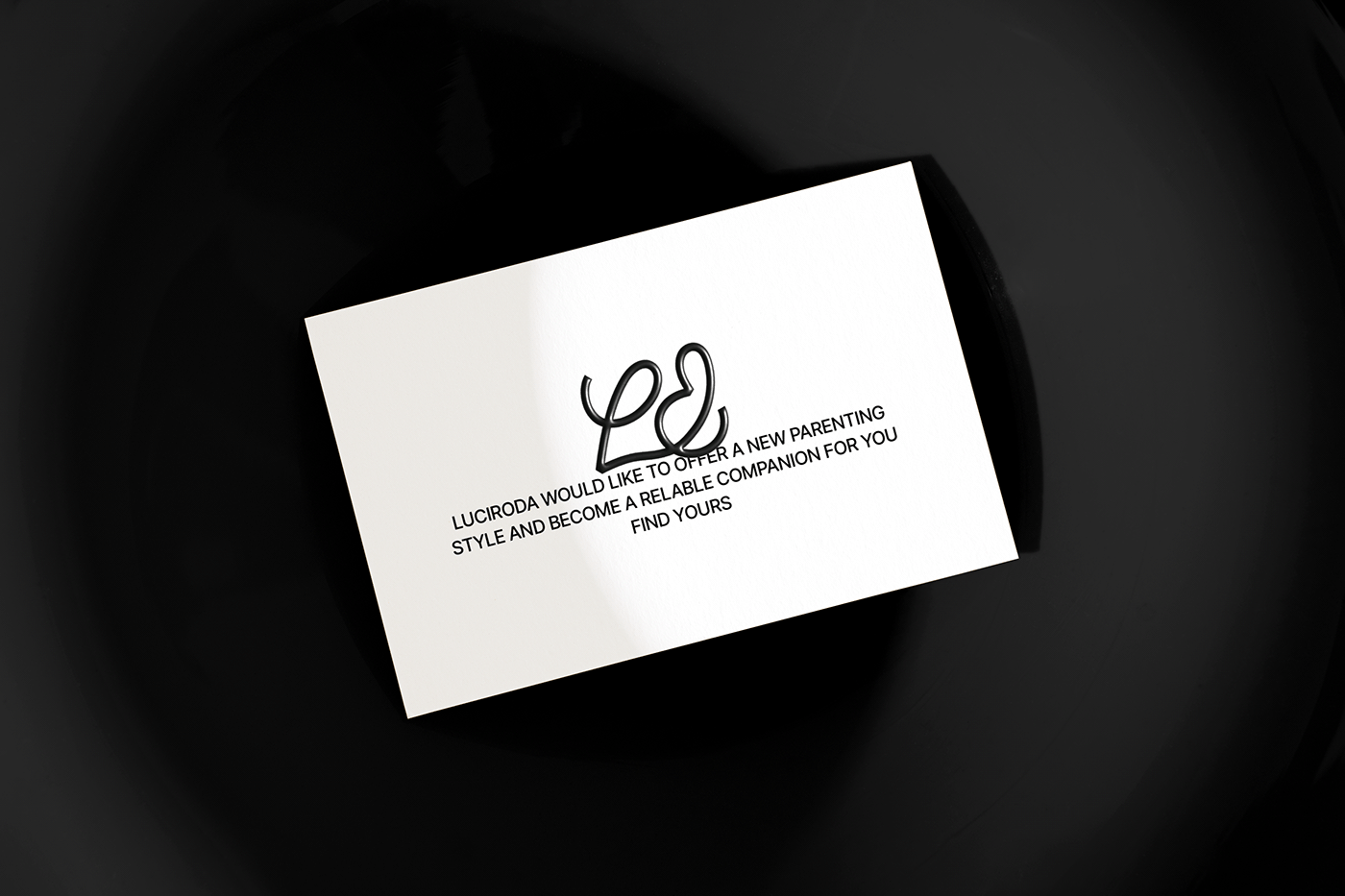
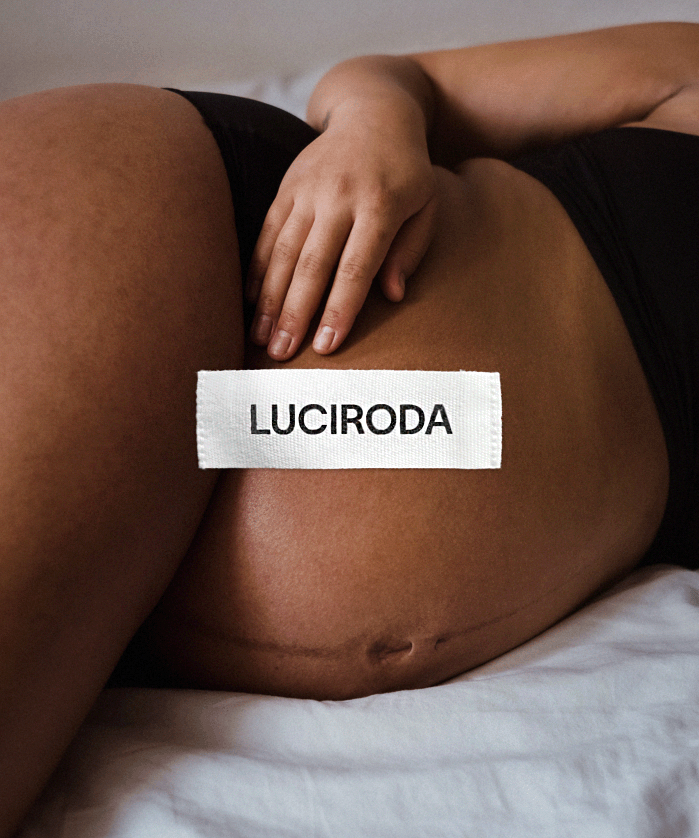
LUCIRODA is a parenting brand that develops baby slings that both parents and children can wear comfortably. LUCIRODA believes that the comfort of the baby is important, but it is also important not to spoil the unique style of the parents who wear the baby sling. Therefore, the rebranding project was carried out to convey the message to parents around the world that they can raise their children sensibly while maintaining 'my own identity'.
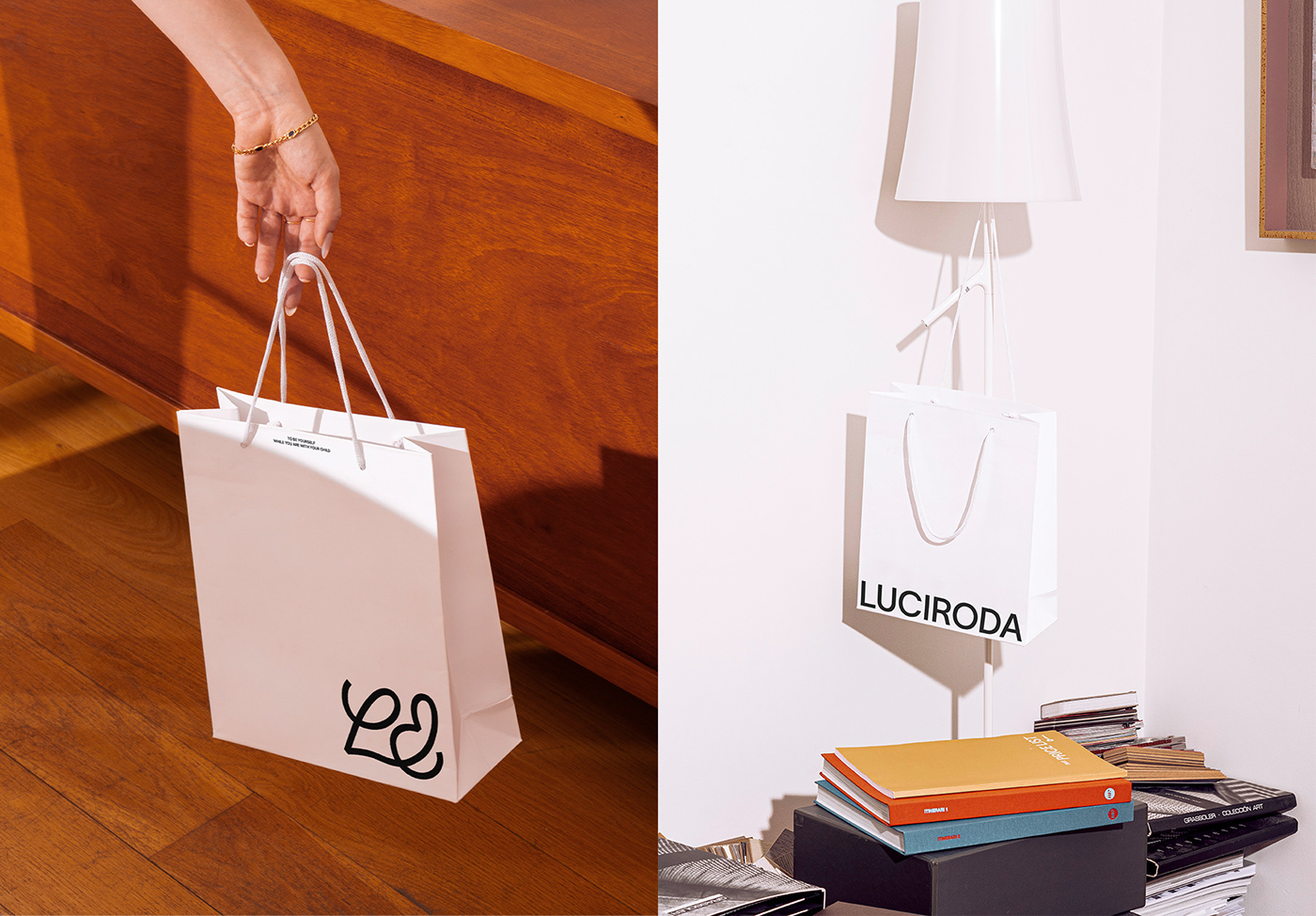
In line with LUCIRODA's philosophy, we created a new design system for strategy, verbal, visual identity, package, web, social and other touchpoints. The rebranded LUCIRODA will help parents focus on ‘parents themselves’ and create a sensuous lifestyle with their children.
LUCIRODA is a parenting brand that develops baby slings that both parents and children can wear comfortably. LUCIRODA believes that the comfort of the baby is important, but it is also important not to spoil the unique style of the parents who wear the baby sling. Therefore, the rebranding project was carried out to convey the message to parents around the world that they can raise their children sensibly while maintaining 'my own identity'.
In line with LUCIRODA's philosophy, we created a new design system for strategy, verbal, visual identity, package, web, social and other touchpoints. The rebranded LUCIRODA will help parents focus on ‘parents themselves’ and create a sensuous lifestyle with their children.

BRAND IDENTITY
LUCIRODA's brand identity 2.0 starts from the core essence of 'Moments with your child'.
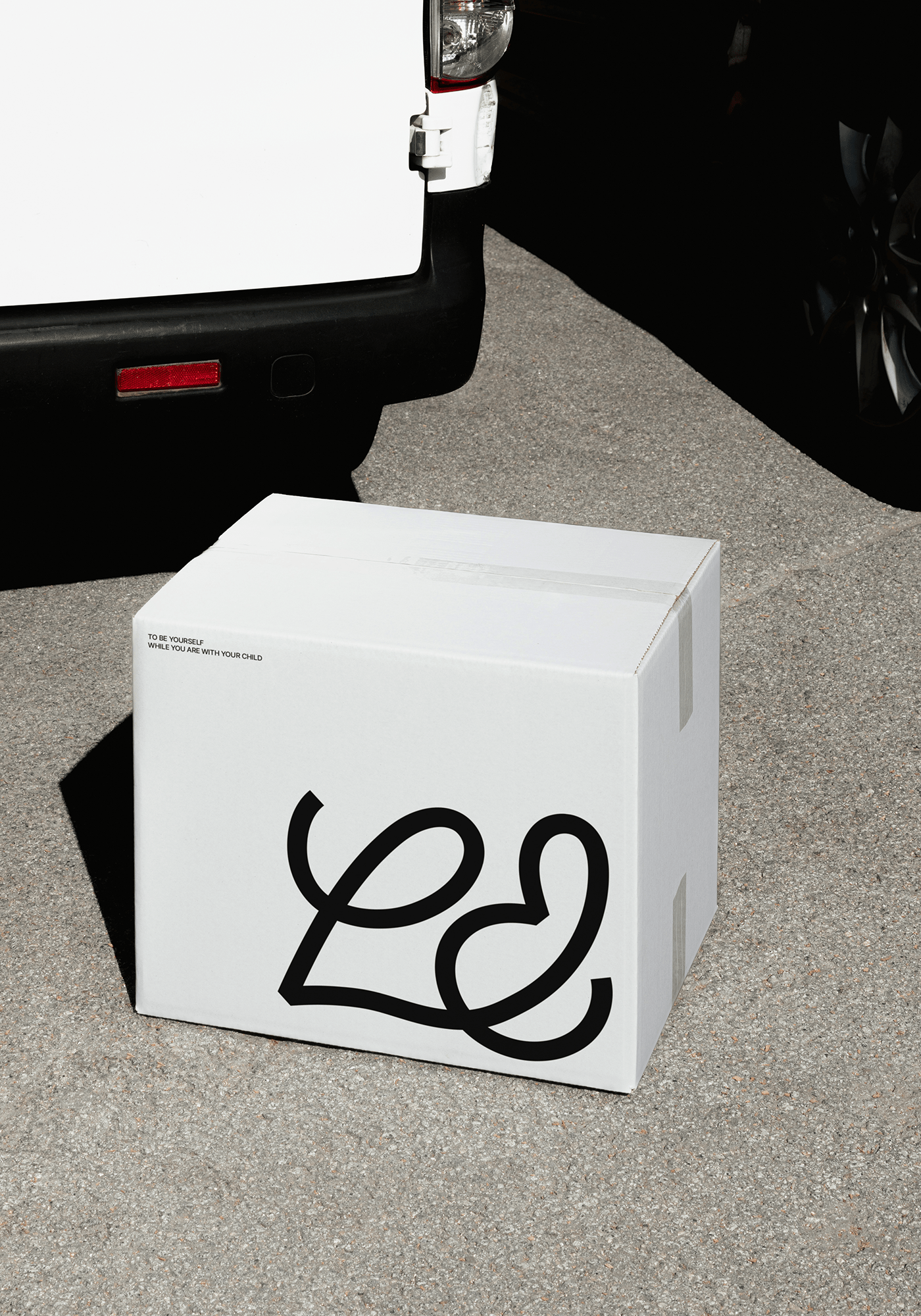
The brand symbol, a key asset, was developed into a single form (ligature) by combining LUCIRODA’s representative alphabet ‘L’ and ‘&(ampersand)’, a symbol meaning ‘together’. In addition, it is designed based on the shape of the script typeface and delivers a free brand image as an identity.
LUCIRODA's brand identity 2.0 starts from the core essence of 'Moments with your child'.
The brand symbol, a key asset, was developed into a single form (ligature) by combining LUCIRODA’s representative alphabet ‘L’ and ‘&(ampersand)’, a symbol meaning ‘together’. In addition, it is designed based on the shape of the script typeface and delivers a free brand image as an identity.


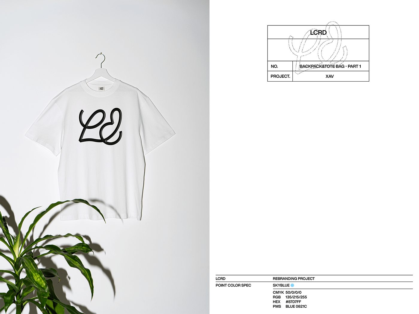
BRAND COLOR
LUCIRODA uses black and white colors as the main colors that encompass all light and color.
This color expresses the brand philosophy of LUCIRODA, which develops universal and sensuous designs without restrictions on gender and size. In addition, ‘Skyblue’, which resembles the color of the sky, is used as the point color. This color carries the meaning of self-reflection, communication, and inclusion, and is a color that expresses the desire to find and feel one's true self in the moments of living together.


Partner : LUCIRODA
Brand Directing : Na Hana
Brand strategy / Verbal & Visual System Establishment : Na Hana, Choi Youngji
Motion Graphic : Jung Hoonho


