Chimera is the result of an experiment with the reversed broad-nib model. The typeface started as a graduation project for Type and Media course at The Royal Academy of Art in The Hague.
Intended specially for display use, Chimera includes two low-contrast text companions in addition. The text styles are an extension to the display ones. They keep the same concept, but are adjusted to be able to perform in smaller sizes. Although all the styles in the family are based on the same concept and share certain characteristics, they are not meant to be used together. Each one works individually, bringing its own unique style. However text styles can work as companions to any of the display ones.
Each of the styles is a separate master and has been entirely drawn from scratch, which gave me a freedom to differentiate the styles. I was able to not only distinguish the contrast, but also find individual solutions to certain shapes. This way it was possible to make design decisions that complement the styles more.
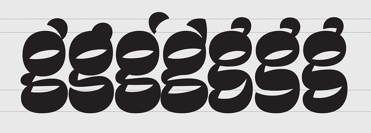
One of the main design features of the typeface is a very big x-height and narrow proportions. Another special element is an inktrap, which appears mainly in the lowercase where two thick strokes meet together in order to reduce the amount of black. The bolder the style gets, the tighter spacing becomes. It is also evident that shapes become more solid and clean. Simplifying comes to an extreme point in the Black, where some serifs disappear completely.

Chimera got Certificate of Excellence in Typeface Design TDC2 2014
And Silver Prize at Morisawa.
↓ Scroll down to read more about the idea and process ↓

The idea
The project started at Type and Media course in the Royal Academy of Arts (The Hague, NL). During TypeCooker classes with Erik van Blokland I opened myself to new ways of sketching. Sketching in a big size, using white-out helped me to feel the letterforms better, to draw precisely and at the same time not to worry about the mistakes I made. Drawing with a marker made me pay attention to the shape, drawing with a tip-ex made me look closer and allowed to correct the counter-shape. One of the works I did for a Thursday TypeCooker class became the very early start of my graduation project.


TypeCooker sketch with a reversed contrast
Here is the initial recipe:
[width]: extra condensed
[weight]: medium
[construction]: italic
[stroke endings]: wedge shaped serif
[ascender]: longer than normal
[descender]: shorter than normal
[contrast type]: between expansion and transitional
[contrast amount]: inverted contrast
[stems]: convex
[intended application]: smooth offset printing
[intended size]: most sizes
[special]: inktraps for inside corners (white)
After I did this sketch, I tried to make an alphabet from it. It took a while to make shapes actually work digitally. It was very hard and sometimes even impossible to bring the same feeling as I had in lettering into a digital format. Sketches usually have their own pleasant appearance, which comes from the technique, from the hand-made feeling and from imperfection as well.

I got addicted to those strange impossible shapes. It was really exciting to work on them. Although I did not solve every shape, I made a big step for the moment and it was a nice exercise for the future.
Later, in the end of January there came a moment when we needed to make our decision. At that time I was still constantly thinking about this impossible style and challenge that I could experience working on it. In the end that became a reason for me to select it as a direction and to take it as an idea for the final project.
Later, in the end of January there came a moment when we needed to make our decision. At that time I was still constantly thinking about this impossible style and challenge that I could experience working on it. In the end that became a reason for me to select it as a direction and to take it as an idea for the final project.
Process


I started the project by trying to imagine a structure of a type family. Of course, at that moment I was mainly excited by the character of the shapes I started with — a condensed black italic. But my goal was to see the possible variety and how the styles can be related to each other. At the same time I was trying to quickly see whether the whole idea can actually work as a family with both romans and italics.
It was obvious to me from the beginning that my sketching-based way of working will bring me a lot more troubles. At the same time I realised that this process will be extremely important to keep freedom, to quickly explore different possibilities, to avoid being stuck with ordinary predictable letterforms and to explore more than what digital format allows me to do.

One of the first family planning of the project. Five display styles: from Light to Bold with Italics companions and Black for poster usage.
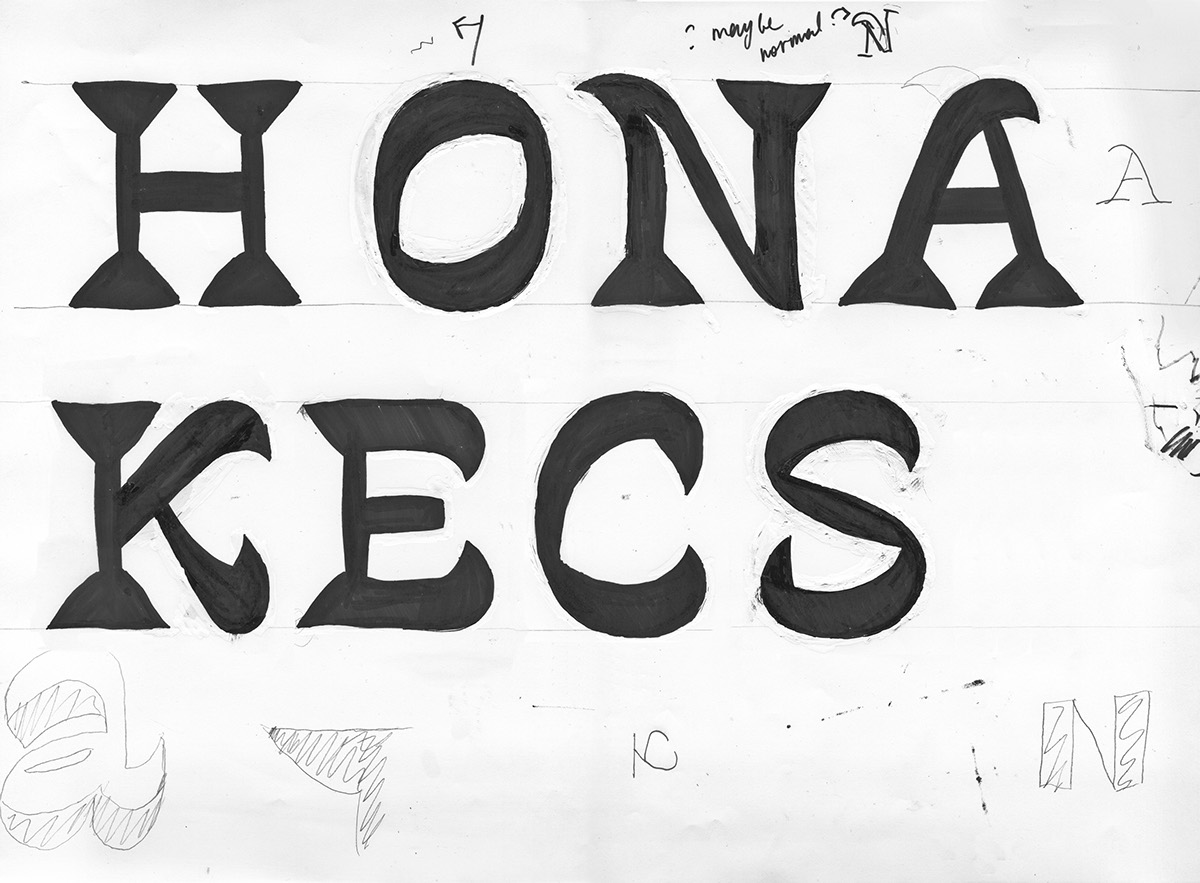
The approach to this kind of a project is completely different to what is done in the process of development of a text typeface, where familiar forms and general view are much more important. I’ve invented almost every shape and I did not even had any close references to look at. To try and test things, my main instruments were my black marker, white-out and a block of paper, which allowed me to test a variety of choices in a short time. Sketching, balancing forms, working to find the best solution, constantly changing everything, adding chaos, then calming it down. It was a constant process of going back and forth the media, looking for the very best solutions. Sketch — digital — print — sketch — digital — and over again. Trying out different particular letter variations in a set of others to see whether it followed the typeface’s rhythm. ‘Isn’t it too strange?’ — ‘Can it be read as a letter?’ — These tests were my everyday exercise. Sometimes I was spending several days intensly researching one particular letter and then going back to see that one of the older versions was better, or that the truth was somewhere in-between. Sometimes the solution for the shape looked almost unrecognizable as a letter without a context. I also played with a contrast and in certain situations allowed myself to make exceptions. As long as something followed my idea and rhythm I considered it acceptable.

An early sketch of the figures
One of the exercises I used in the beginning was writing a normal contrast letter with a broad-nib pen first to be sure about how the contrast is normally developed. Then directly sketching the inverted one on the side. When drawing figures, I started with the same trick. It was a surprise for me that figures turned out looking almost normal.
My rule was to keep the weight mostly on top and bottom with a little amount of diagonal rhythm. I really appreciated the wrong proportions and I incorporated some of my ideas in figures. For example I tried [8] with a bigger top oval. I made several experiments on the oldstyle [0] with various possible contrast with the intention to clearly differentiate it from the lowercase [o].
Looking at those sketches of words you can see that a lot needed to be standardized (be more even and consistent). You can also imagine that digital shapes would need a lot of attention as well. I did not want to avoid that difficulties, I wanted even to force them, to learn not from what is technically more simple and can give me fast results, but to learn how my hand (sketching) works and how that experience can lead me to different shapes, also how to transform drawings made on paper into digital curves.


It was clear that triangular serifs I’ve still been keeping was a wrong direction. But I’ve been postponing this conclusion. At certain polint I finally realized that triangles need to be changed. I took some time and paper to look for other solutions. My goal was to find a clear and simple solution that will organically fit my idea and will also be flexible enough to be applied to a variety of shapes. I picked up [a] as a shape that I liked, [n] as a basic one for which solution should have been found and [i] as a shape with a single stem (such letters as [i] [l] are hard to solve in this style as they cause a lot of white space around). With those three letters I started experimenting on paper, not rejecting even the very stupid ideas.
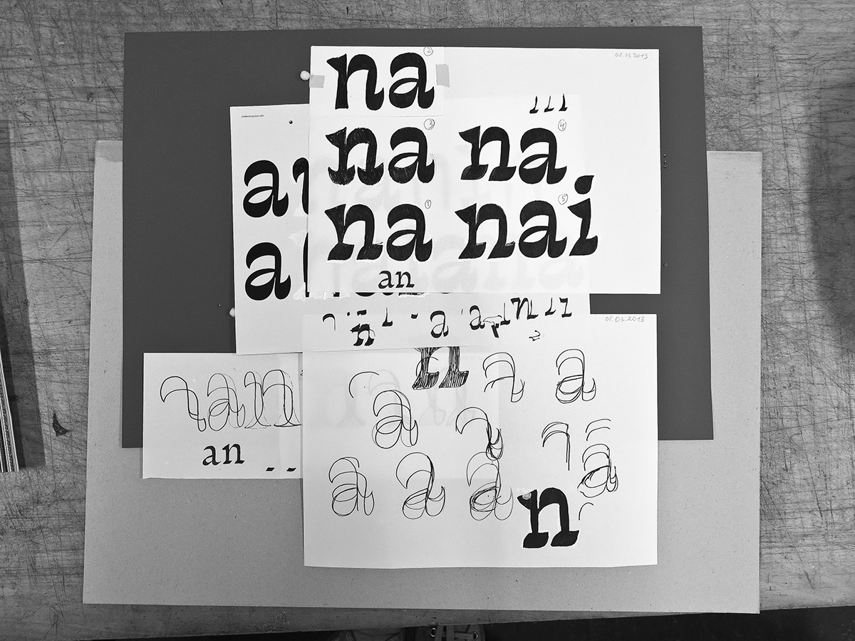
My goal was to find a clear and simple solution that would organically fit my idea and would also be flexible enough to be applied to a variety of shapes. I was exploring the styles as fast as I can, sketching more and more to see how the shapes would look within the whole alphabet.

From the beginning of the project I’ve been experimenting a lot. I’ve been constantly testing different ideas for the same shapes in order to find the one that would fit the best. Being always in doubt and unsatisfied helped me to see the overview of the possibilities, not just selecting the common construction or whatever appeals to me at first. Another experiment I did was keeping the variety of sizes and shapes of, for example, serifs. It may seem strange, but this inconsistency for me was a way not to copy the same form from letter to letter. Doing that helped me not to be stuck with a particular form, still being in the design process, looking for the better shape.

Text styles development
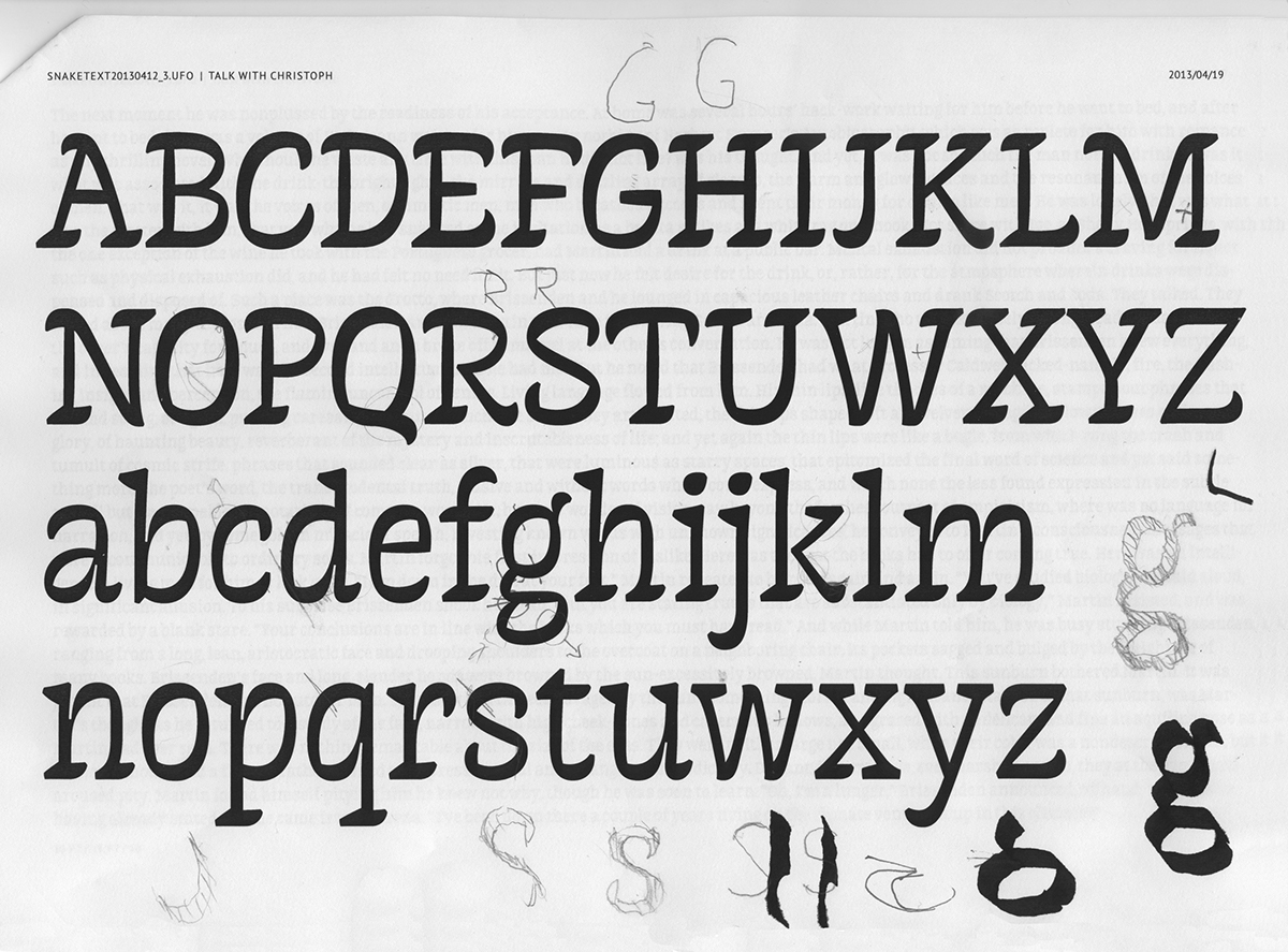
Initially the project was intended for display use. But I was always curious about the possibility of creating a text companion, that would keep the same concept, but would be adjusted to perform in smaller sizes. Starting with the Display Light style, I immediatedly understood that treatment of this style has to be different. From that moment I started making slow steps in getting rid of certain disturbing elements: cutting sharp details, defining ink traps, simplifying the serifs, working on the stems as they appeared slanted.
Initially the project was intended for display use. But I was always curious about the possibility of creating a text companion, that would keep the same concept, but would be adjusted to perform in smaller sizes. Starting with the Display Light style, I immediatedly understood that treatment of this style has to be different. From that moment I started making slow steps in getting rid of certain disturbing elements: cutting sharp details, defining ink traps, simplifying the serifs, working on the stems as they appeared slanted.

As the project always needed to go further I was combining my sketching process with the process of actual development, expanding the character set, working on different styles at the same time. Although all the styles in the family are based on the same concept and share certain characteristics, they are not meant to be used together. Each one works individually, bringing its own unique style. However text styles can work as companions to any of the display ones.
The way to the final result was long and thorny. Going so far from the original idea, going through the whole development part of the process, what I have in an output still has a lot of that strange flavour and has not lost its character. It still feels strange and implausible.
It is important for me I can now prove to anybody and, what is more important, to myself that sketching is a powerful instrument, not a waste of time and not an artist’s exercise.
Language support
Chimera supports Central and Eastern European languages, Baltic, Turkish and Extended Latin.
The family is going to include Cyrillic soon.
The family is going to include Cyrillic soon.


