
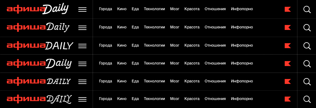
At the end of 2015 Afisha launched the new Afisha Daily – brand new website about city, movies, entertainment, lifestyle. We were asked to create a new logo – a combination of the well-known Afisha logo ('aфиша') and 'daily'. 'Daily' had to bring a different flavour to the brand, work well with the existing logo and of course be catchy, hip and trendy. Web was initially described as the main application, which gave us a very good starting point. Web use means we had to keep low resolution in mind. Low resolution means that proportions, weight and structure are more important then any of the details. These technical requirements and the process we came through resulted in an angular script lettering that performs well on all kind of screens and has a strong remarkable personality at the same time.
AXE special project on Afisha.ru. In order to turn on a night page the reader needed to switch from ‘Daily’ to ‘Nightly’ using the widget.

Daily PROCESS
— 1 —
First sketches
At first we had do see what style would fit better to the existing logo. We made a few quick sketches to see how the different constructions would fit. At the same time it was important to define the lowest resolution for the logo to be used. So we counted the height and the width of the logo in pixels and created a grid – the main instrument for all the future experiments. We tried all the possible constructions, proportions and weights directly on the grid to see which structure, weight and proportions will fit better to the logo. This gave us an understanding of an appropriate weight, proportions. Having a contrast between 'Afisha' and 'Daily' was key. Starting 'Daily' with an uppercase helped a lot in separating of the two parts of the logo. Below you can see the first six sketches that were shown to the client. The weight of the letters is more or less the same, but within the chosen weight we tried different constructions: all caps and uppercase+lowercase, connected and disconnected script, more calm and more decorative style with swashes, we tried to put it stable on the baseline and add an angle to it. The client's initially wanted to try a script version of the lettering, so this direction was explored more throughly.


— 2 —
Working with the chosen direction
The first general decision was made, the client liked the diagonal script idea. We adjusted the drawing a bit and went straight to Robofont to try how it would work digitally. It was challenging to fit the script lettering on the grid. This resulted in a pretty abstract and rectangular digital drawing. Only after the structure was settled we worked on softening the counters. While there was no point of having such small detail for the website, a softer version could possibly be used in larger applications: billboards and large advertising. Even though the client liked the lively diagonal script, we developed two slightly different variations of the idea. Apart from the website application the new logo had to perform well in social media, that is why we had to try a more compact vertical positioning as an alternative.


— 3 —
Back to the horisonal alignment
In the meantime the company hired a new creative team and we started working with Maxim Nikanorov – the new art director of the entire Afisha brand. Maxim appreciated a more stable version with a fixed baseline. This version was less developed, so we had to take a step back to find the perfect widths and proportions. 'Daily' became slightly wider in order to make the inner spaces of the letters more close to each other within 'афиша' and 'Daily'. Italics often tend to look smaller, so we adjusted 'Daily' by two pixels (one pixel above the x-height and one pixel below the baseline). The changes in the structure also affected the 'D' which had to become slightly bigger. In order to have a better control on the shape and it's construction the curves were deleted and the shape of the 'D' became rectangular.


— 4 —
Last Corrections
Last Corrections
At this stage we proposed two modifications of the drawing — rectangular and curved. The difference did not effect the way the logo appeared on the web, so choosing one was more an aesthetic decision. The angularity of the logo was very much appreciated by the art director and we decided to keep it as a stylistic feature. He suggested not to hide the angularity but even make it more distinctive. This had to deal with the shape of the 'D' mostly, which curvature still did not look convincing, so we had to simplify it even more. A few more rounds of polishing and simplification and we finally solved the puzzle and got everything work together perfectly.


Nightly PROCESS


In most cases it not enough to create a vector drawing of the logo. In order to get the best (and predictable) result on the screen you need a manually adjusted low resolution version. This is how a manually adjusted ‘Nightly’ lettering looks like in 33 pixels high size.
Editor-in-Chief: Ekaterina Dementieva
Art direction: Ira Ivanova, Maxim Nikanorov
Project management: Ekaterina Molchanova


