MODENA FC 1912
VISUAL IDENTITY FOR THE FOOTBALL TEAM OF THE CITY OF MODENA,
THE SO-CALLED “CANARINI” (CANARIES).
brand identity, typeface design

In 2021 CRSL Carosello Lab was chosen by Modena FC to work on a full rebranding with the goal of accompanying the society into a new era.
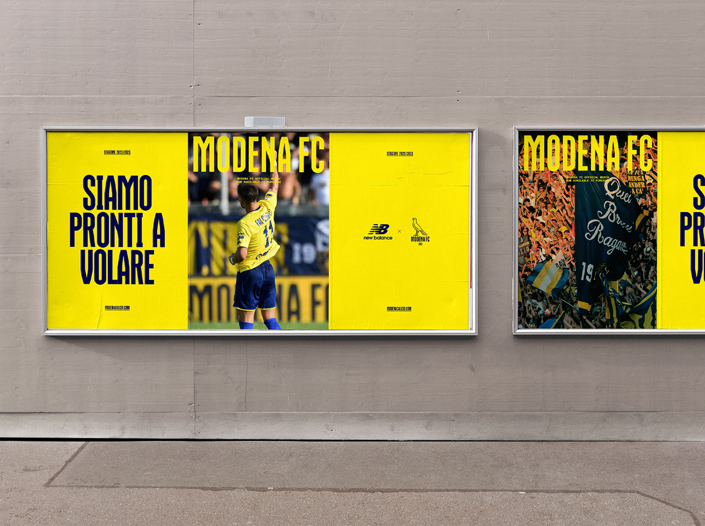
Inspired by its rich heritage, but looking ahead to the future, we designed a bold brand identity that goes beyond the football pitch, reaching new generations and strengthening the relationship with traditional supporters.
As always in our design approach, we delved deep into research and analysis. The Club 110 years of history are a fertile ground full of visual inputs that stimulate curiosity and imagination. Parallel to this research we engaged the club in a constant dialogue, creating the common ground where we passionately worked together for almost one year.
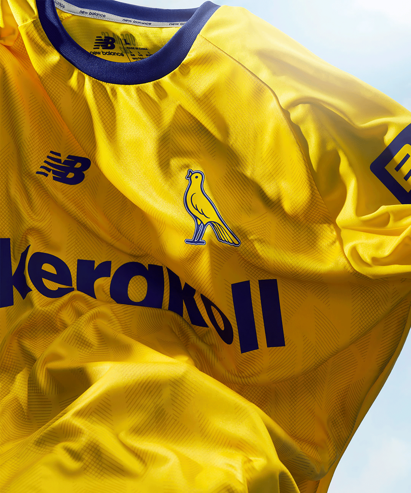

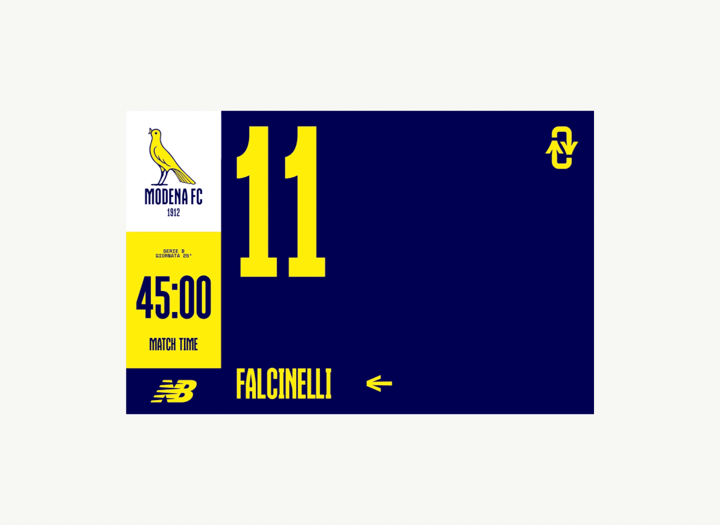
We radically changed the logo, a risky operation in any field, but especially in football, where the community of supporters has a tight bond to the team crest. Nevertheless, we felt that the choice was right: the new logo depicts a recurrent character in the history of the team. The friendly, accessible and unique personality of the canary make it stand out in the graphic language of football teams.
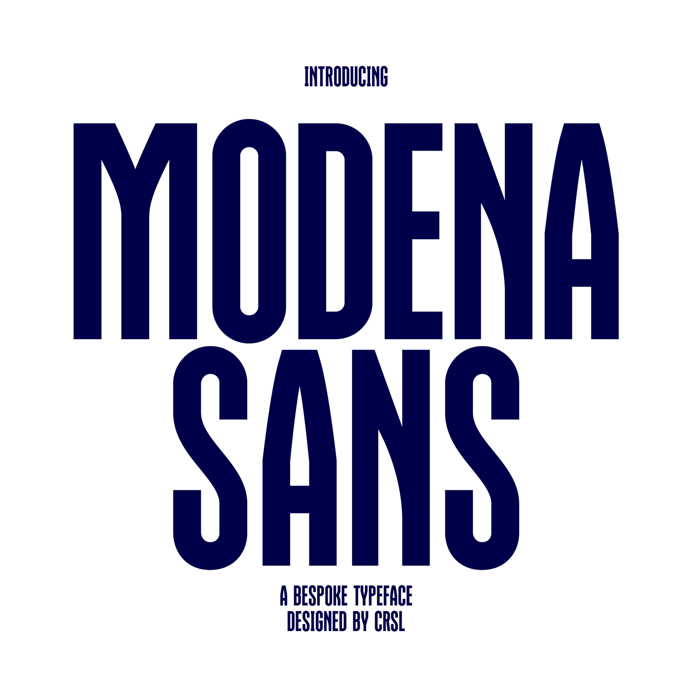
As for the logo, also for the other fundamental elements of the identity – typography and color – we started from the club’s past, remixing it to create a contemporary language. Inspired by the energy of the team and its proud supporters, we designed a bespoke typeface with a vintage flair, setting the whole tone of the Club’s communication.
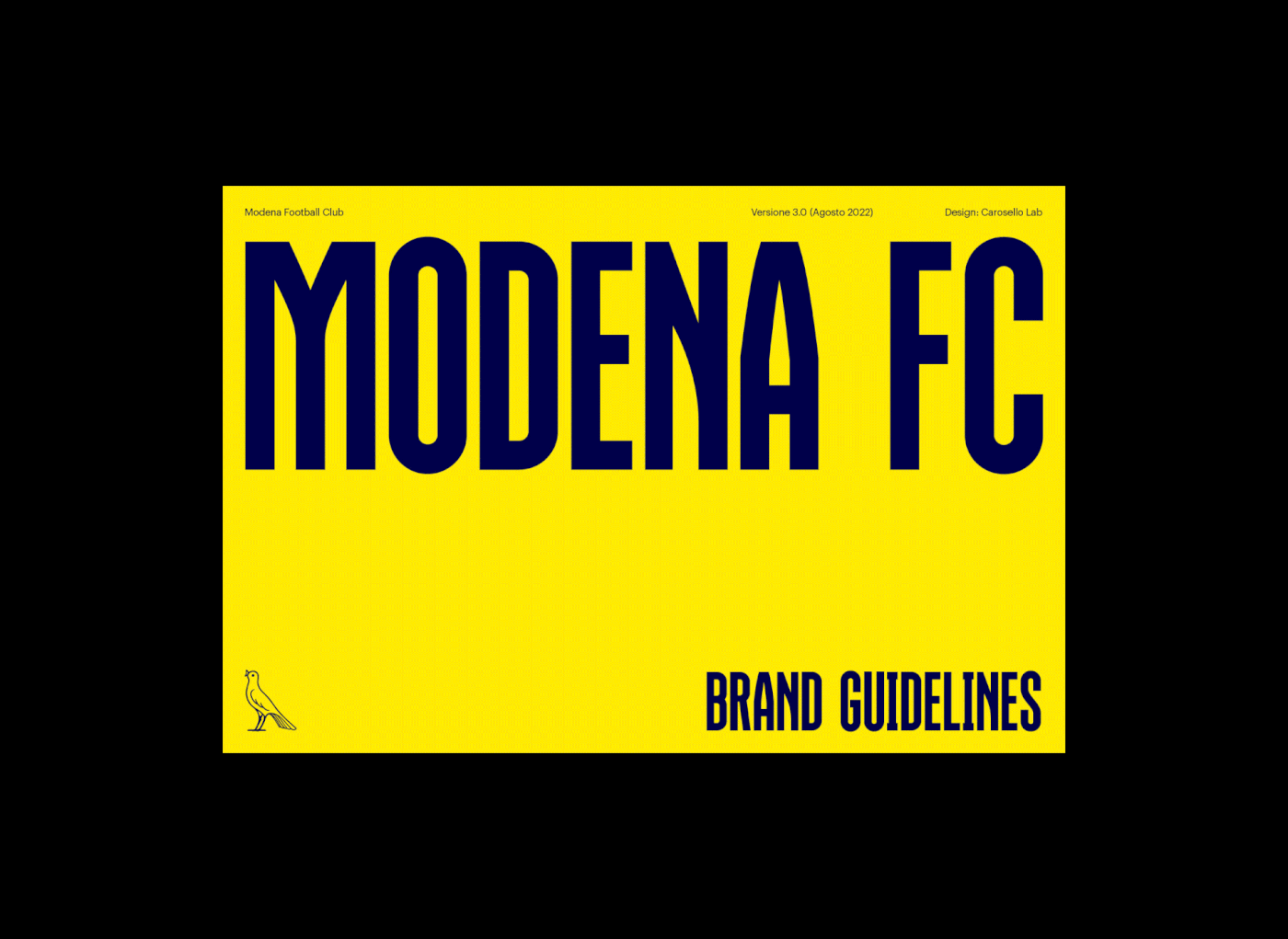
We created a detailed and clear brand manual, ensuring the consistent application of the identity by Modena FC marketing and design team.


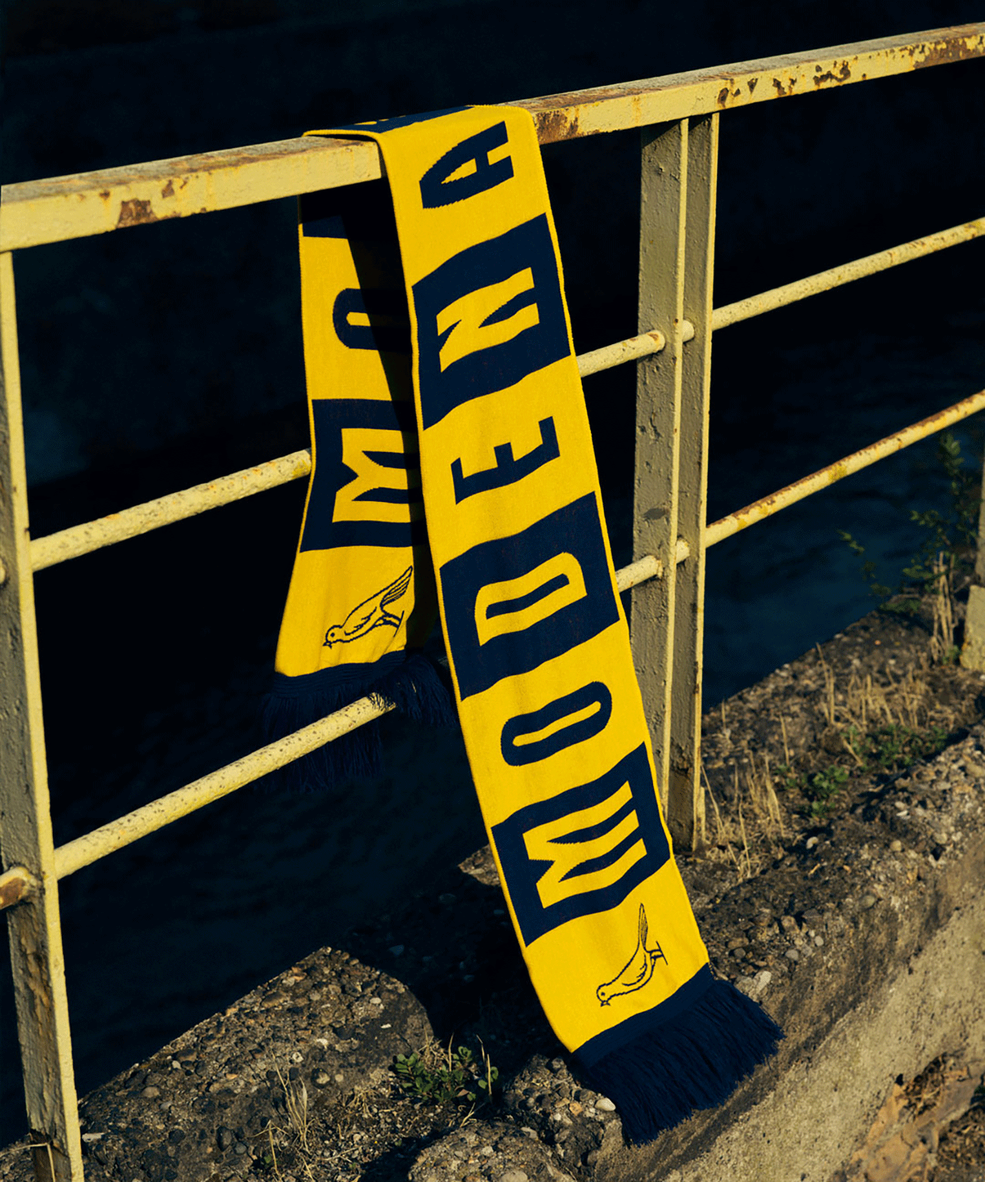
Part of our assignment was the design of few merchandising items.
Pictured here the team’s official woolen scarf.
Pictured here the team’s official woolen scarf.