This project was for 'Wellbeing International'. They are a company which specialises in exporting health foods to the Middle East, parts of Asia and Africa.
The brief was to redesign their logo, as their current one is too similar to another copyrighted logo design, it also features a bird, which in some religions in the Middle East/Africa is illegal to feature.
FINAL LOGO DESIGNS:
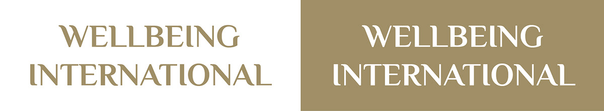
TEXT ONLY LOGO
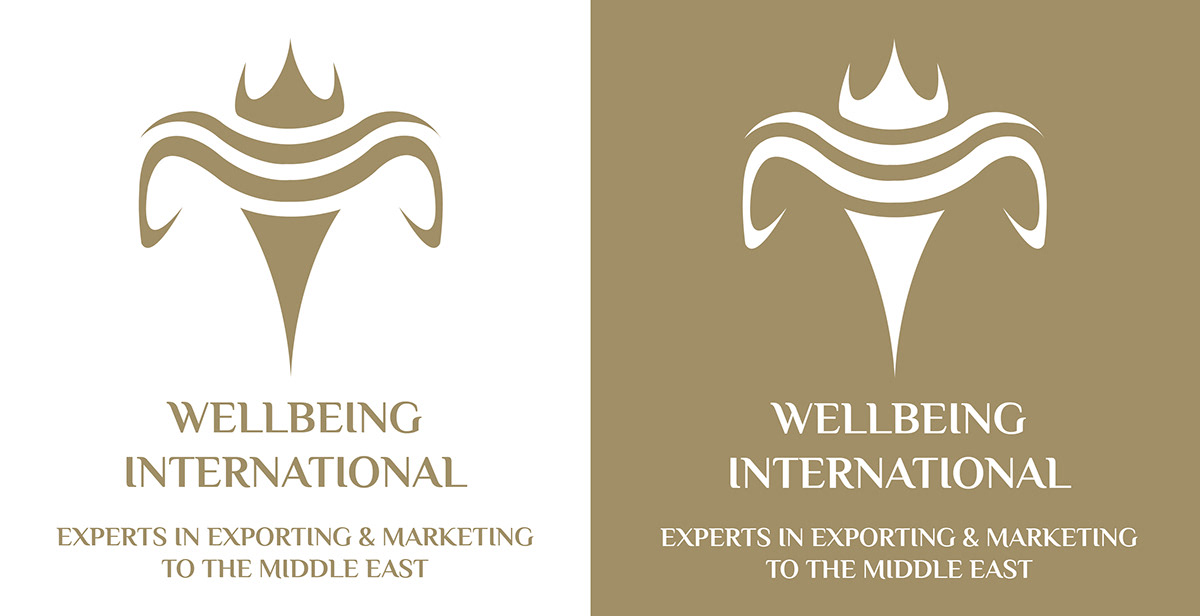
FULL LOGO

LOGO - ICON & NAME

LOGO - ICON ONLY
DEVELOPMENT PROCESS:
This was the current logo for Wellbeing International...
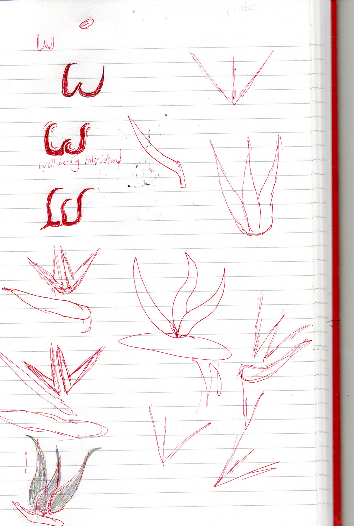
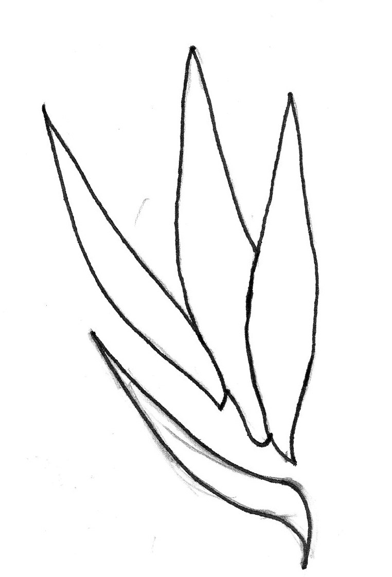
The client, at first, wanted their new logo to feature a bird of paradise flower. I noticed when looking at the flowers that a lot of them have a kind of 'W' shape to them. As Wellbeing International's name features a 'W' at the beginning, I thought it would be a good idea to try and draw the bird of paradise flower as a 'W' shape, but at the same time in a kind of Middle Eastern look.

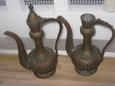
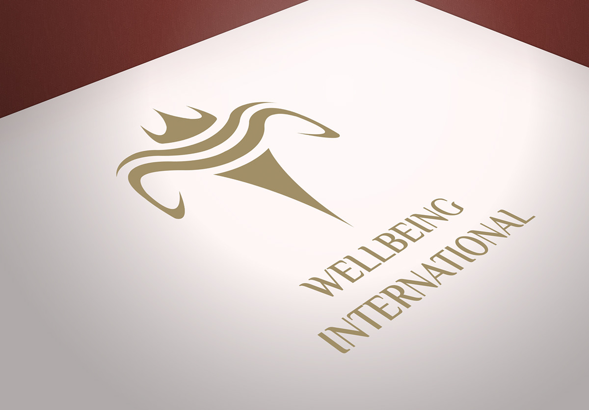
The client also wanted their logo to look similar to the shape/logo below:

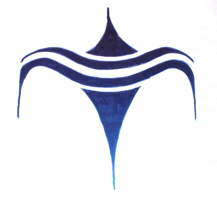
Therefore, I started to try and merge the two ideas together to create an icon shape...

This was the result of that experiment...
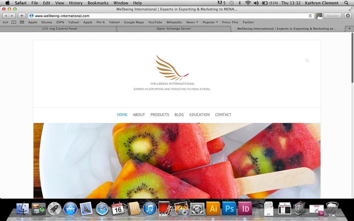
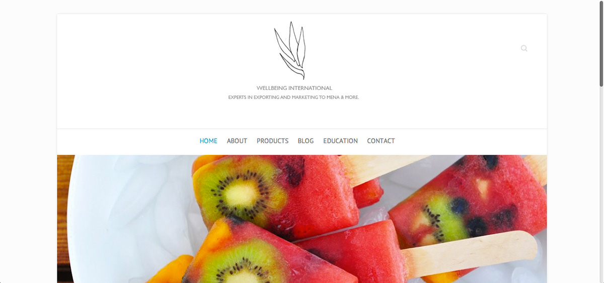
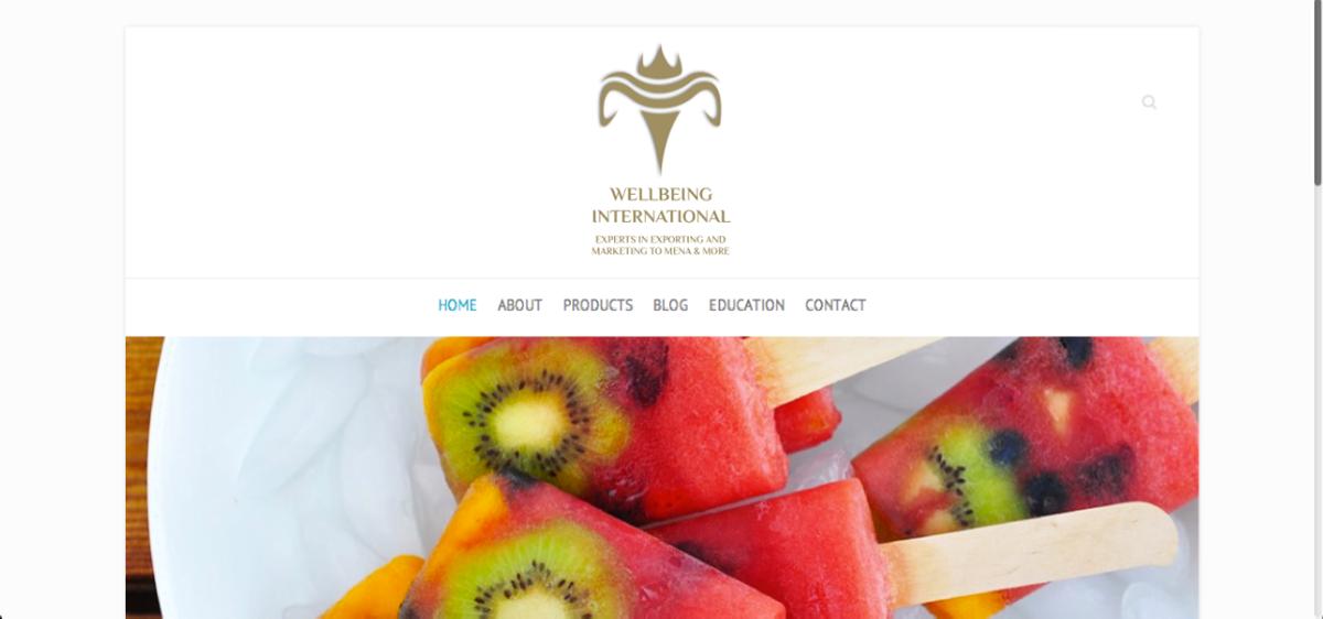
I then mocked it up onto their website so that it could be seen more clearly whether it would work as a logo or not...
The client and I both liked this design. However, we felt that it would be better to feature a shape that would insinuate food/middle eastern food markets.
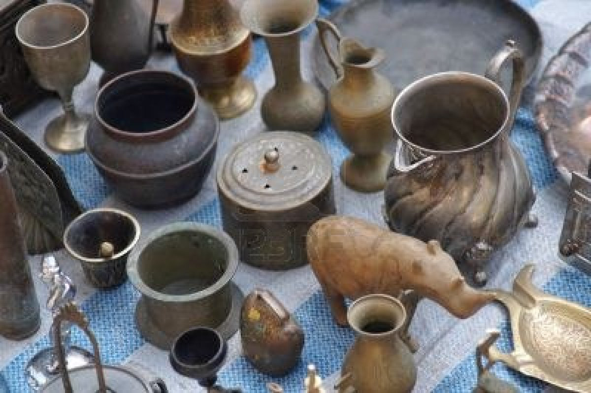
When thinking about this, the weighing scales came to mind, but also the pots and kettles from the middle east...

I then tried to merge these shapes into one icon shape, and this was the result...
Once again I mocked it up onto their website, and it seemed to work really well...

Once happy with this idea of the icon, I experimented with the shape of it a bit more to refine it...
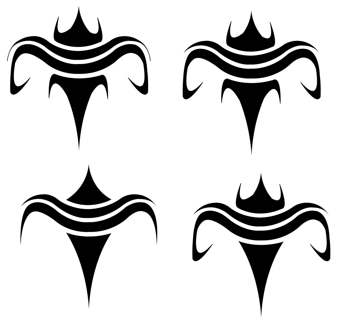
This was the shape we were happy with. I also changed the colour to the gold colour that the client wanted...

I then experimented with the layout of the text that would feature underneath the icon...


The font I used features flicks similar to the icon and the original gold icon that the client sent to me with the brief, to tie it all nicely together and further enhance the middle eastern feel.

The new Wellbeing International Website with the new logo:


