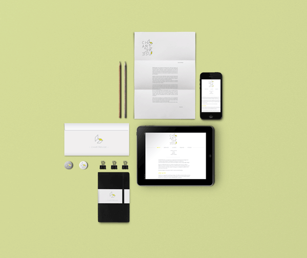
CHARTREUSE
Rebranding of Chartreuse
Chartreuse is a progressive integrated marketing and management company specializing in multiplatform solutions through live communications and social media technologies using cutting edge design.
Charteuse also means respect for the environment and re use of materials.
Charteuse also means respect for the environment and re use of materials.
The logo is adapting its design to the situation. Its structure is vertical to simbolize a building site, wich is growing up from the basis to the top, from the biginning to the end (exactly as the company is working on each of its projects).
The logo is bidimensional but expand itself in a tridimensional structure with the connections between the letters. This represents also the different aspects of Chartreuse and the relations between them.
The naming comes from a color called "chartreuse" and in this word there are three other important words: art, use, and re-use.

Ther are two different version of the logo: one extended and a second one which is a synthesis of it.
The extended version of Chartreuse was thought to be seen and to make think, to surprise the observer and to have different levels of interpretation, meaning and understanding.
The other version of the logo can be used in different occasion, for small as well as for explicit application of the meaning of the company.

The letters are at the same time, part of the structure and tools to buid it up.
The logo is kept in a grid, where the space between the letters is the basic unit, while the diagonal lines are breaking the rules, to create multiple dimensions.
The logo is kept in a grid, where the space between the letters is the basic unit, while the diagonal lines are breaking the rules, to create multiple dimensions.