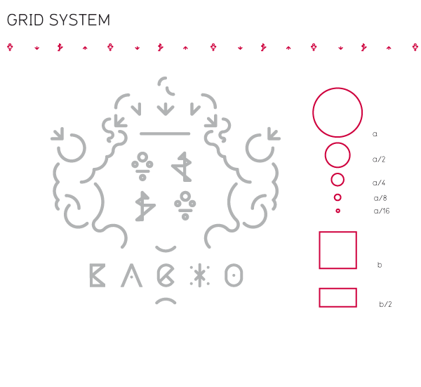
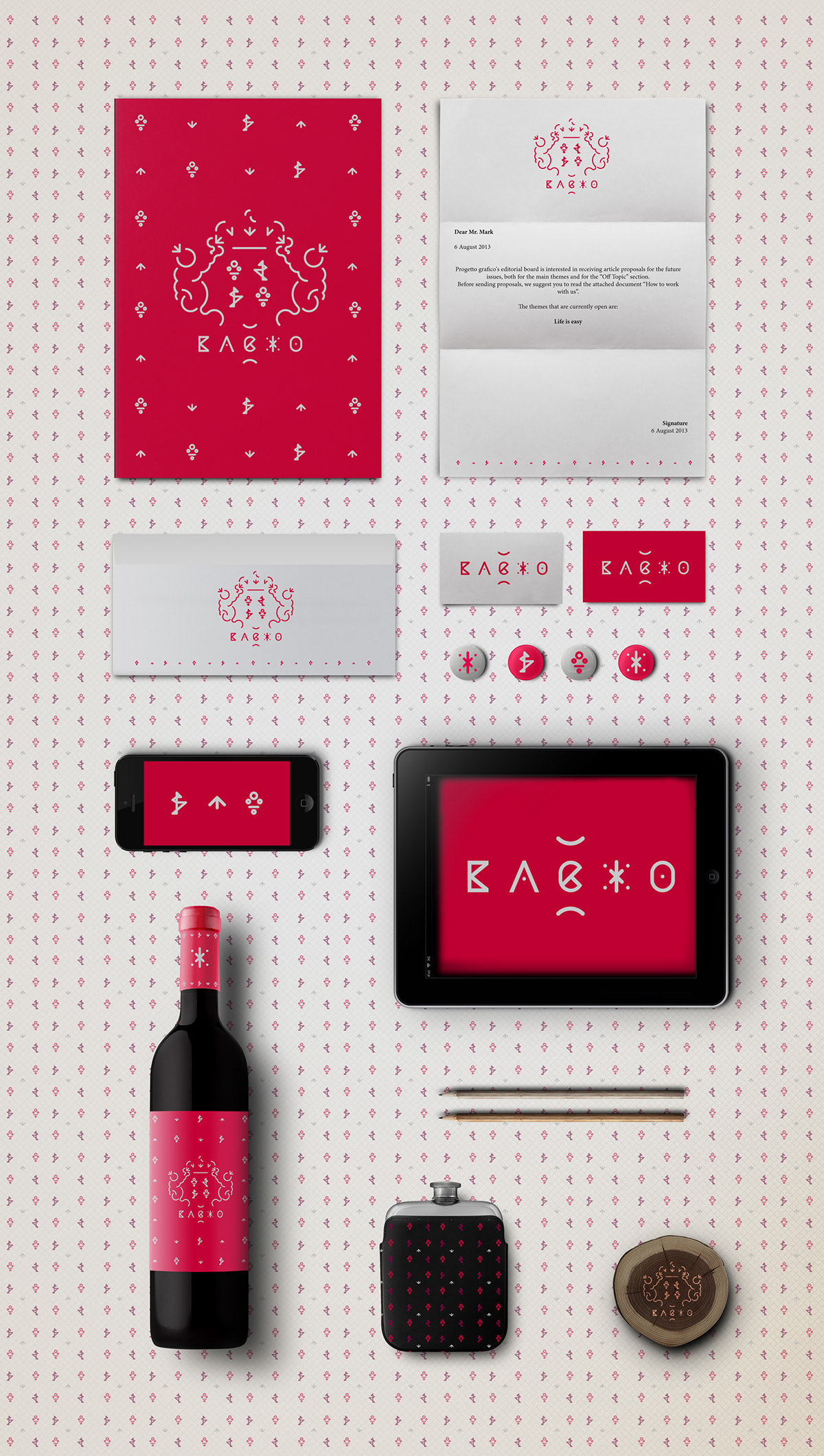
Bacxo
Personal project: redesign of an old wine label
The two little baccos and shields are the symbols of power,
prestige and tradition for an old wine identity.
I decided to redesign it, to make it easily understandable, in simplifying it in minimal forms,
I decided to redesign it, to make it easily understandable, in simplifying it in minimal forms,
but in keeping the structure and the forms.
I invented a new naming, short and incisive, which could remind the god Bacco
I invented a new naming, short and incisive, which could remind the god Bacco
and the power, in conserving the elegance of the wine : BACXO.
The logo is created ad-hoc, to be completely coordinated of the draw and to be part of it.
The logo is created ad-hoc, to be completely coordinated of the draw and to be part of it.