Disfrutar. Vol. 1 — Disfrutar Restaurant
Editorial design
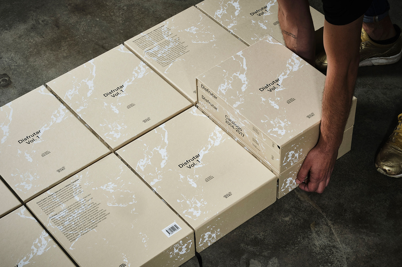
Disfrutar Vol. 1 is the first book by Disfrutar, the prestigious restaurant with two Michelin stars and the fifth best restaurant in the world in 2021, led by chefs Oriol Castro, Eduard Xatruch and Mateu Casañas. The work consists of a case containing an archive folder and a book explaining the first years of the restaurant's life, between 2014-2017, and contains a selection of the most relevant recipes and techniques from those early years.


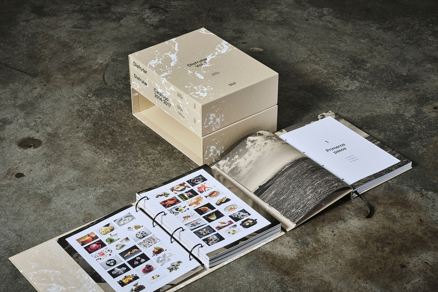
Once we understood the unique way of working of the chefs from Disfrutar in the creation, documentation, photography and archiving of the recipes that they prepare annually, from the first moment we were clear that conceptually and formally we should not make a sewn book, but a folder, instead. A folder that, at first, had to contain both the history part and the recipe part, but as we progressed in the project, and due to the large amount of content, we had to rethink about. That's why we decided to keep the folder for the recipe part and edit the history part in book format. A book that is presented perforated in the same way as the sheets of a folder, to maintain the initial idea, and to highlight the unique way that the Disfrutar team has to archive and document absolutely everything.


For the design of the case and its covers, we were inspired by the typical marbling of the classic archive folders, and we looked for a way to create our own effect. In the first pages of the book we can read that the three chefs began to define the concept of the restaurant Disfrutar in the town of Cadaqués, just in their first restaurant, the restaurant Compartir, next to the Mediterranean Sea. We wanted to represent this fact on the covers. From a photo of the waves breaking, taken for the occasion, we turned the foam generated by the water into a resource reminiscent of classic marbling. The background earth color is also reminiscent of the beach sand tones.


On the back of the case, a white box recalls the typical tags used to index the contents of the files, in this case, the two volumes that it contains.

In the use of typography we have been very minimalist, using throughout the book a single dry stick typography, as neutral as possible, mostly in a single weight -the Regular version-, and using the Bold version only to prioritize some content . We only use two sizes of text, we want the work of the chefs to shine on its own, with no design elements that mask or stand out above the content.


The folder format, daring and very little used in the publishing world, has allowed us to play with different embedded formats, index of dishes in DIN-A4 format as their originals, drop-downs that surprise and better explain the step by step of some selected dishes... and the option to be able to extract the pages that the reader wants, to be able to prepare the recipes, with no need to have the whole book in the kitchen.
There is also the option to insert notes, material… from the readers or even the minute for those who have eaten in the restaurant.
There is also the option to insert notes, material… from the readers or even the minute for those who have eaten in the restaurant.


