Today at Apple | Design Research and Web Design
How might we craft a community strategy that inspires, engages and connects a diverse set off participants while celebrating the store opening?
—
Apple is expanding in the Middle East and in the Turkish market, with a willingness to deepen its connection with the cultural fabric and renew its commitment. As a significant milestone, Apple’s new flagship store in Istanbul was launched in fall 2021. This store focused on re-energizing the market by showcasing all that Apple has to offer its customers and the creative landscape of Istanbul.
As ATÖLYE, we got involved in the programming of the new store to be opened. Our approach was "communities of communities" that enhances and inspires people, creates meaningful connections with Apple values, and celebrates the new store.
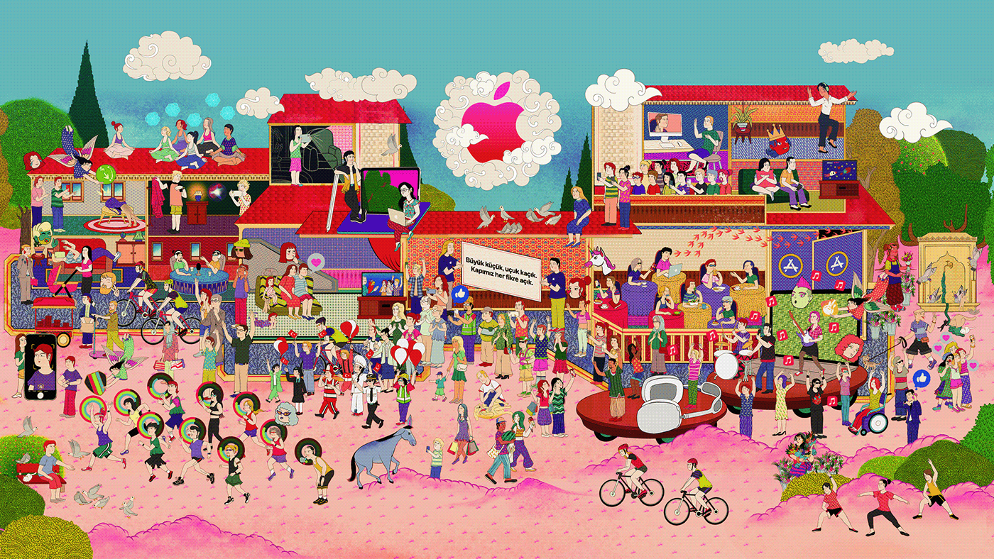
Exterior coating of the store prepared by Murat Palta
After Apple team accepted the proposed approach, we started to work from the design research phase as a group of 8. We did 20 interviews from 8 different locations in the research phase and analyzed 52 local and global benchmarks. Based on one-on-one interviews with artists, designers, and content creators living in Turkey and abroad who took part in the Istanbul design ecosystem and desktop research, we created programming principles and offered potential activity suggestions.


One of the most critical insights that we gain is the lack of equal distribution of creative and financial opportunities in Turkey's creative ecosystem. This situation creates a tendency for micro-communities to be closed and a lack of diversity.
With other hearings and research findings, we located the new store as a playground and Apple products as creative's playful tools—a place that creatives can meet, exchange, explore and create together.
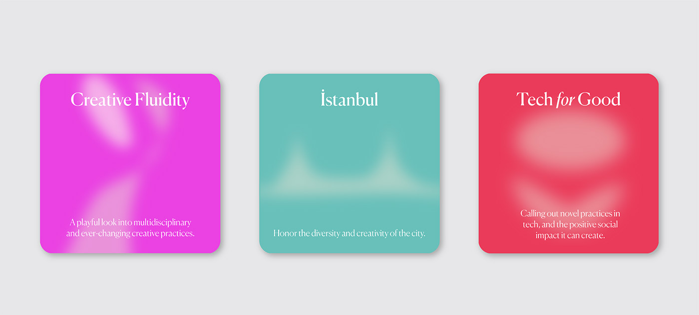
As a result, we created a 6-week program called "Perspective Istanbul" that presents practices from Istanbul's thriving creative community through different sessions focusing on multidisciplinary creativity, the use of technology for good, and celebrating the creative side of Istanbul. These topics eventually turned to program themes: Creative Fluidity, Istanbul and Tech for Good.


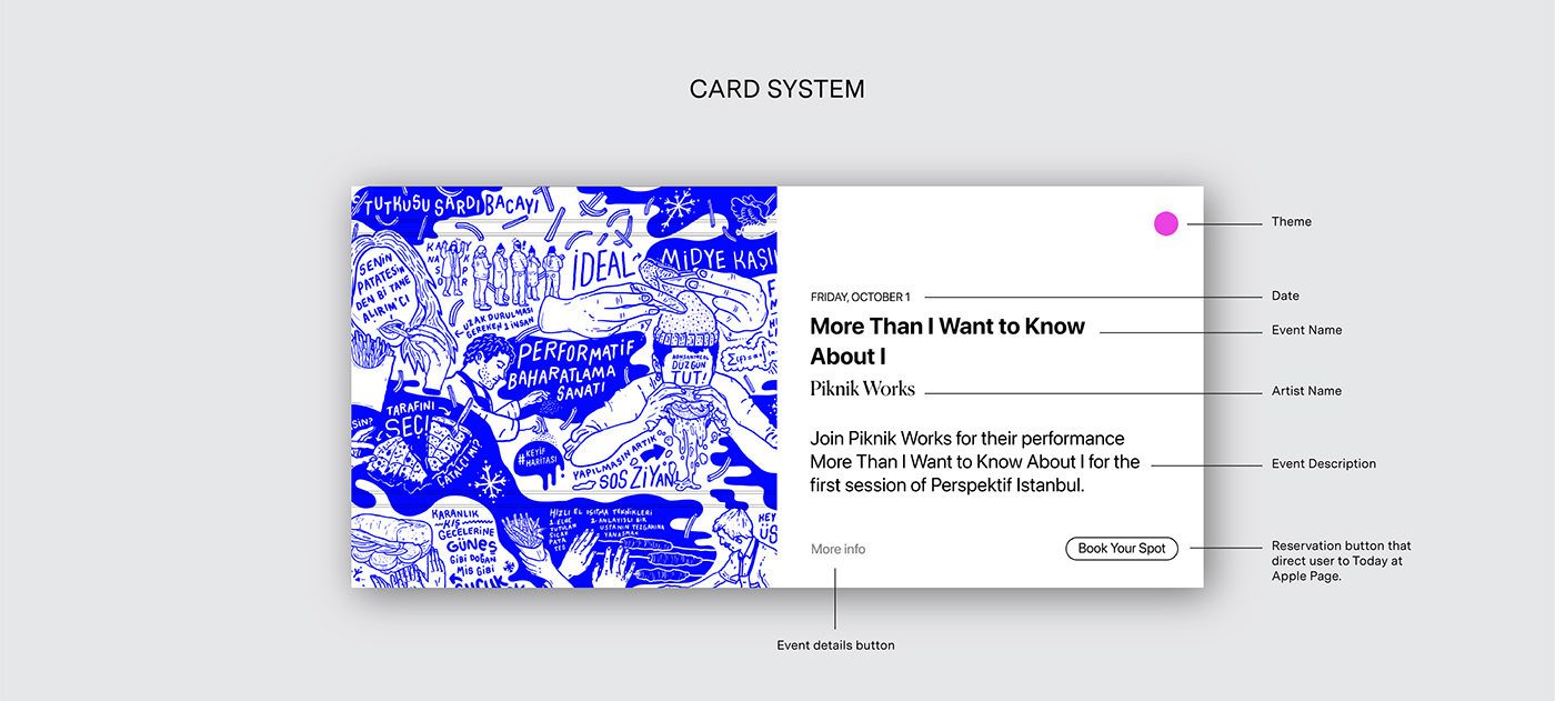
One of the most important principles was to empower talent. We decided to make a separate website since there is no detailed information about the artists or the events on the T@A website, and I was responsible for the design.
As soon as the site opened by a line-up of artists participating in the program, we wanted to give a festival-line up feeling. We placed the shortened version of the narrative under since line-up section doesn’t contain any information.
We used two indicators to filter events; first one is the event type (lab, walk, performance, online studio), and second is the theme that the event belongs to (creative fluidity, Istanbul and tech for good.)
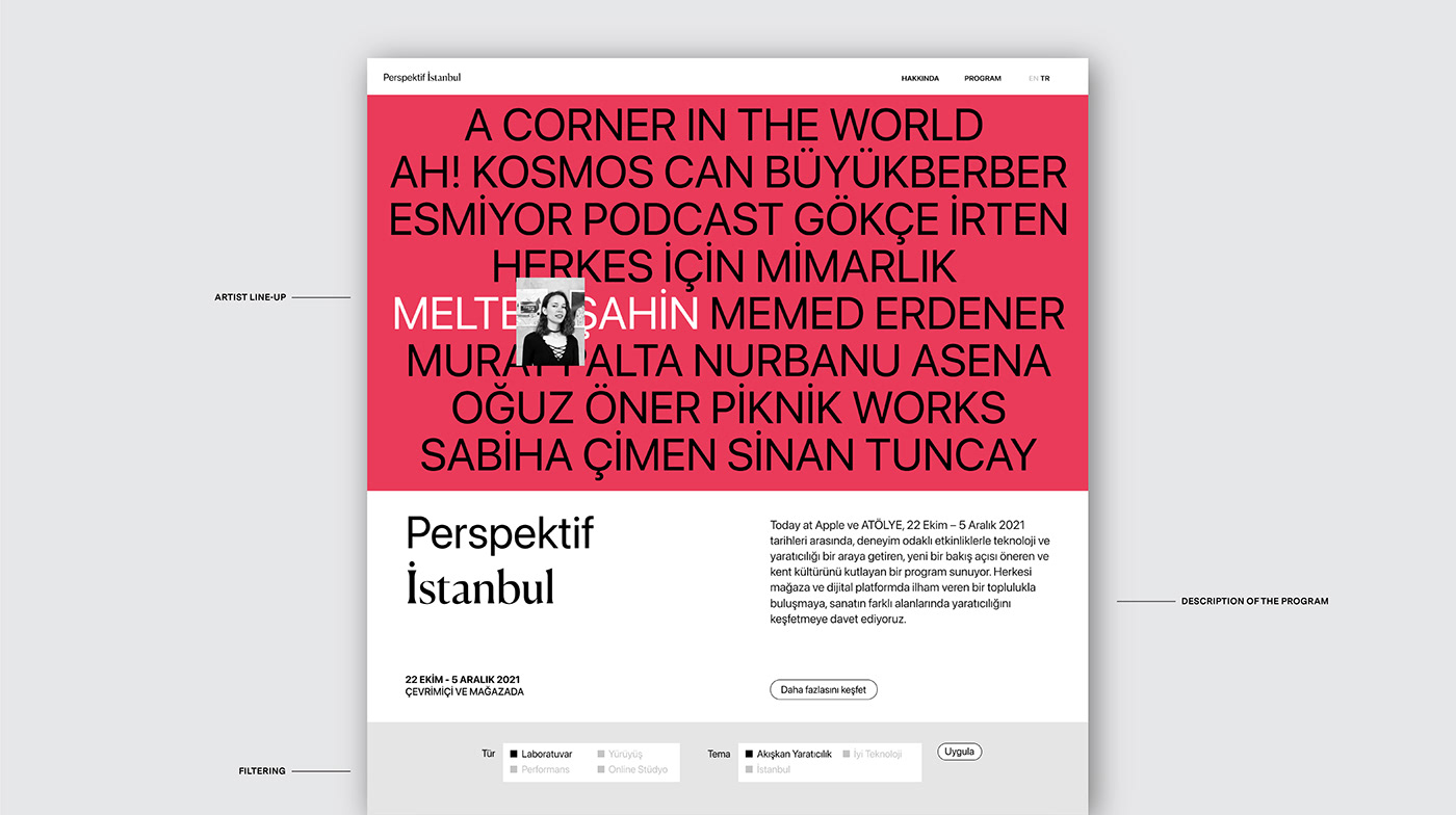
We also used the official colors of the T@A program to illustrate themes: pink for creative fluidity, blue for Istanbul, and coral for tech for good.
To emphasize the partnership between T@A and ATÖLYE, we used SF pro, (Apple’s corporate font) and Canela (one of ATÖLYE's corporate fonts) together.