


The Warsaw University of Life Sciences (SGGW) has over 200 years of tradition in research in biology, agriculture, and other fields focusing on life, nature and its relation to human kind.
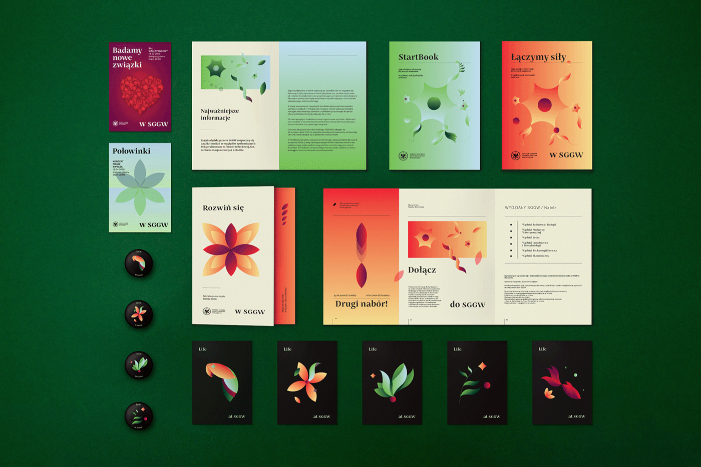
LIFE. The Universities became the principal inspiration for the new visual identity of the university. The key creative idea is based on nature and life in its most visceral and elementary forms (cells, water drops, proteins and other organic compounds).
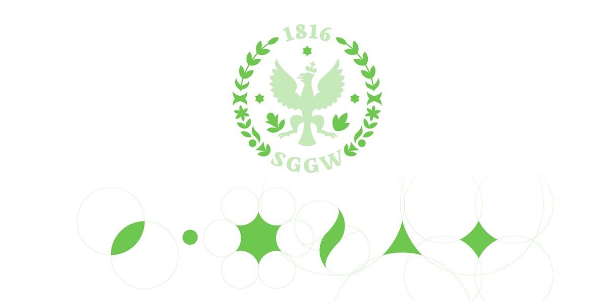
ELEMENTARY PARTICLES. In cooperation with SGGW’s scientists, we created six atomic forms, which became the foundation of the new identity. The elementary particles are based on the circle – the primary form found in nature.

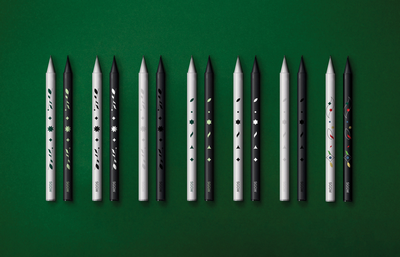


Elementary particles are used as diacritics in the custom typography created in cooperation with Natanael Gama and Mateusz Machalski.


The primary palette of the identity are two shades of green and red – traditional colors of the University, secondary colors include nature-based hues of light green, blue and yellow and purple. An additional essential component is the use of gradients and tonal transitions, reflecting the fluidity and mobility of life and nature.


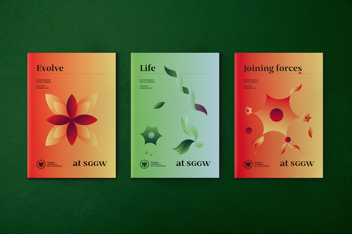


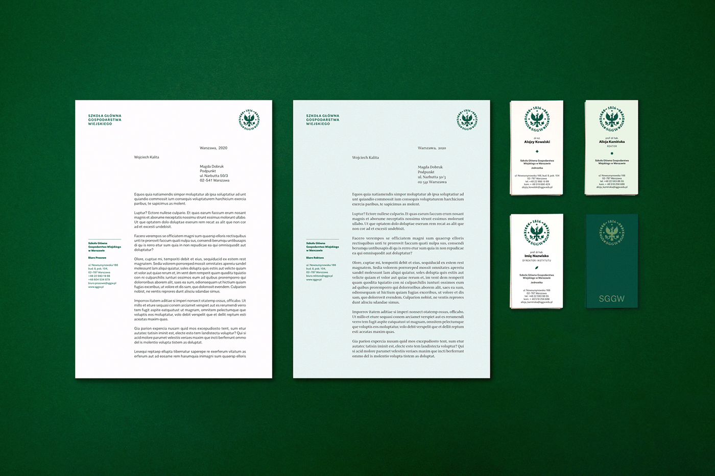
The identity has two visual lines designed for external communication: promotional and scientific / business; it also has a visual line for internal materials. In all the designs, we play with elementary particles as a basis for the visual language


Visually strong and well made products by


