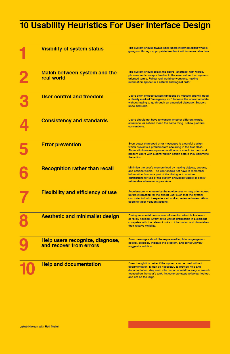
The 10 Usability Heuristics For User Interface Design were created by Jakob Nielsen for the Nielsen Norman Group as the 10 most general principles for interaction design. Originally developed as a heuristic evaluation in collaboration with Rolf Molich in 1990, the refined version presented here was published on January 1, 1995.
I created this poster as wall art for my work area. It is important for me as a designer to surround myself with the knowledge and principles that make for good design. The poster was created in the spirit of the International Typographic Style as a nod of appreciation to design history and as a highlight of the eighth heuristic, Aesthetic and minimalist design.
Process
It took a few iterations to get the poster right. I started out exploring the content and various solutions for interpreting the information. I eventually moved to a more formal method, basing the design on the Josef Müller-Brockmann method of constructing a grid.
1. Paper Size. As I knew I would be printing this in-house, I chose the largest paper size I could to maintain the visual dominance of a poster while remaining within the constraints of the final output. 11x17 inches was the format chosen.

2. Margins. After deciding on the paper size, the next step was to loosely sketch in the ideal margins. Knowing that this would be a stand alone poster, I wanted the left and right margins to be equal. For balance, it felt best to have the top margin follow suit with room for adjustment at the bottom.

3. Type and Leading. After initial analysis of the content and chosen paper size, I knew there would be a strong possibility that the main text would need to be at an average type size. With that consideration, I chose 10-pt font size on 2-pt leading—or 10/12—set in Helvetica.
4. Baseline. From the type size and leading, the baseline grid was established. I often conform my designs to the baseline grid in order to achieve a strong vertical rhythm, something I feel is important in maintaining the hierarchy of information. The baseline grid was eventually adjusted to a 6-pt rhythm in order to better accommodate the heading sizes and leading.

5. Grid Fields. This is where the layout of the page gets interesting (and where many designers bail on the creation of a proper grid). Grid fields are usually more advantageous in a design that calls for photography and artwork to be set with the type. However, with the 10 heuristics and their descriptions, it made sense to me to proceed with the calculation—yes, math and numbers—of the number of fields I felt were needed for the best solution. It went something like this:
(1) Header
(10) Heuristics
(1) Footer
That gives me a minimum requirement of 12 grid fields. However, for hierarchy and aesthetics, I decided I would need an additional field (that would remain unoccupied) in order to add contrast and interest. That gave me 13 grid fields.
Going back to the baseline grid, I counted the number of lines of text that fit within the current dimensions imposed by the page margins. I divided that number by the 13 fields + the 12 blank lines needed to separate them. With a little tweaking and adjusting of the margins, it was found that 90 lines of text was the ideal number to accommodate the fields and the blank lines that fall between them.

6. Columns. The number of columns I use within any page layout is usually the result of trial and error with the placement of text, headings, and images. I knew that minimally, I would need a primary heading that would most likely span the width of the page, headings for the 10 heuristics and the accompanying text that describes them. I thought a lot about how this information would read and display best and decided that a horizontal flow for each heuristic would be best. In additional, I numbered the heuristics for easier reference.
With that said, I began to see a 9-column grid as the ideal solution for handling the asymmetry of the layout: 1 column for the numbers, 4 columns for the headings, and 4 columns for the text.


