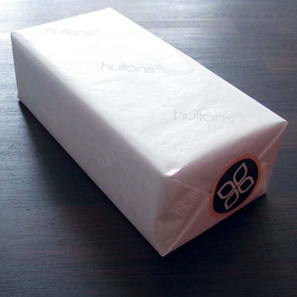
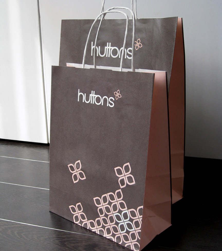
Huttons is a retail chain covering a wide range of products from scented candles and women's clothes to high-end furniture. They required a complete re-brand covering all aspects including signage, point of sale and marketing materials.
This was a challenging brief as despite 80% of customers being female it was important that the brand did not alienate men.
This was a challenging brief as despite 80% of customers being female it was important that the brand did not alienate men.
To create that fine balance an abstract icon of a flower was developed in a very subtle pink. In contrast the primary brand colour selected was a much stronger and masculine dark brown. To create further brand distinction a bespoke typestyle was developed for the logotype.