Today I'm gonna tell you a story of one unusual logo. One day Nikita contacted me to order a branding project for a company producing Russian healthy food. I found it very interesting as I love the history of my country. Nikita offered to use a Russian oven as a mark because it cooks real healthy food.
As usual I began with sketches.
The first logo concept is to represent the Russian oven.
One of the variants is to represent it in fireworks clouds or floodlit.
I decide to replace those elements by a traditional Russian pattern. Then I develop this concept and try to apply the Russian pattern to the whole Russian oven.

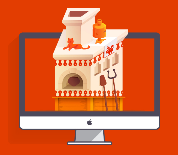
The second version is a Russian oven represented in isometric projection. I pick out some details to complete the image: a cat, a samovar, an oven fork.

Nikita: "Let's decide on the last version!"
I draw it on vector editor.

It looks ok, but I think something's missing. I try to apply rear projection used in old russian icon painting. It looks effective, unusual and it is easy to remember.

I'm trying lettering types:


The final logo.