Ci è stato chiesto di sviluppare il brand partendo da questo nome e considerando che volevano dare al locale un aspetto "on the road".
Ispirati dalla Route 66, quel mito il cui asfalto profuma di avventura, abbiamo dato vita ad un'inebriante esperienza di libertà. La famosa strada che attraversa gli Stati Uniti, fu celebrata da musicisti, registi e da scrittori. Steinbeck, nel suo romanzo "Grapes of Wrath" (Furore), le regalò l'affettuoso soprannome di "Mother Road".
Quando si intraprende un viaggio verso l'ignoto, non importa dove si arriverà, ma l'avere sempre la certezza di trovare qualcosa di nuovo dietro la prossima curva. Magari un'officina, un posto in cui sostare, senza fretta, un luogo di ristoro, di incontro, di spensieratezza e divertimento, dove si può fare qualche chiacchiera, tra un sorso di ottima birra ed un gustoso boccone.
L'Officina 405 è un luogo fatto di rapporti umani, di quelle piccole grandi cose che si credono ormai estinte, ma che sono ancora vive dentro di noi.
Officina 405 is a pub inspired by the counterculture of the 1960s' in the USA and its values like freedom and itch for break out.
For this project we took inspiration from the Route 66, that asphalt myth which smells of adventure and gives life to the pub's image.
For this project we took inspiration from the Route 66, that asphalt myth which smells of adventure and gives life to the pub's image.
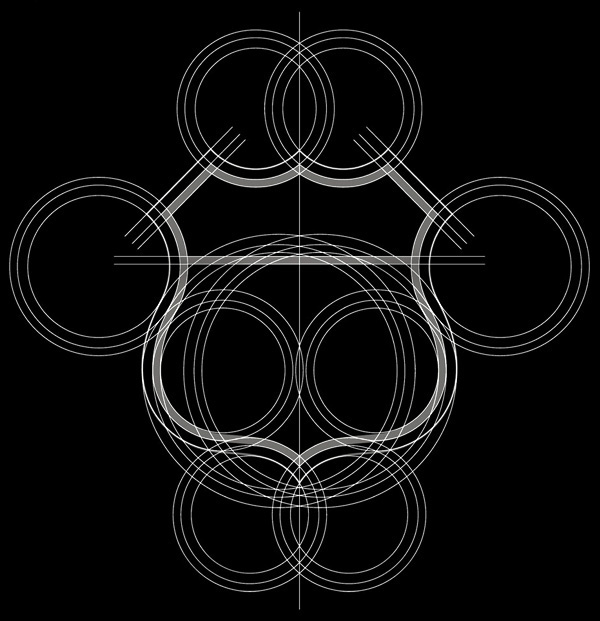
Symbol Design
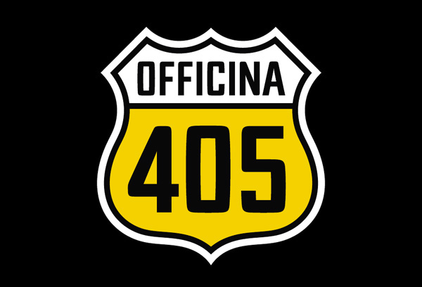
La forma, caratteristica dei segnali stradali degli U.S.A., vuole richiamare la famosa Route 66, simbolo di libertà e della vita “On the road”.
The symbol has a characeristic form of the road signs in the USA which recalls the famous Route 66, a simbol of liberty and the 'on the road' lifestyle.
Typeface design

Il carattere tipografico è stato progettato prestando particolare attenzione alla leggibilità risultando, al contempo, compatto, deciso e grintoso.
The typeface has been designed with paying a particular attention to a legibility and, in a the same time, it results compacted, forceful, pushful.
Colours
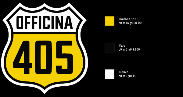
I colori sono stati scelti per attribuire un ulteriore simbologia al logo: la forma, assieme al giallo (birra) e al bianco (schiuma), disegnano un calice di birra.
The colors have been chosen to add a further significance to the logo - its form combined with a yellow (a beer) and a white color (a froth) create a beer pint.
The colors have been chosen to add a further significance to the logo - its form combined with a yellow (a beer) and a white color (a froth) create a beer pint.
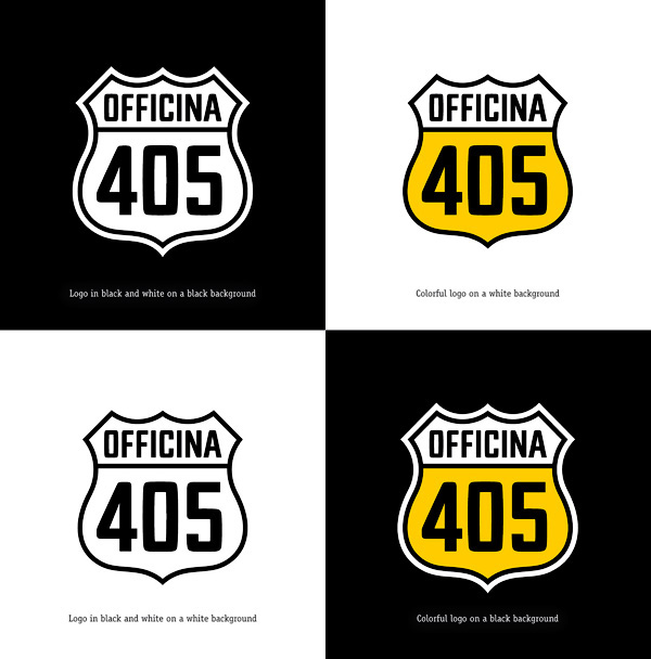
Colour combination
Minimal dimension

Font to be used

Icons

Signboard

T-shirt

Print Design

Menu and business cards.

Dettaglio Copertina Menù Officina 405, Carta Patinata Opaca 300 gr. Accoppiata (600 gr.), Stampa 4/4 colori + Plastificazione + Vernice Serigrafica Granulosa (per renderla simile all'asfalto al tatto).
Anche i biglietti da visita hanno le stesse caratteristiche.
Menu's cover details: matte paper 300 gr. matched (600 gr.), Print 4/4 colors + Plastic Coated + Silk screen Grainy Paint (to make it similar to an asphalt cement in the touch).
Even the business cards have the same characteristics.
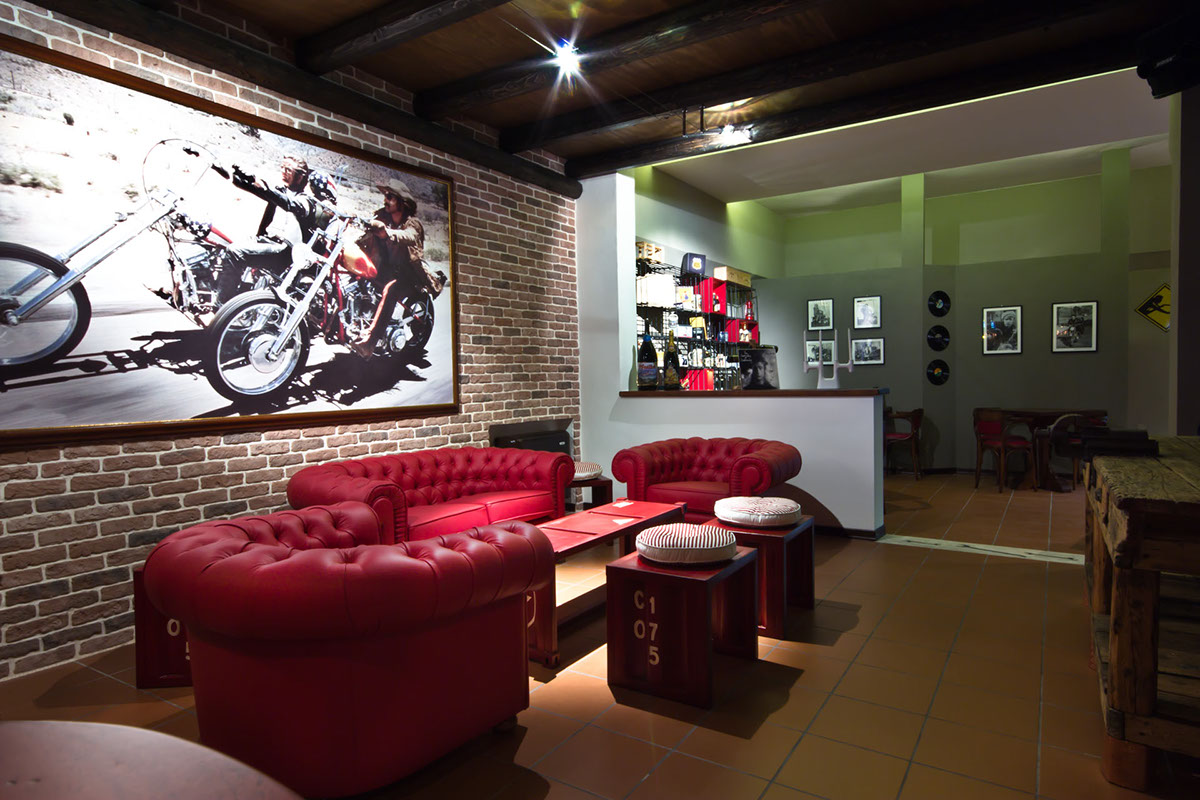
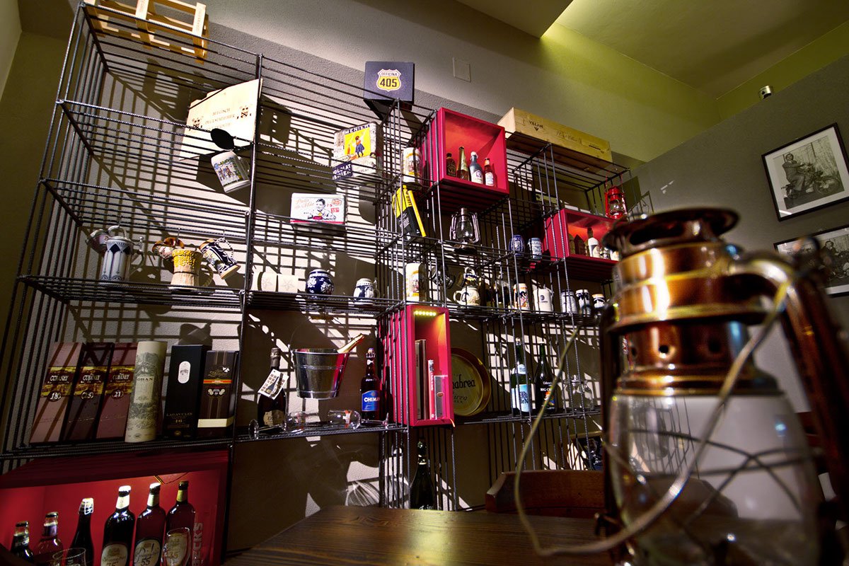
Photos


3D illustration for a digital fresco:

Illustrazione stile Trompe l'Oeil, applicata al muro come affresco digitale.
An illustration applied on the wall in the back of a counter as a digital fresco (trompe l'oeil style).

Foto del risultato finale applicato sul muro come affresco digitale.
Photo af the final result applied on a wall as a digital fresco.

Thank you for watching our work.


