THE NEW TOURISM
BRAND OF ★ MOSCOW

The city of Moscow is known all around the world as modern and rapidly developing metropolis that is annually visited by millions of tourists. However the city has had no official brand which could have made it distinguishable from other world cities. Untill now.
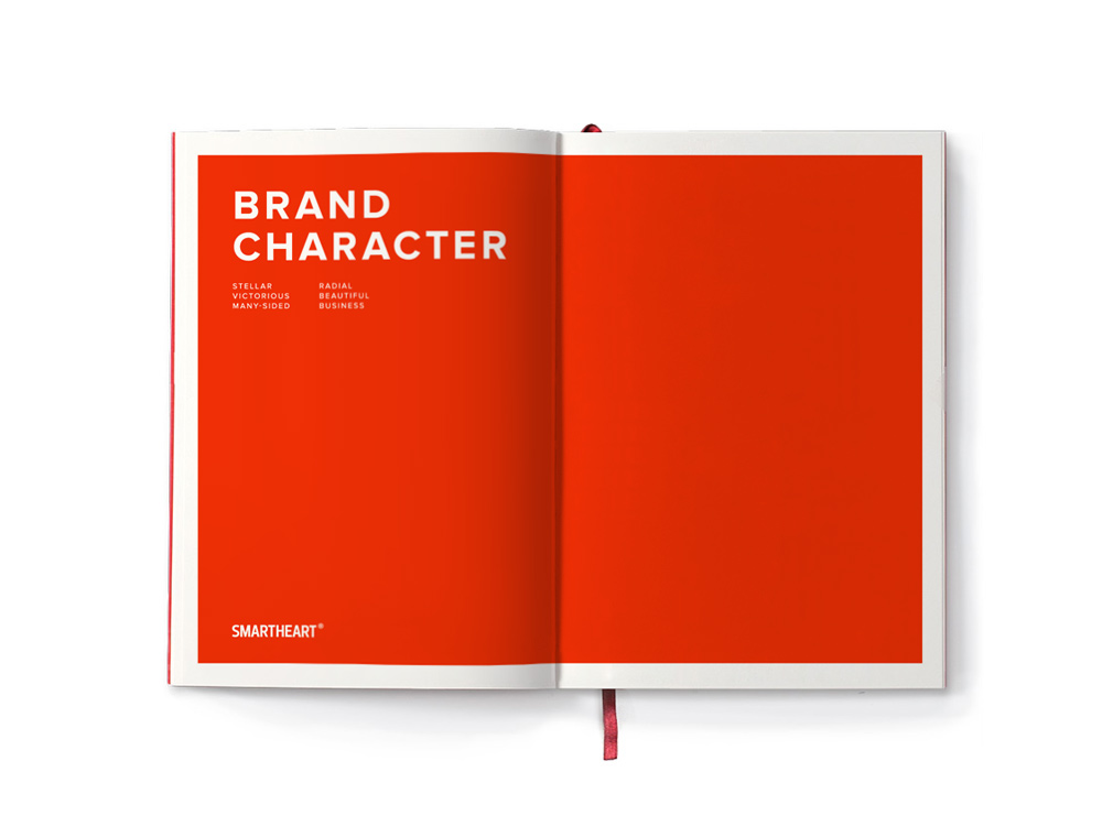
SmartHeart agency developed the brand of Moscow to create a stable and memorable image and also to highlight a character of Moscow. The brand is based on five key characteristics of this city: stellar, victorious, radial, business and many-sided.


Slogan. The expression «Wow! It's Moscow!» has become a slogan expressing the emotions that arise in many people after the first acquaintance with the city. Despite the fact that the brand is primarily aimed for a foreign audience and tourists, it can be fully accepted by the inhabitants of the capital and other cities of Russia.


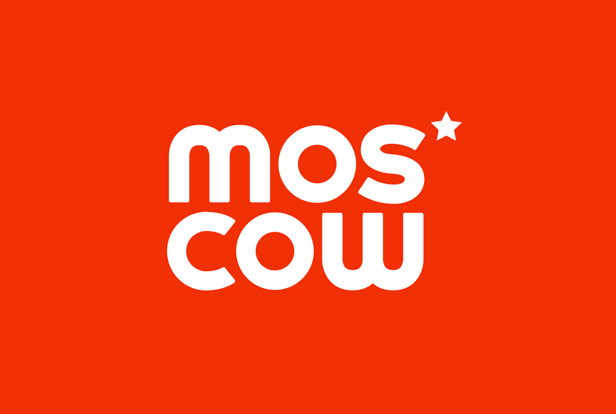
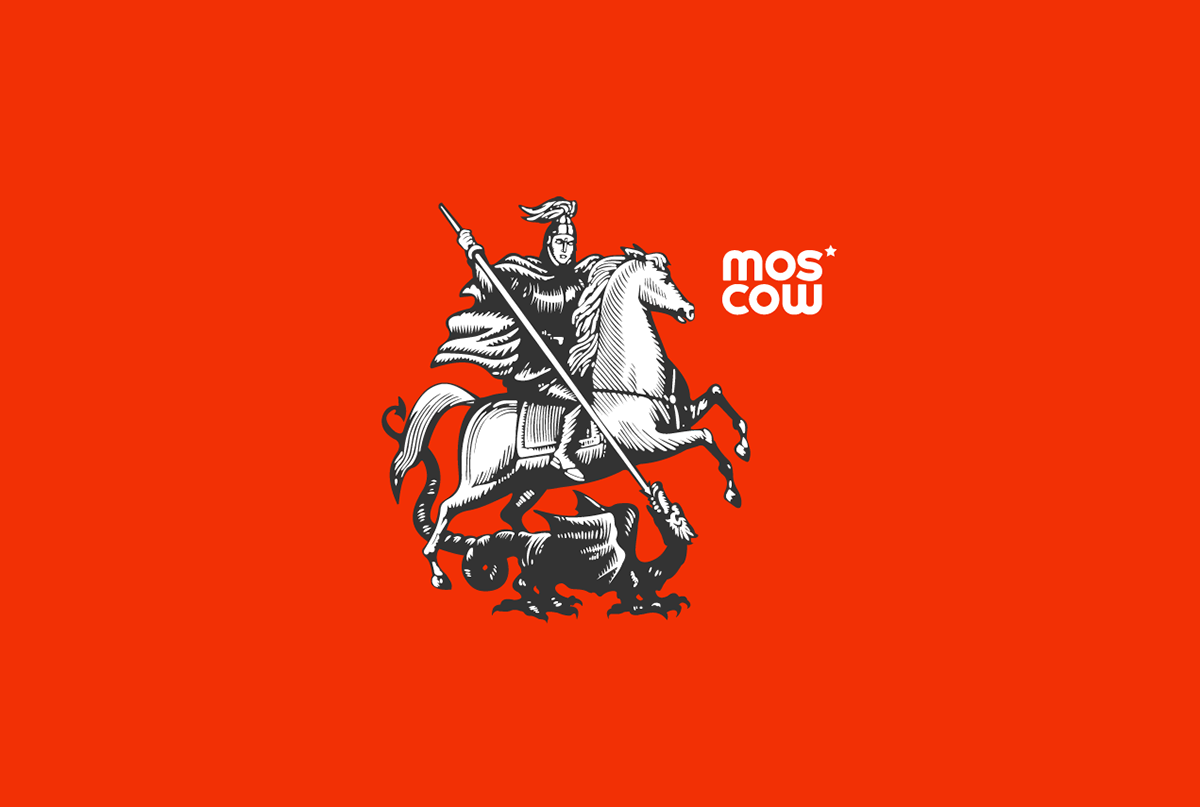
Logotype. In order to present the brand on a world arena it was important to make it modern and understandable for foreign audience. SmartHeart agency propose bold and up-to-date graphics solution that combine all the main characteristics of Moscow. At the heart of the logo is a geometric construction and the interaction of two circles on which the dynamics of the sign is based. The logo may vary depending on the area in which it is used, that extends its application. The sign also emphasize the character of the city: bright, many-sided, emotional and modern.


Art-director and idea: Yuri Mihalchenko
Creative Director: Stanislav Okruh
Strategist: Artem Mitin
PR-manager: Irina Kartina
Project Manager: Victoria Prussak
Translation: Maria Mihalchenko
Strategist: Artem Mitin
PR-manager: Irina Kartina
Project Manager: Victoria Prussak
Translation: Maria Mihalchenko
All images are presented in demonstrational non-commercial purposes only.


