Missions of Palo Alto


Palo Alto is a relatively small city on the Southern end of the Bay Area. It's known around the world as the home of Stanford University, a hub of tech-oriented venture capital, and the birthplace of Ethernet and the GUI thanks to the infamous Xerox PARC. Nevertheless, it struggles to stand out in the Bay's crowded market: San Francisco overshadows its cultural significance, San Jose dwarfs its size and population, Oakland boasts far greater hip-hopulence, and its own neighbor, the economically troubled East Palo Alto, is the undisputed leader in gun homicides per cubic millimeter.
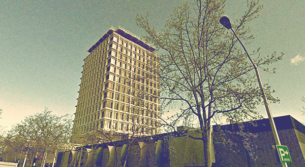
Still, I find its modest urban landscape uniquely charming, even by Bay Area standards. From the college town energy of University Avenue to the unremarkable swaths of shops, suburbs and office parks that radiate from it, there's something that fascinates me about its dated architecture and muted color palette. It all comes together to produce a dignified, mellow vibe that's unusual for the South Bay.
Still, I find its modest urban landscape uniquely charming, even by Bay Area standards. From the college town energy of University Avenue to the unremarkable swaths of shops, suburbs and office parks that radiate from it, there's something that fascinates me about its dated architecture and muted color palette. It all comes together to produce a dignified, mellow vibe that's unusual for the South Bay.


The final layout seen in the poster is actually an idea that popped into my head instantaneously while walking through a parking garage in 2009 and remained virtually unchanged since. It spent three years at the bottom of a to-do pile in the back of my brain before I finally uncovered it and decided to produce it for real as a one-off piece.
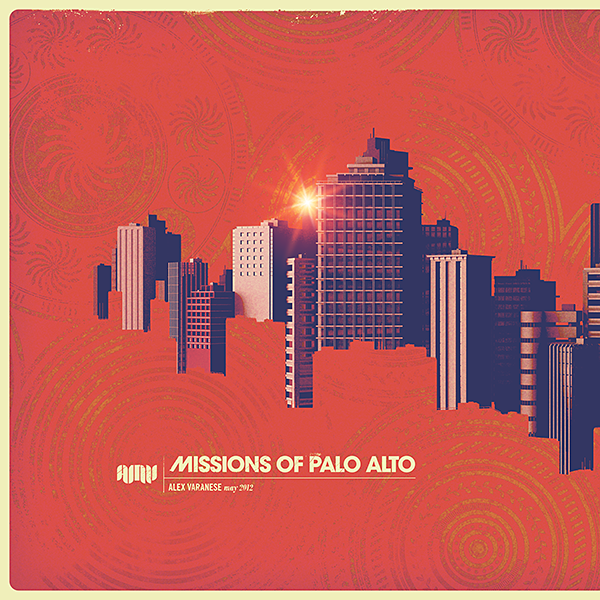
I find Palo Alto's visual language incredibly rich, but in more objective terms it lacks the kind of obvious landmarks that most cities brand themselves around. It's also a relatively flat place, with only a few buildings that would qualify as highrises and a dearth of topological interest. My goal was to capture a number of real-life structures and mix them together into a more dramatic, fictional skyline that merges the real with the unreal in a faithful way.
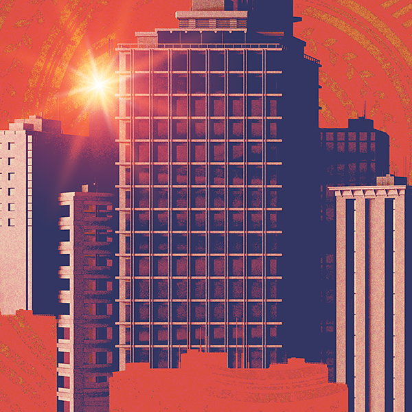
I began by modeling a virtual rendition of Palo Alto's urban landscape, guided by the two principles that dominate my work: shameless artistic license and a near-complete disregard for technical accuracy.

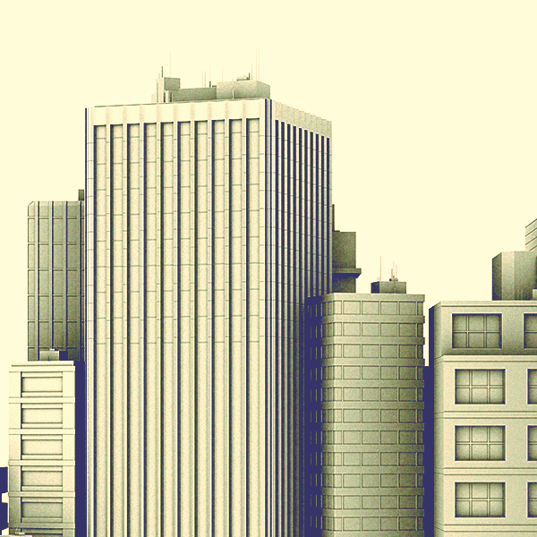
The geometry itself was relatively simple, but I didn't want to create a realistic, bounded city. Visually, the skyline needed to exist in a totally detached, abstract universe of its own with no connection to a larger environment. This prompted me to create a second skyline and use its contours as a matte that would occlude the bottom edges in a more creative way. The fine details running along the top of large rectangular chunks also invokes the feeling of the unfinished work of paint rollers.

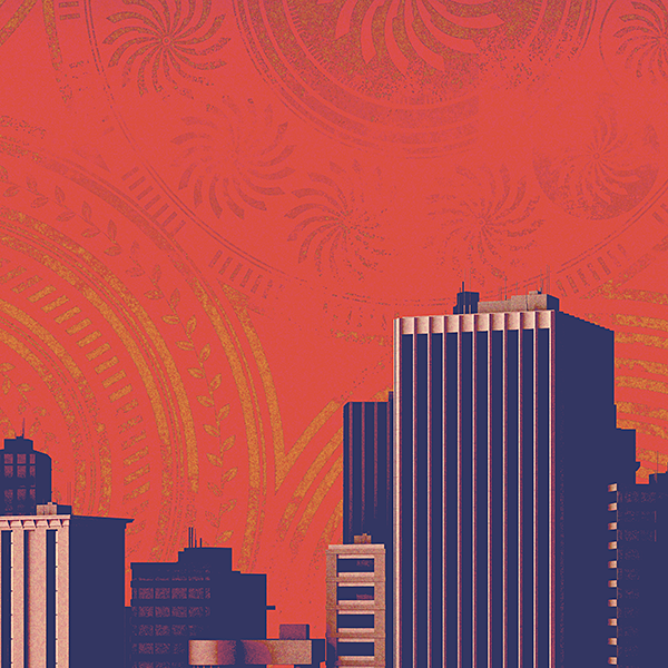
Since the idea dates back to the very start of my career, I wanted to stick with the red-dominated color schemes I clung to back then. To give the background some character of its own, however, I covered it in a pattern operating at different scales, with bold radial regions subdivided by increasingly granular details. My original intent was to create something bold and geometric, but it evolved rather unpredictably into something a bit more tribal and organic, which was a pleasant surprise.

Finally, I wanted to add just a bit of typography to round out the layout. To capture the 60's/70's vibe felt in so much of the city's architecture, I bludgeon the viewer over the head with an appropriately vintage combination of typeface and distressed texture. Not everything has to break ground, right? Sometimes the most predictable choice is the one that works.
