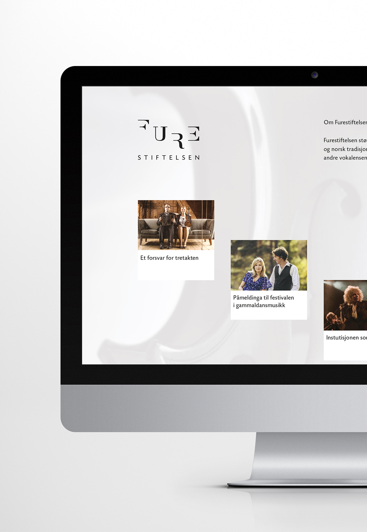
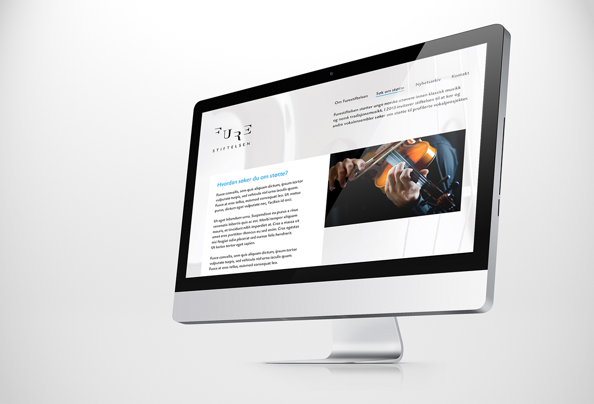
Furestiftelsen
Furestiftelsen (The Fure Foundation) supports young Norwegian performers in classical music and Norwegian folk music. In 2013, Furestiftelsen invites choirs and other vocal ensembles to apply for support for profiled vocal projects. Furestiftelsen asked Mission to create an identity and website to raise awareness about the services the foundation has to offer.
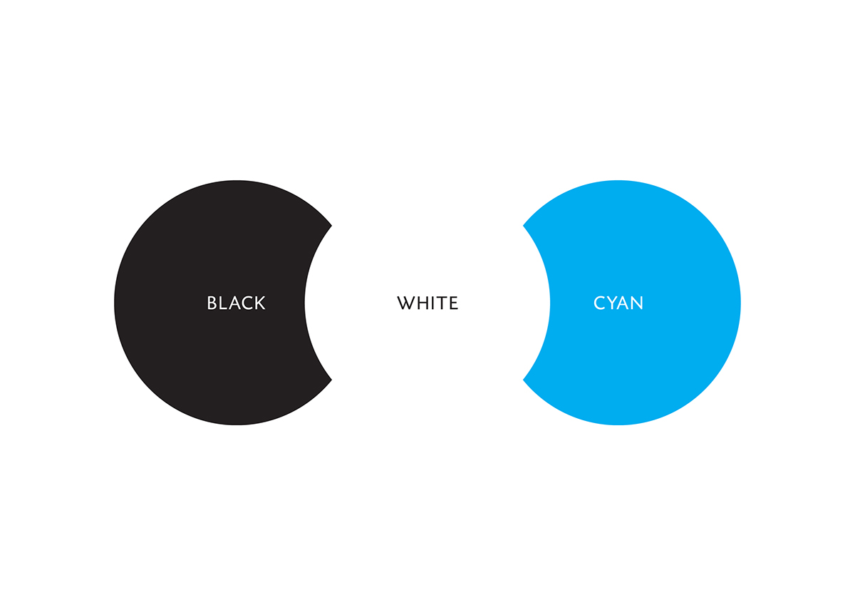
Our proposal is a brand that live at the intersection of tradition and modernity. The logo is inspired by classic typography in a contemporary suit. The bright cyan color represents the youth and future of the performers, while the black and white speaks for the proud cultural heritage and the classic.
Concept
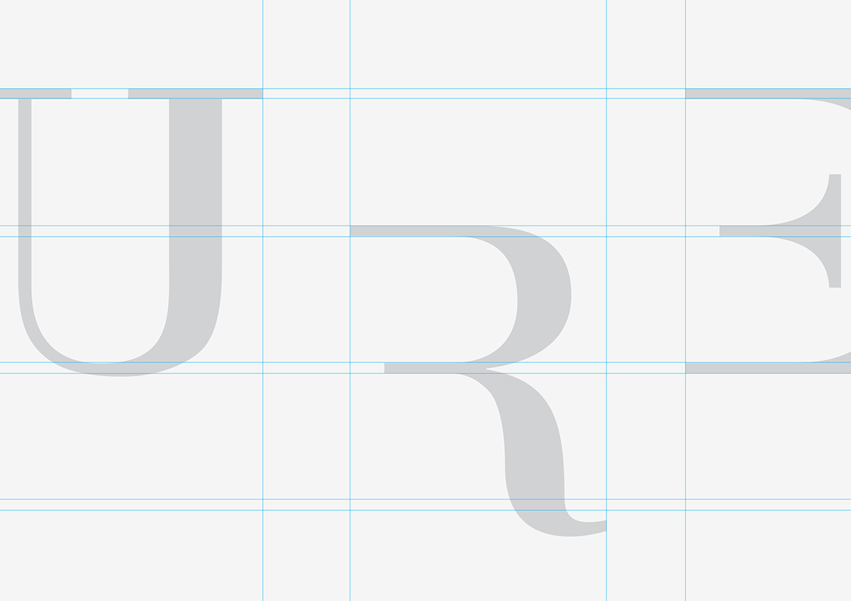
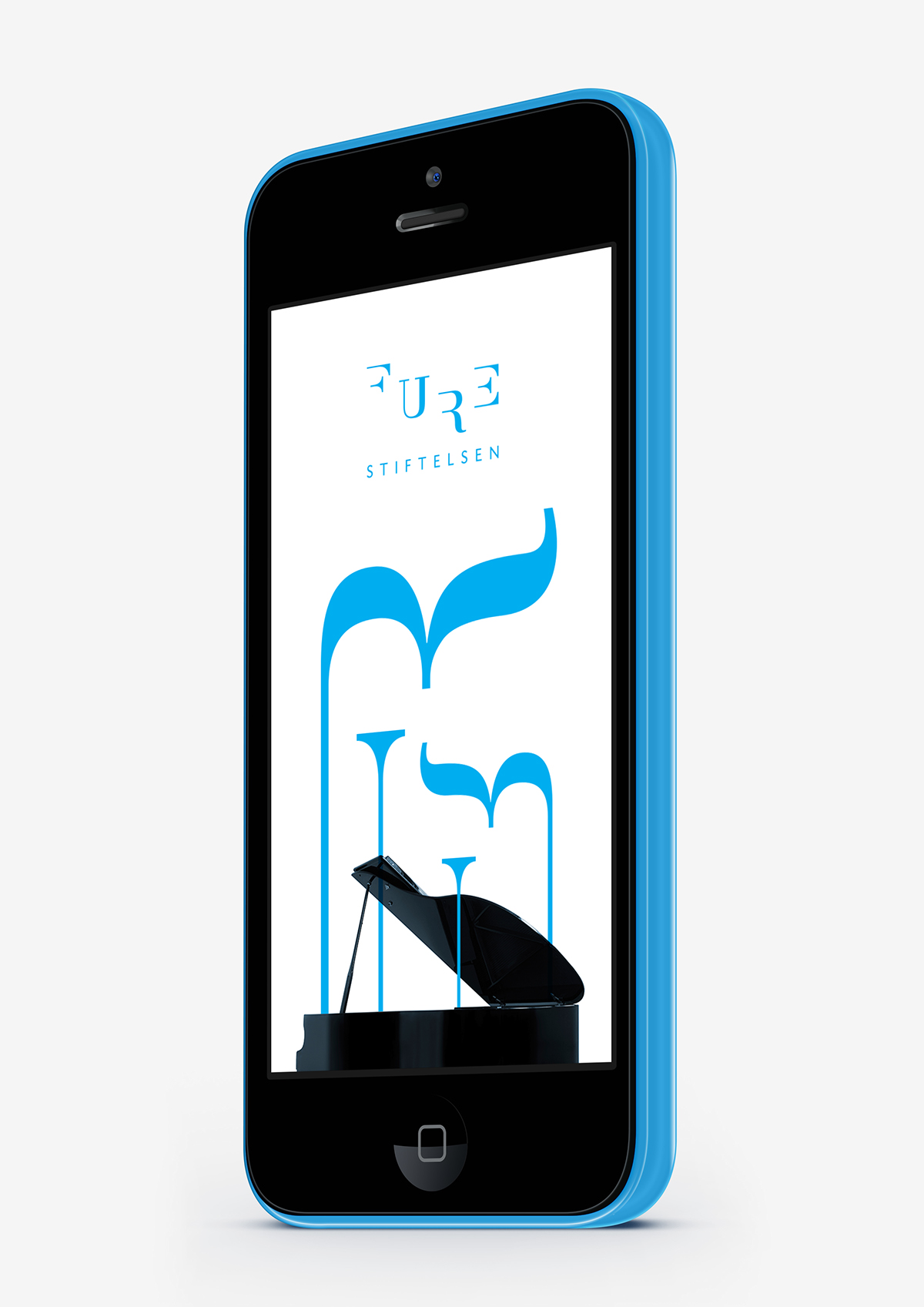
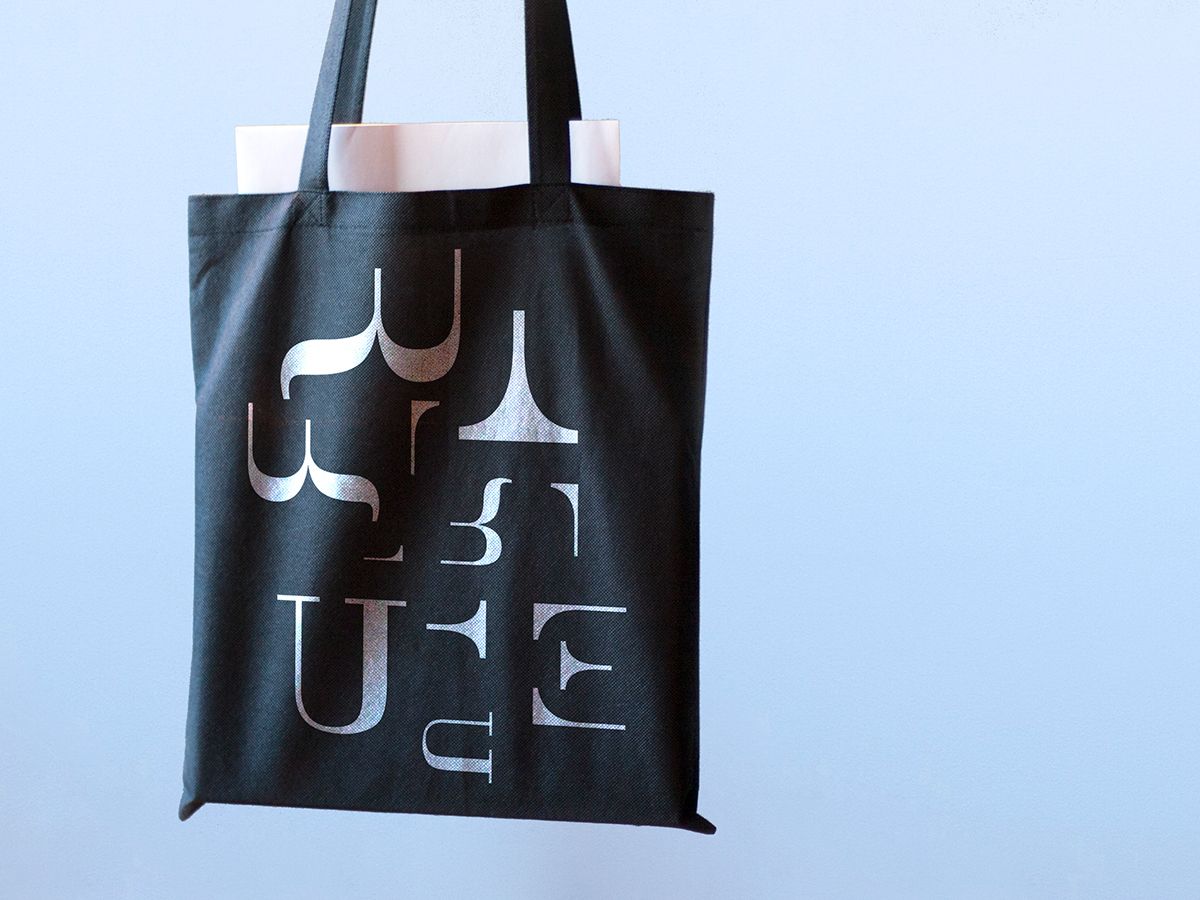
The logo is inspired by something every musician has a relationship to, sheet music. The shapes that form the word "Fure" is embedded in a 5-line sheet music. This gives the logo a playful and dynamic expression, while providing an indication that the foundation is working with music. In addition, the forms gives associations to various musical instruments. Tightness in the typography that constitutes "Stiftelsen" helps to give the logo a balance between order and playfulness. The identity gives many opportunities in terms of expression and will hopefully give the receiver a feeling of watching visual music.
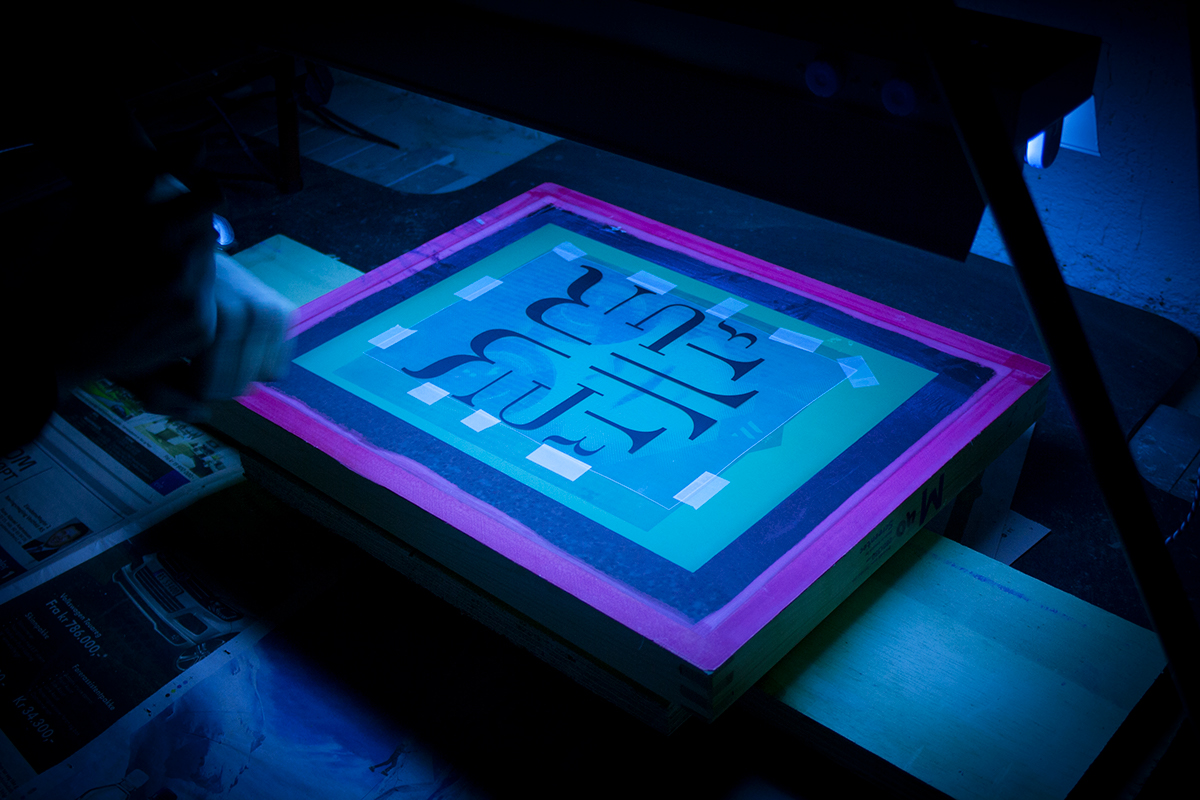
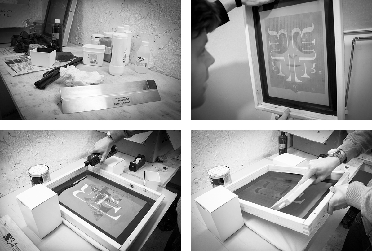
Silk screen printing in collaboration with Geir S. Lysbakken.