FF Spinoza
An elegant workhorse – crisp, sturdy, economical and versatile
An elegant workhorse – crisp, sturdy, economical and versatile
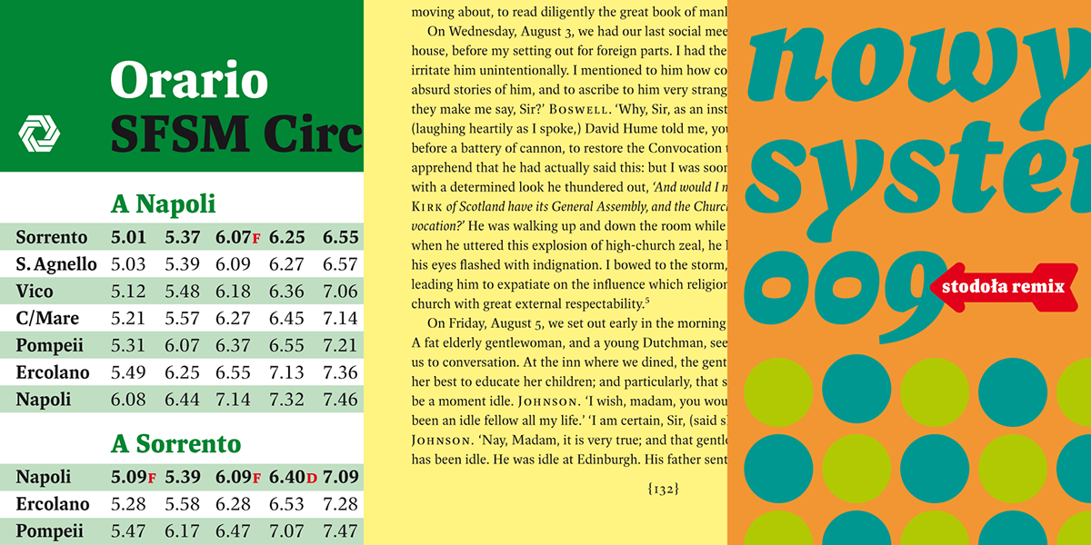
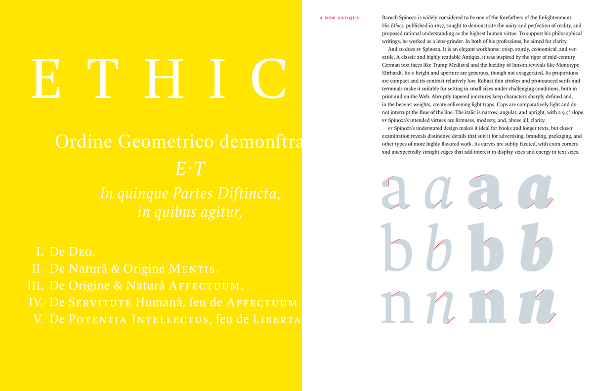
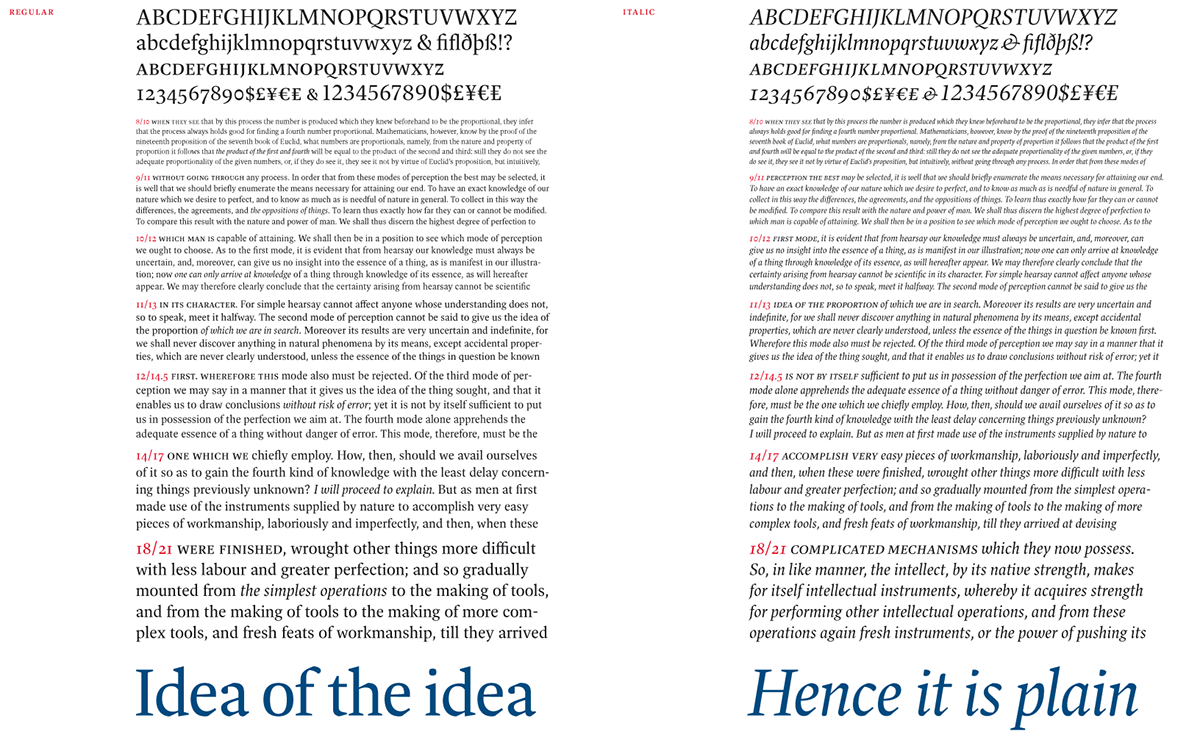
Max Phillips developed FF Spinoza over a period of eleven years. With the goal of readability in mind, Phillips named the typeface after 17th century rationalist and lens-grinder Baruch Spinoza, a man whose job it was to help people see clearly. The family is meant as an elegant workhorse, a classic text family with just enough individual character to hold its own in display sizes. It was inspired by mid-century German book faces like Trump Mediaeval and Aldus, and by the types of Nicolas Kis. The forms are narrow and economical, with open counters. The line is firm and distinct. It has strong thick strokes and serifs to help it grip the page. Its intended virtues are firmness, clarity and modesty


