It took three years and three designers to develop FF Meta® Serif. All through the ’90s, Erik Spiekermannmade several attempts at designing a counterpart for his groundbreakingFF Meta®. Fans of Meta frequently asked him which serif face would bestcomplement it. He recommended Swift™, Minion™, FF Clifford™,and others, until he realized that he should just buckle down and drawhis own serif Meta. True to his principle of collaboration, Spiekermannenlisted the help of accomplished type designers Christian Schwartz and Kris Sowersby.
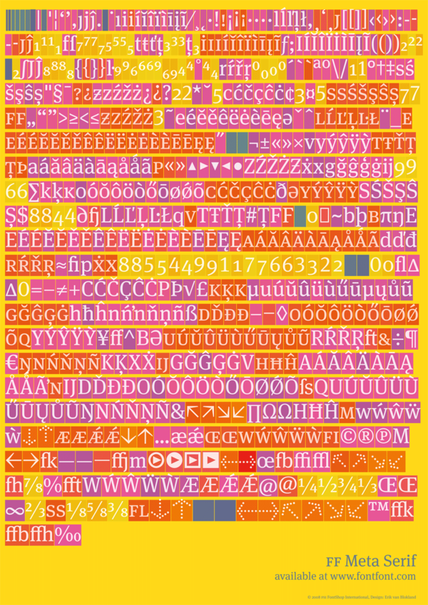
This image in higher resolution on Flickr: http://www.flickr.com/photos/fontfont/3370277928/in/photostream/
At the beginning of 2005 Erik finally admitted to himself that he was stuck: all of his sketches looked like Meta with serifs added, not like a serif typeface that could survive on its own. He needed fresh eyes, so he got Christian involved who, in turn, asked Kris to take on some of the workload. Obviously, a serif FF Meta would need to fit in with the existing FF Meta family. After drawing the first weights the designers saw that there was still something wrong: the serifs were too strong so that both families didn’t really go well together in the same line, despite identical x-heights. The theoretical approach obviously hadn’t worked well enough, so they decided to trust their experience instead. They changed the metrics so that the letters are not mathematically identical, but optically the same. Now what you see is what you get. And they discarded the idea of a tighter spacing to make it appear darker. After much trying, comparing, generating fonts and printing out samples, the final formula for a new Meta was found: two percent heavier and two percent more condensed than the sans.
Erik van Blokland’s sophisticated technology “Superpolator” helped to extend the family, although manual corrections were always necessary: the spirit of a typeface can still not be delegated to software.
The OpenType version of FF Meta Serif offers Book, Medium, Bold and Black, each including Italics and of course Small Caps, OSF, LF, TF and a range of arrows and other symbols. While it is a typeface that can stand up on its own in a wide range of applications, the extra benefit is its close relationship to the original FF Meta, its sans serif sister. The two families can be mixed in the same line and one can be used to accentuate the other. Using both on the same page adds variety and meaning to a text.
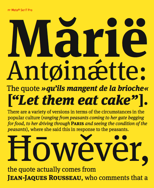
This image in higher resolution on Flickr: http://www.flickr.com/photos/fontfont/3370322976/
See everything about FF Meta Serif [the story behind, technical specification, an in-use gallery, and more] on MetaSerif.com and high resoluted images at our FontFont Flickr account.
