
Final design of the HLMS
I led small product team through a complete re-design and overhaul of our web-based "HLMS" product. Education Elements team included: Richard Luong, Namita Dalmia, and Kusha Tavakoli. Also, Mason Yarnell was our contract visual designer.
The original HLMS was designed specifically for elementary school teachers, where there is a 1:1 mapping of teachers to classrooms. However, this model broke down as we attracted more middle school and high school clients where teachers can have upwards to 7 different class periods. The HLMS needed a navigation and UI overhaul to accomodate classroom switching and additional functionality.


Step 1: Product Visioning Design Games
I led our resident subject matter experts through a series of design games to draw out key product values and feature organization schemas. The subject matter experts were divided into three teams representing core user groups: teachers, students, and principals. Each group was given a persona development task as well as a feature card sorting task. Each group was monitored and interviewed by a product team member.

Mapping of the "old" information architecture

information architecture prototype

information architecture prototype
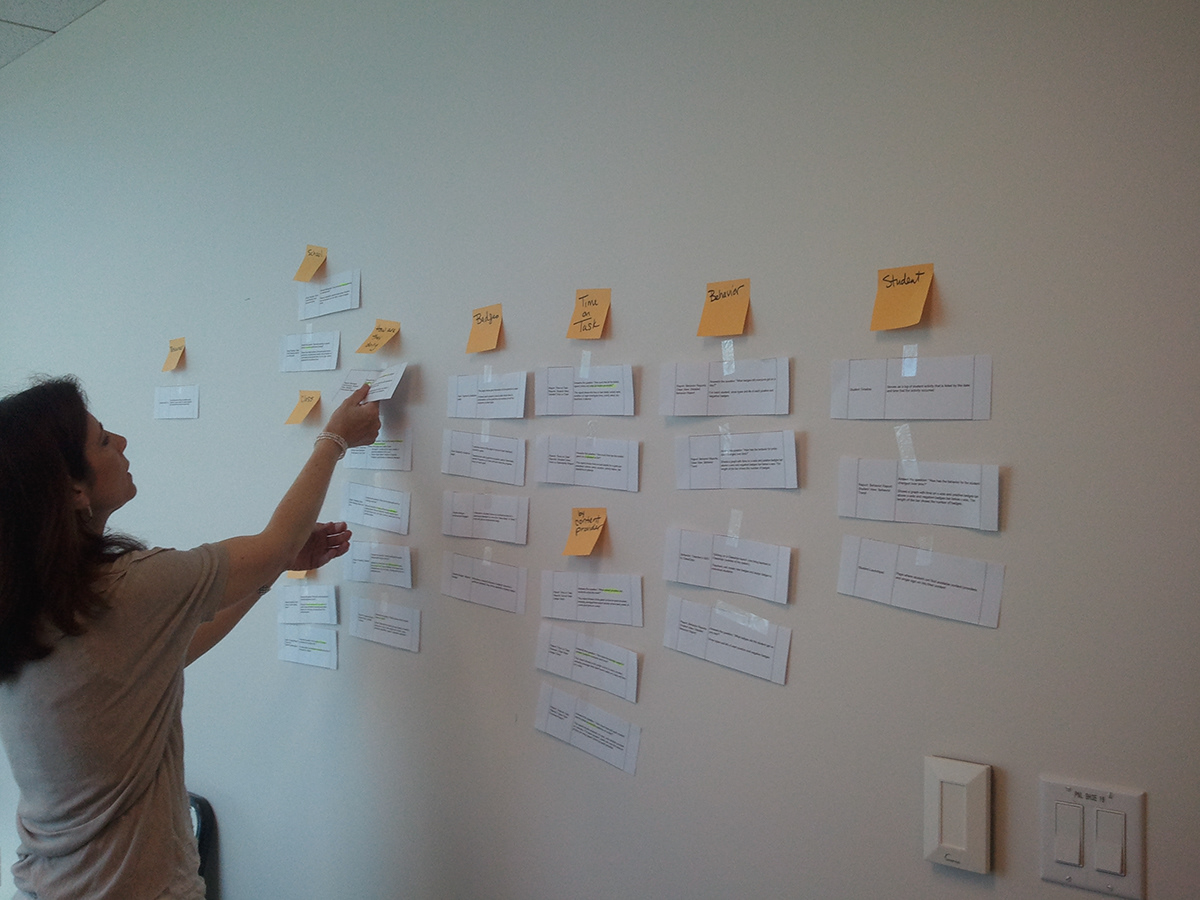
Step 2: Information Architecture
I created a mapping of the existing/old information architecture, as well as mappings of information architectures articulated by the design game groups. These information architecture "prototypes" were discussed and refined through a series of product focus groups.

prototype whiteboard sketch
prototype example by Namita Dalmia - namita.dalmia@gmail.com
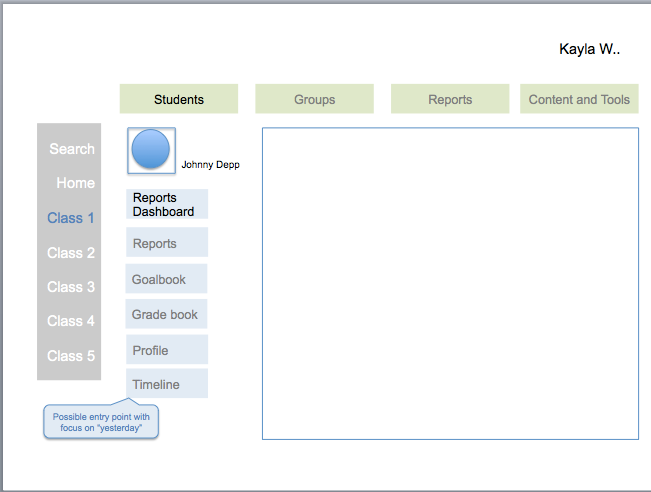
Step 3: Prototyping
Once a final information architecture was decided upon, the product group created a series of lo-fi prototypes. These prototypes were refined and more hi-fi prototypes were developed before ultimately delivering a final prototype to our contract visual designer.
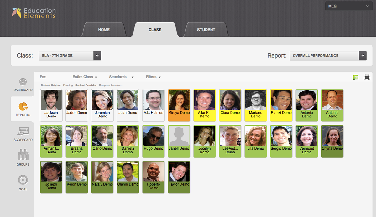
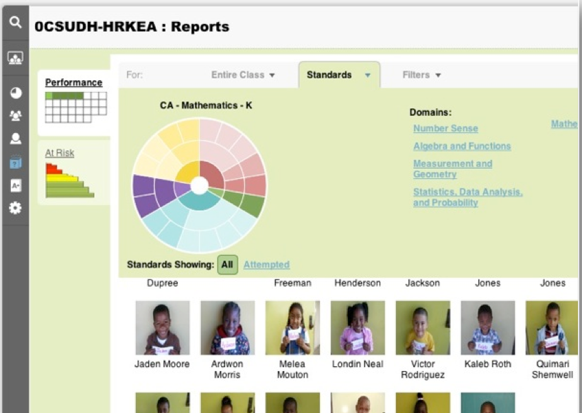
Final visual design by Mason Yarnell - Masonyarnell@gmail.com

Final visual design by Mason Yarnell - Masonyarnell@gmail.com
The final design allows for teachers and principals to take key actions on behalf of : themselves (Home), their Class, or a particular Student. These three categories are represented as three main persistent navigation tabs. System functionality displays along the left margin. A key and neccessary feature is the ability to easily switch between Classes and Students while taking a particular action, which is faciltated by drop-down navigation menus. Also, the design is "touch" or tablet friendly.
The final design was released in December 2012 and was received with enthusiasm and positive feedback from our clients.


