

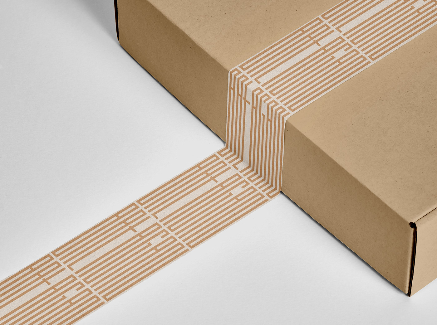
Visual identity concept for a decorative studio specializing in floristry. Concept plays with contrasting feeling of clean and calm versus strong and aggressive.
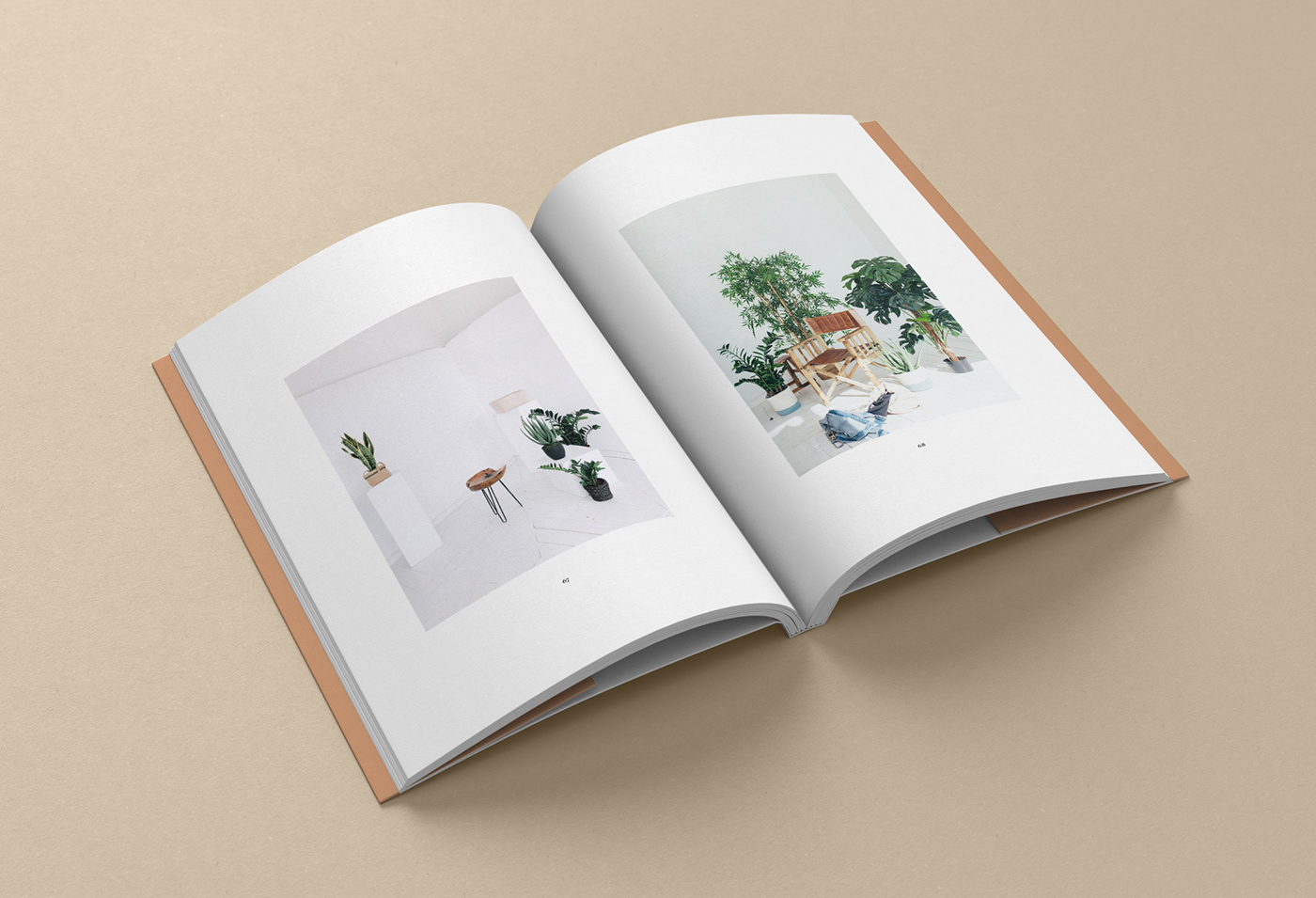
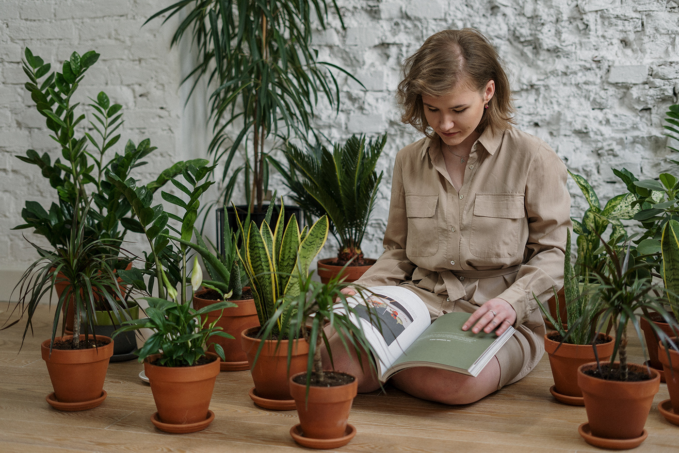
Project was born as a need of showing that floristry studio's identity doesn't necessary need to be smooth and lightweight to stand out, in fact it even helps to be different. This identity is meant to create contrasting bond between the name ("bałagan" which stands for "mess") and its meaning to the business. To turn up the heat, as a complement to the heavy logotype there was pared elegant sherif font to it. But it's not only about logotype and typography, also photographies are playing crucial role here – the main rule for photos is that there should be visible clear order with some kind of steadiness and calm (of course there could be exceptions, but still any disorder has to seem under control to not destroy the whole image of brand feeling).


Thanks for watching!


