
Experimental branding
01 – 06.2020
Project created for the purposes of a bachelor of arts degree. Identity system was partly inspired with De Stijl movement, modern Dutch designers style and 3d anaglyph technology.
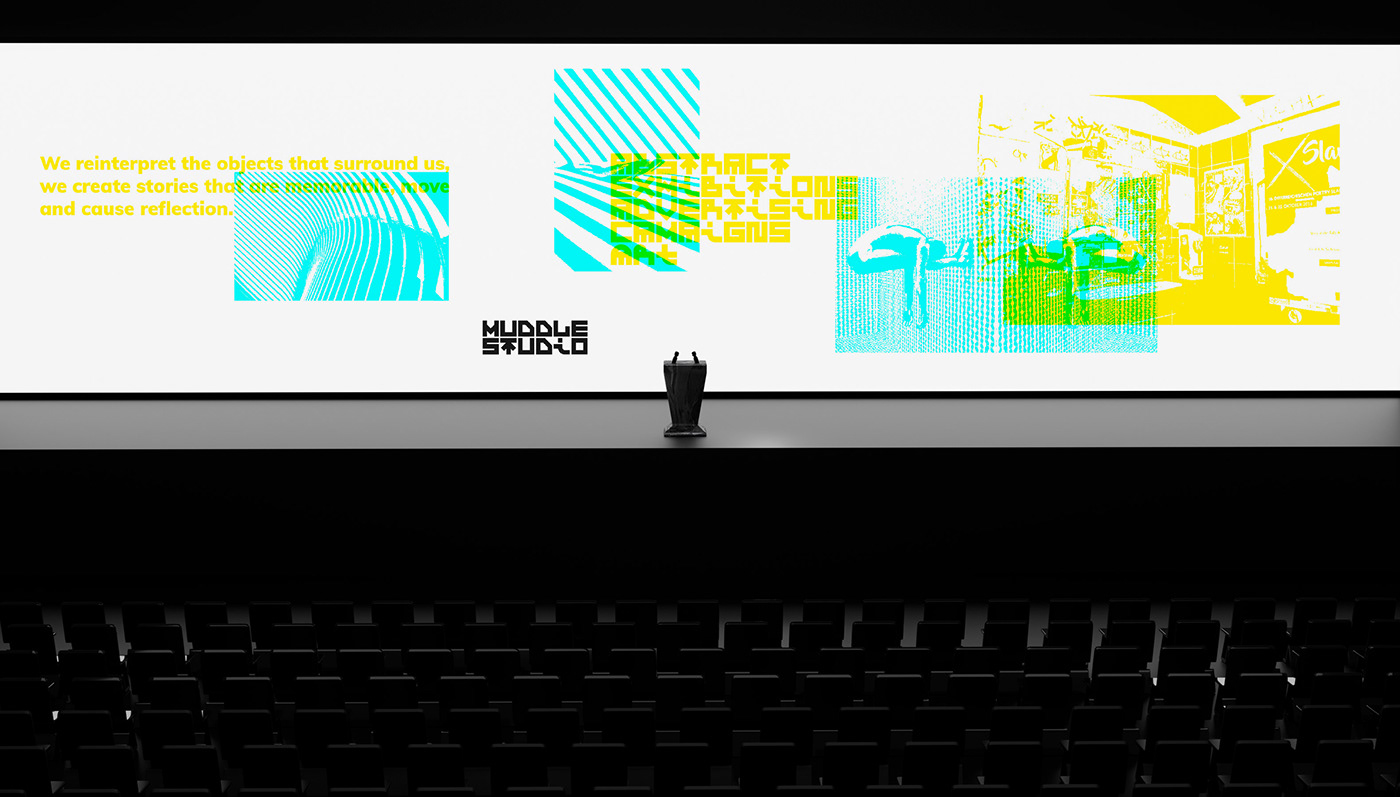
Studio was created for needs of this project, it specializes in creating abstract exhibitions, using unusual materials and forms –
this is supposed to make people reflect and see new possibilities of usage for objects / materials we already know.
this is supposed to make people reflect and see new possibilities of usage for objects / materials we already know.
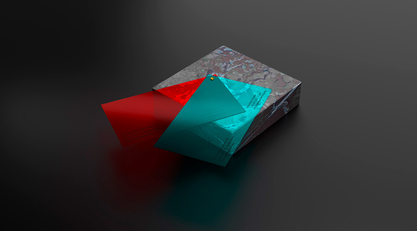
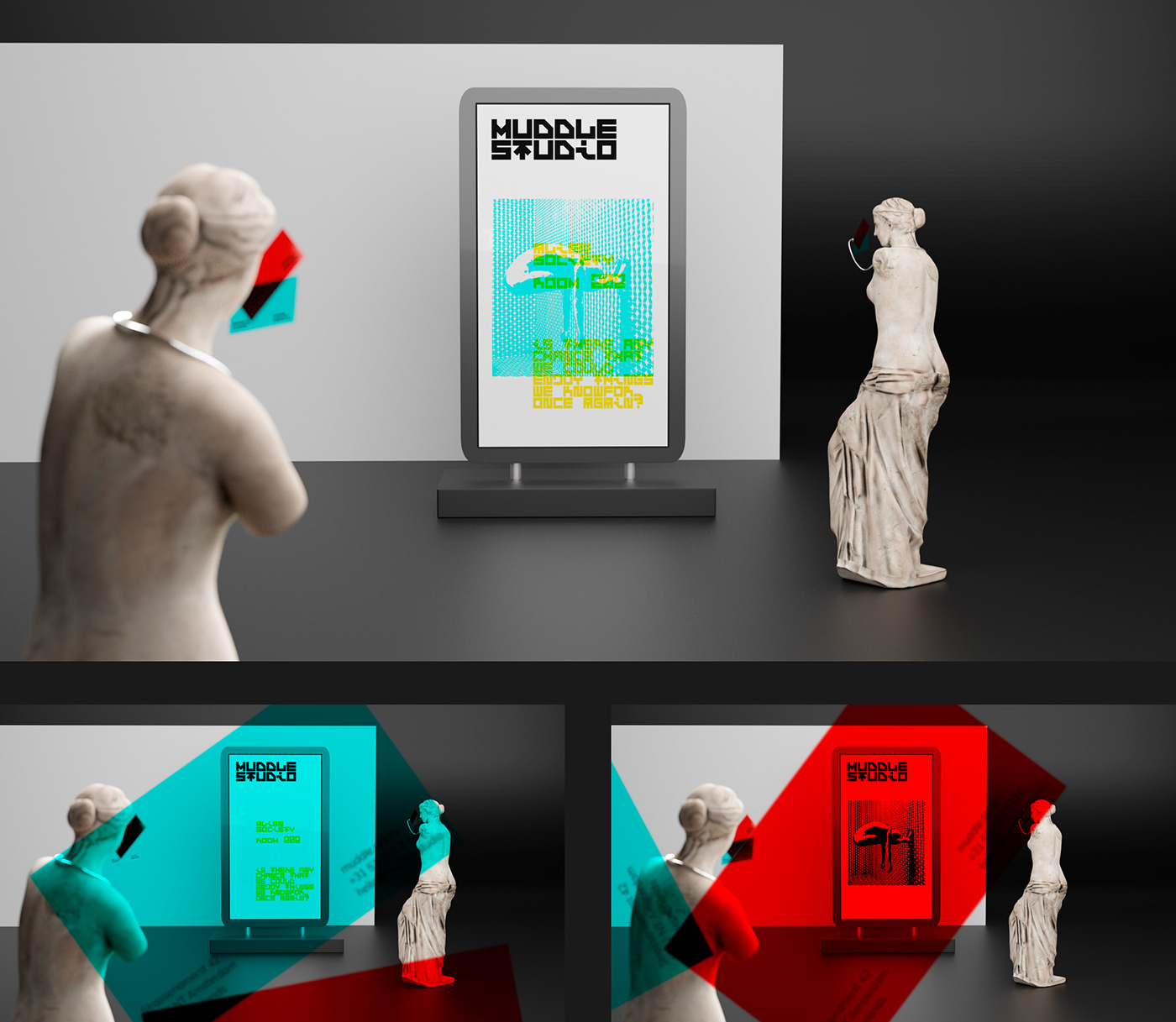
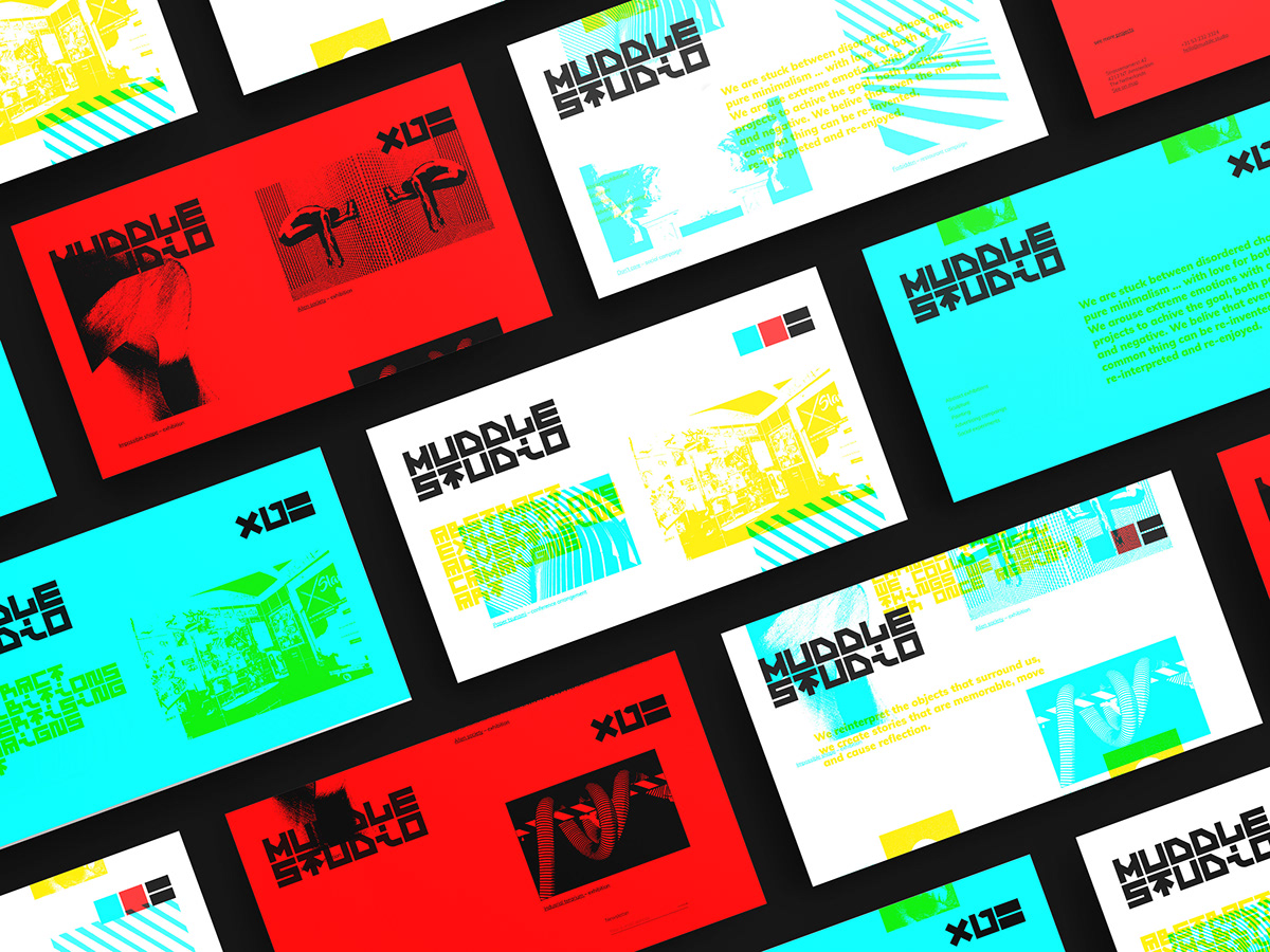
Long story short, whole identity system is based on anaglyph technology (look at oldschool 3d movies, red/cyjan), where aesthetics has been devoted to functionality. Main idea is to show two independent messages in one place, one on top of another (it's reflection of studio's mission). With that being said, the easiest way to achieve it is to use different colors for both layers and some filtr that will allow us to watch one layer at time.
Business card seen above is the filtr element, it's made of foil used in 3d glasses. Generally, blue foil eliminates blue color and red foli elimantes red color. If you have 3d glasses like this somewhere, grab them real fast and check it out!
As You have probably noticed, the base colors are not same as in the standard anaglyph images. Reasons of this change are simple:
1. with standard color there is too much contrast between them which helps to read messages without using foil (we don't want that here)
2. connecting points of standard colors are black, again, it helps and that's not cool
3. come on... everyone knows red/blue connection, let's use fact that yellow is near to red in color wavelenght table and make it different

Whole identification system is very flexible as it doesn't have defined complex brand book (project is created for designers who know how to express themselves). Project gives them path they can follow and includes just few restrictions: no slant angles, strict colors and grid system. Grid is based on logo size (it's up to creator on how big logo will be) – letter width is the column width. There are no limitations to positioning of objects on the vertical axis.

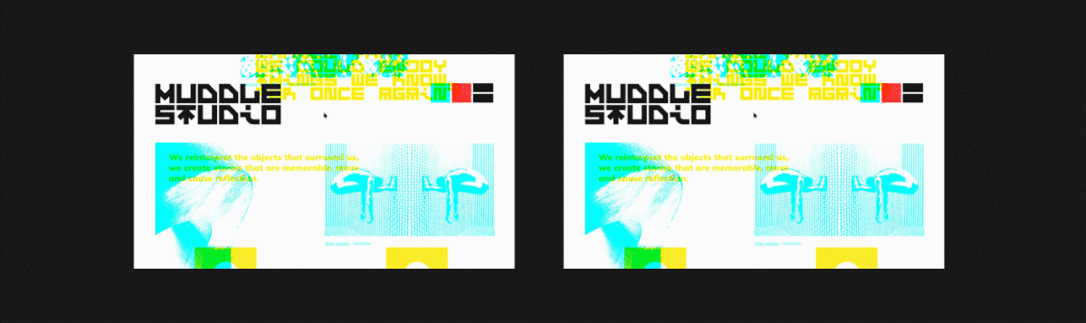
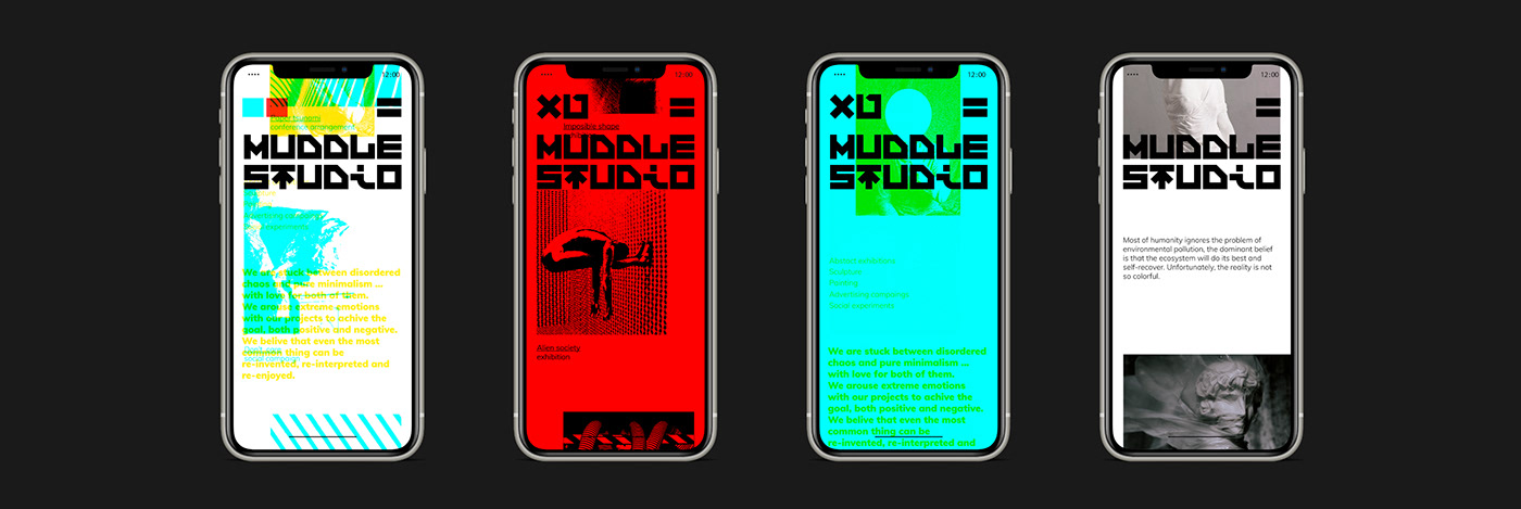
One of the most important comunication channel is studio's website with portfolio and 'about' subpage. Referring to the initial design assumptions (about showing two independent messages at once), i have came up with an idea of two subpages displaying simultaneously. There was used a two-way scrolling system to emphasize the independence of those two layers. Blue layer presents portfolio thumbnails, and the yellow one presents information about the studio.

At first, the identification system was meant to be completely illegible to uninitiated people, but in the design process readability was gradually increased. Most people visiting the studio's website probably will not have business cards to read the content, therefore there was added an option of using the "screen filter", located in the upper right corner of the screen.
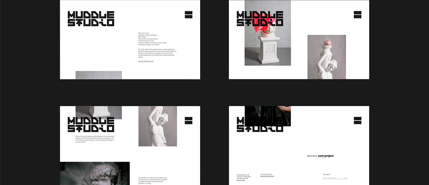
Style used above causes some limitations. One of them is depriving photography of color, which may be OK in case of main page, but when we talk about detailed case study, colors are crucial. Solution is simple, case study subpages has to be 'clean' – so if we could think of website as a book, the 'main page' would be book cover and case study would be one of it's pages.
Big thanks to my thesis supervisor Tomasz Budzyń MA for being helping hand during whole design process.


