Graphic Standards Manual
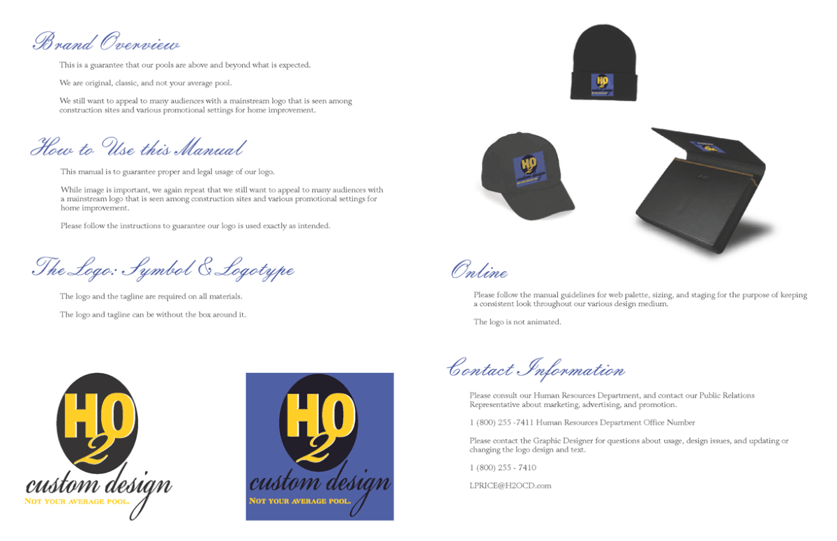
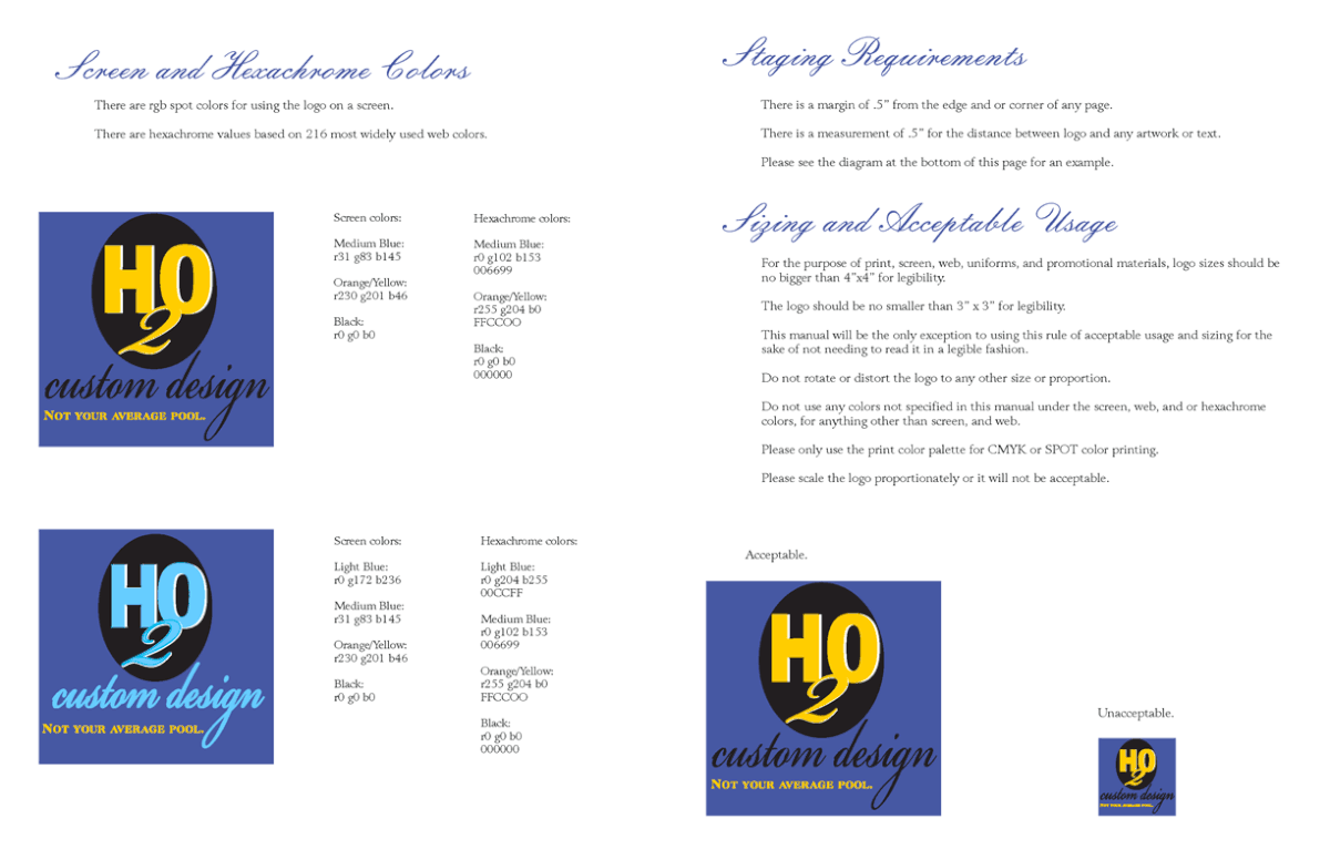
This is a portfolio example of logo design and how to use it correctly in a corporate setting. This helps especially when a company has standards for the legal usage of its branding and identity. This is of course, a fictional company meant for a portfolio, but the logo design, text, colors, and layout, are of my originality. The black t-shirt and the silver mug photographs are just free stock art. This was designed for a real client in a competition with the rest of the class to see who would be chosen for this particular vintage look. It feels like a paint company, but the requirements were so specific that the logo had to feel like water in a certain way. It needed to be very conservative and easy to print on everything. Needless to say, since everybody had a water droplet... I begged to differ and needed a clean corporate look. This was for a bigger company than the look they needed, but at least it was a valiant effort. The kid who won made this awesome Illustration of a hand rendered water droplet and a bucket. Oh, well.


