SOTERIAS BRANDING
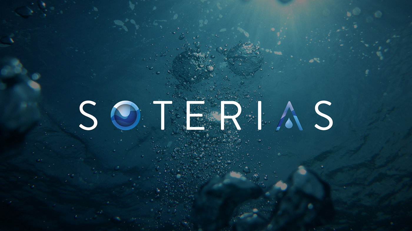
Soterias is a soon to be launched tech startup set to revolutionise the water purification industry with their launch product. The brand name is derived from the Greek goddess of safety and deliverance; Soteria. I knew almost instantly that I wanted to implement the Greek character 'lambda' in place of the Roman 'A' as a nod to the Greek heritage of the name, and that the logo had to be clean-looking overall - after all, cleanliness through measuring water purification variables on a microscopic scale is the aim of the business.
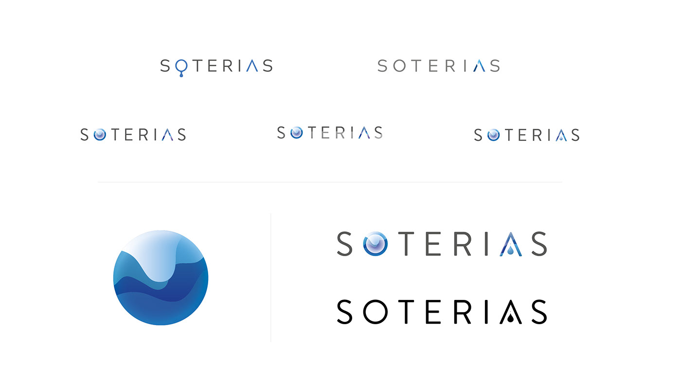
Despite a wordmark having always been my preference for this design, while briefly experimenting with possible devices to complement the logo the beginnings of what later became the 'O' came to fruition (see below, along with a brief evolution of the concept) and this was later refined and incorporated to balance out the lambda character, both with patterns and gradients flowing through them to represent water. At the client board's request, the water droplet was then added to the lambda character to provide an even more overt water reference. As always, consideration was paid to how any of the concepts explored would work on both dark and light backgrounds, or in one colour if necessary (see examples below).
Ultimately, any brand must be fit for the client's needs and so my aim is always to ensure that they're 100% happy with the final result as long as it doesn't adversely compromise the overall aesthetic, and the reasons for adding or subtracting an element of a design can work both ways - it's easy for both designer and client to become blinkered at times, but with clear communication things always work out. I'm excited about the ground they're making research and production wise with their launch product and look forward to the opportunity to work with Soterias in the future to develop this brand and market their product range in the future.