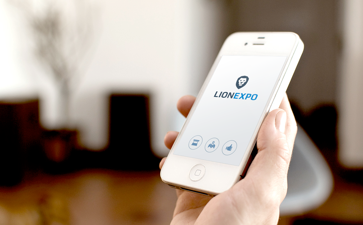
Lionexpo is a fast growing Slovak start-up company which provides an All-in-One Exhibition Platform.
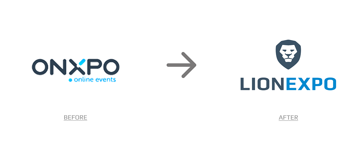
After a few years of success the company decided to change its name from ONXPO to LIONEXPO, which was the main reason for the logo change. They wanted to keep their already established colour scheme and to change the logo shape to better express the company’s values.
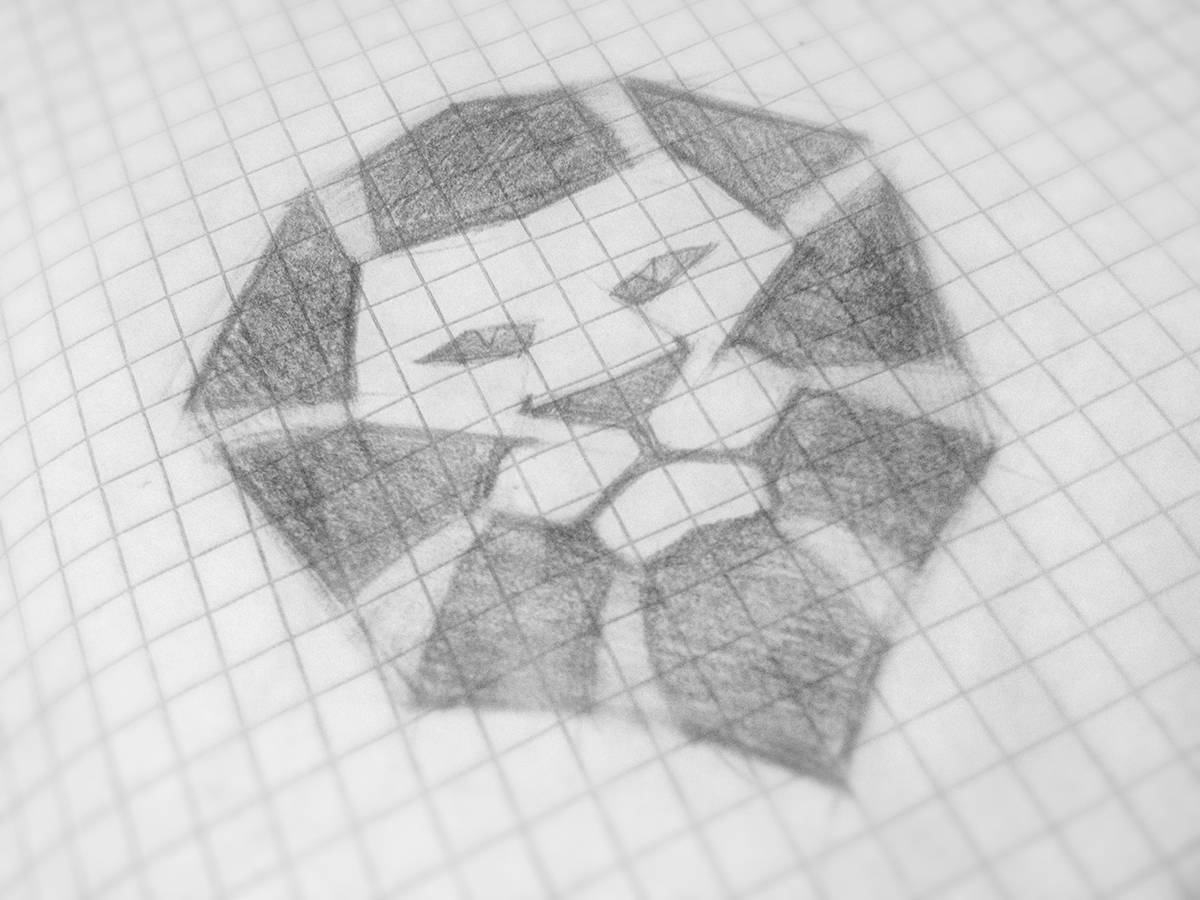
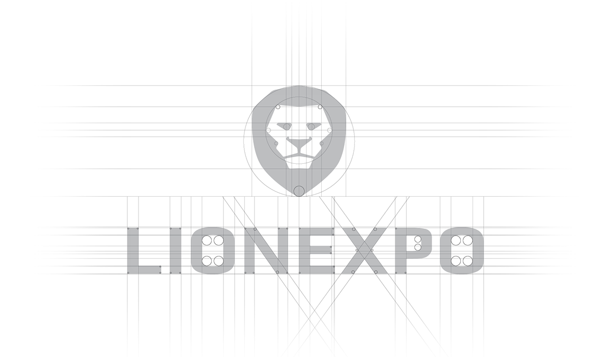
The head of a lion was chosen as the main symbol to reflect the values of; strength, friendliness, youth. After the visualization of these characteristics came the greater challenge of stylizing the head into a more technical form. This was reached by using straight lines and corners with radius. It gave the logo a minimalistic look with a human touch.
The font was selected last. The most suitable was the google font Play, which perfectly matched the new logo.


~ Thank you ~

