VIS Fitness
—
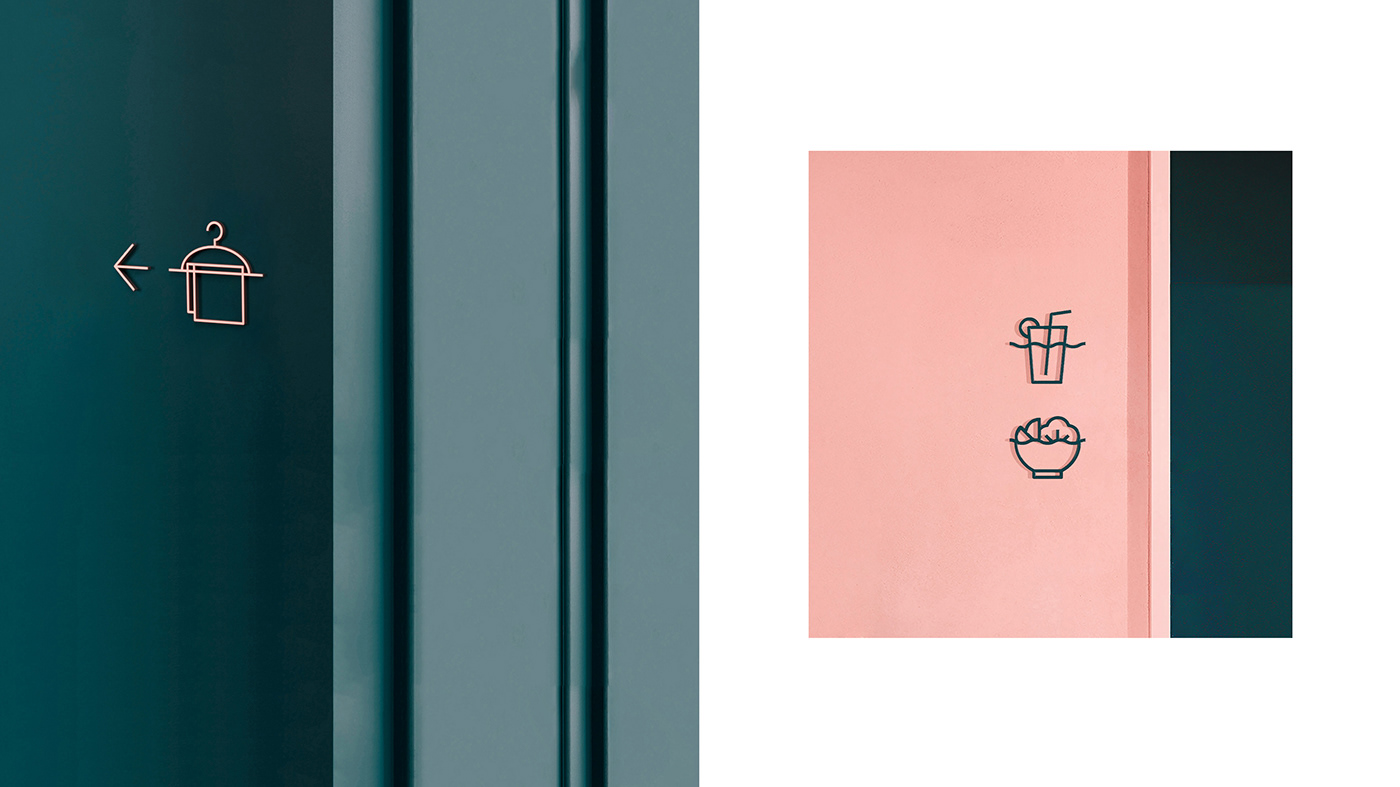
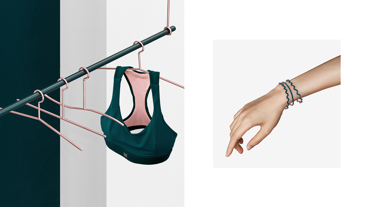
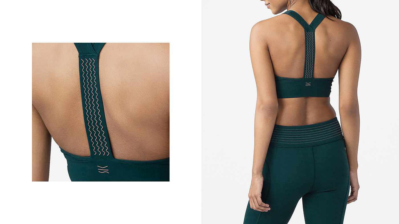
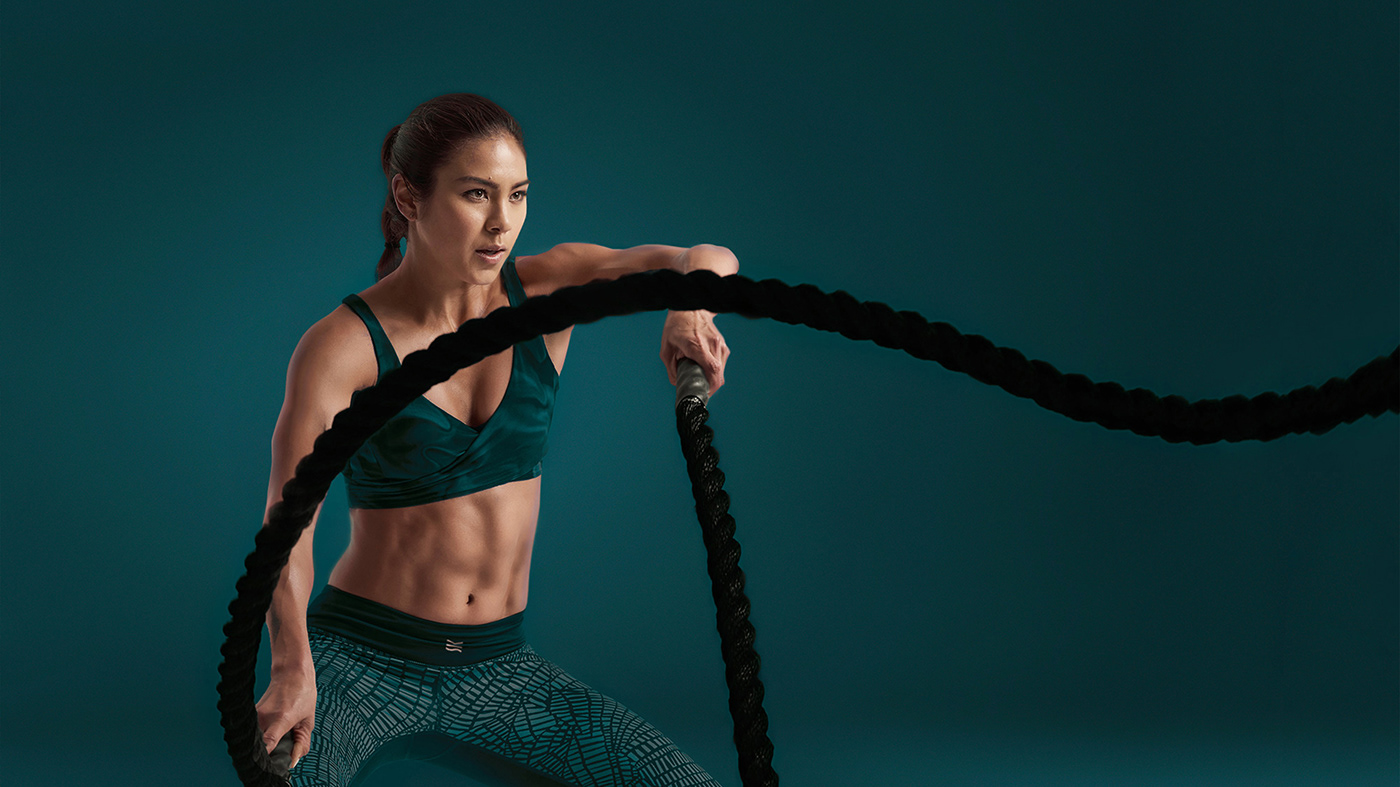
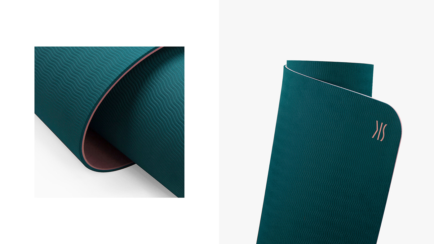
Integrate the brand characteristics with its core values to visualize the brand logo. Create a compelling brand identity with a simple but unique visual language.VIS is a women exclusive, high-end fitness studio located in downtown Shanghai. The name VIS stands for Vision, Independence and Specialty, which are the values the company stands by. It also represents qualities of modern elite women — elegance, courage and independence.The design is a perfect blend of the brand name and the image. By innovating the logo. In the form of the letters, "V" is a broken line, indicates strength, resistance and challenge; "I" is a straight line which stands for slim, smooth and peace; "S" is a wavy line that refers to sensuality, rhythm and mellowness.
The design visualized the connotations of the core values, combined it with the brand’s athletic nature. The result is an iconic and unique logo, meanwhile, the dynamic visual extensions provide great possibilities for the brand application.
—
VIS是位于上海市中心的一家针对女性的高端健身工作室,V代表视野vision,I代表独立independed,S代表专业speciality, 这是品牌创立之初的追求与目标,也是针对当代精英女性优雅出众,独立担当的风范写照。设计通过图形创新,将品牌名与品牌的形象树立进行了完美的融合和表达。V在平面视觉里是折线的线段,在意义上可以理解成strong,resistant, challenged等等 I在平面视觉里是直线,可以理解成slim,smooth, peaceful等等, 同样,S是波浪线,可以理解成sexy,rhythmic, mellow等等,通过对品牌文字图形内涵的结合与创新,一方面呈现了意义非凡且独一无二的品牌标志,另一方面,丰富的视觉延展为品牌未来应用提供了无限的可能。
—