


SILVER CITY WINERY
PACKAGING | 2016-20
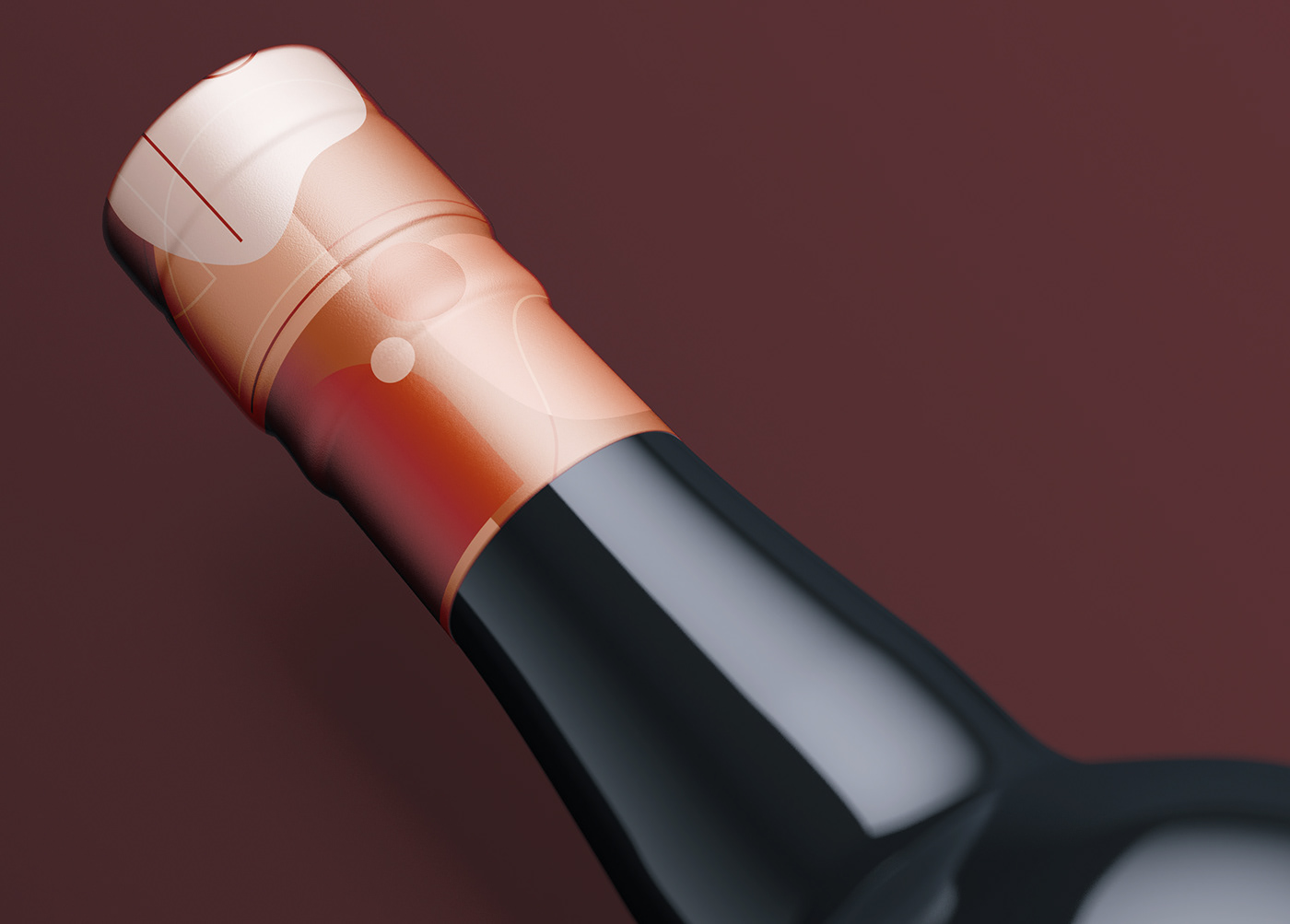
The concept of the packaging series began while planning for my senior thesis. It was inspired by my home state of Connecticut with names and wine descriptions revolving around places in my home town. The series centers on five fruit wines.
When the project began in 2016, the concept relied heavily on watercolors representing the fruit flavors. A watercolor circle on the wine bottle framed the names and a wash could be seen through the bottles. Today’s version consists of abstract compositions using colors representative of the respective fruits.
