In my country, the word "casino" refers to the center of games & night entertainment but also to a place to eat for example inside universities or buildings, similar to a cafeteria, and it sales packaged and prepared food for snack & lunch.
We started observing the actual casino located in our campus and its users (mostly students cursing design & architecture), who spend almost the whole day at the university, adopting this as a "second home".
That's why i took the concept of "domestic", seen, for example, in the notes we left for others as reminders or messages, usually in papers or post-it.
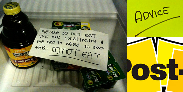
I decided to use the graphic language of the post-it notes, such as the different shades of yellow with black for visual elements. I observed also the gesture in the handwritten notes, usually made with pen or sharpie, considering the calligraphy as a important part of the graphic, looking forward the idea of owning the space and objects, to make you feel as in your home.
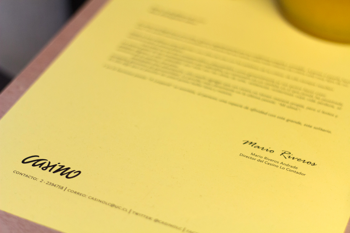
Because of that, i used lettering to design the graphic identity, focused specially in the logo (we couldn't choose a different name, we had to work with the generic word "casino" as requirement)

(a friend helped me in the process of logo design by drawing the letters i asked her to, credits for Constanza Morales for the "paper" version of the logo, which i drew & adjusted after as vector in Adobe Illustrator)

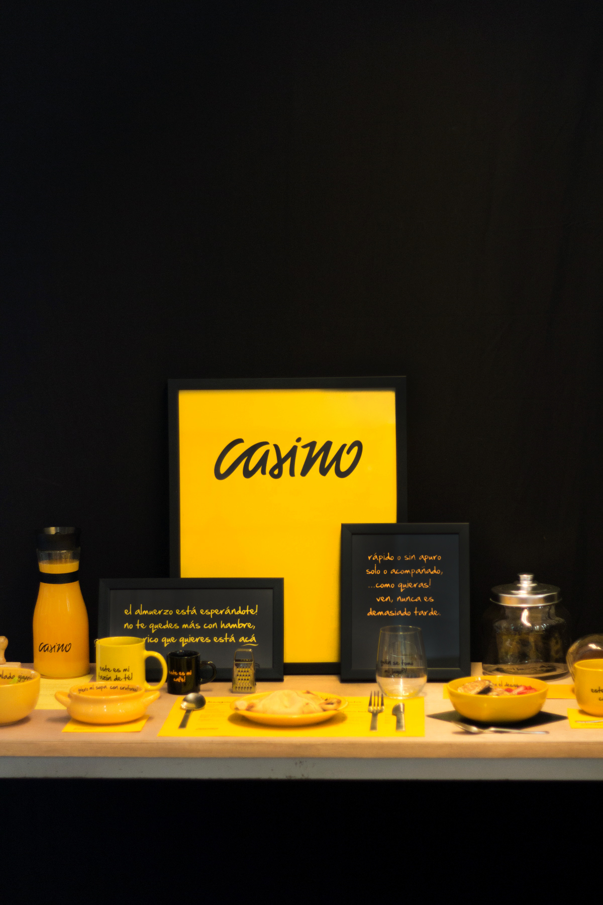
The stationary & Identity played with the different shades of yellow (like in the post-it logo) as a distinctive graphic resource, with the premise of using the yellow as the "blank" or basic color.

The stationary was designed to avoid the need of external or specialized printers, which are expensive, so i used wood rubber stamps instead for the envelope, business cards and others. The letter paper was able to print in a domestic printer using just black ink, what happens to be more coherent with the concept.


For the lunches i said it wasn't allowed to eat in disposable plastic boxes anymore, which is pretty uncomfortable, so i considered crockery (metal, ceramic & glass) instead, the way we eat at home, with dishes and utensils. I played with the shades of yellow in the tableware.

The uniform of the cashier is comfy and keeps the style.
As the casino tries to be domestic and friendly, the employees have a pin which says "Hi, i'm (name) and you?" to have a close approach to the costumers. For sure, the client must be treated nicely.
As the casino tries to be domestic and friendly, the employees have a pin which says "Hi, i'm (name) and you?" to have a close approach to the costumers. For sure, the client must be treated nicely.
The apron goes with "like at home. amiable" (buena onda is slang, so it's hard to traduce)


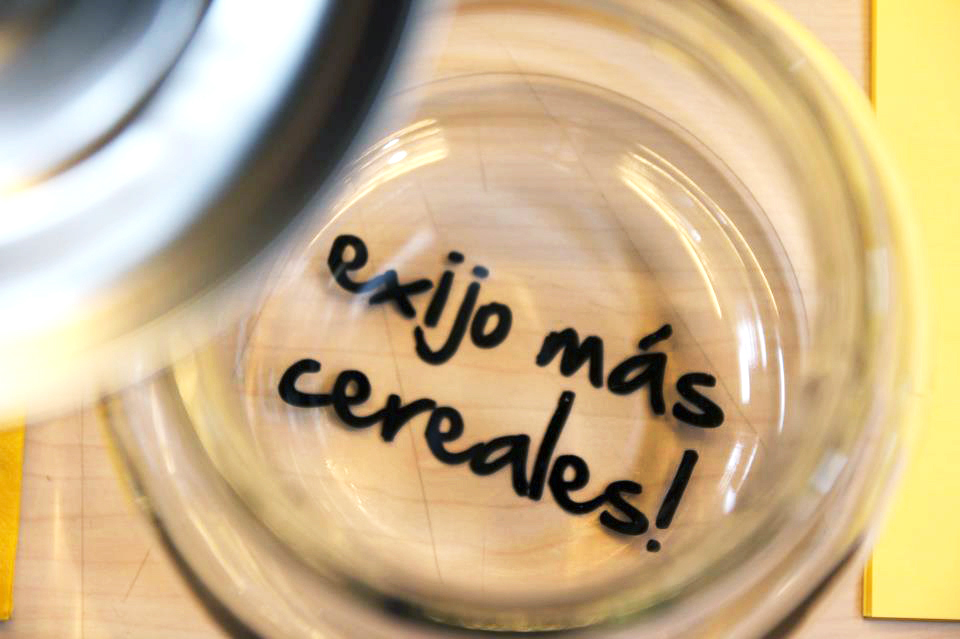
"I demand more cereals!" appears in the bottom of the cereal barrel when it gets empy.
The crockery is interactive & playful, according to the domestic notes concept.

The dishes have apelative phrases that invite you to feel part of or owner of them, such as "this is my coffee".

It's never late for the breakfast (a meal university students usually miss due to the lack of time)

I want my soup with croutons!

The "table paper" works as the menu, where the food no longer available or out of stock can be scratched with a pen or pencil to keep it update.


Finally, designed a lettering sign thought to be outside the casino as a manifest of the "musts", communicating the basic principles to the people who is going to enter.
The style reminds to a blackboard with chalk.

the great manifest. delicious breakfasts. meals. homely lunches. the best soup. desserts & fruits of the day. comfortable ambience. always everything fresh.
Thanks for watching!


