MIE&TEA
Mie&tie is a student project as part of the packaging course at the Department of Graphic Design LNAM.
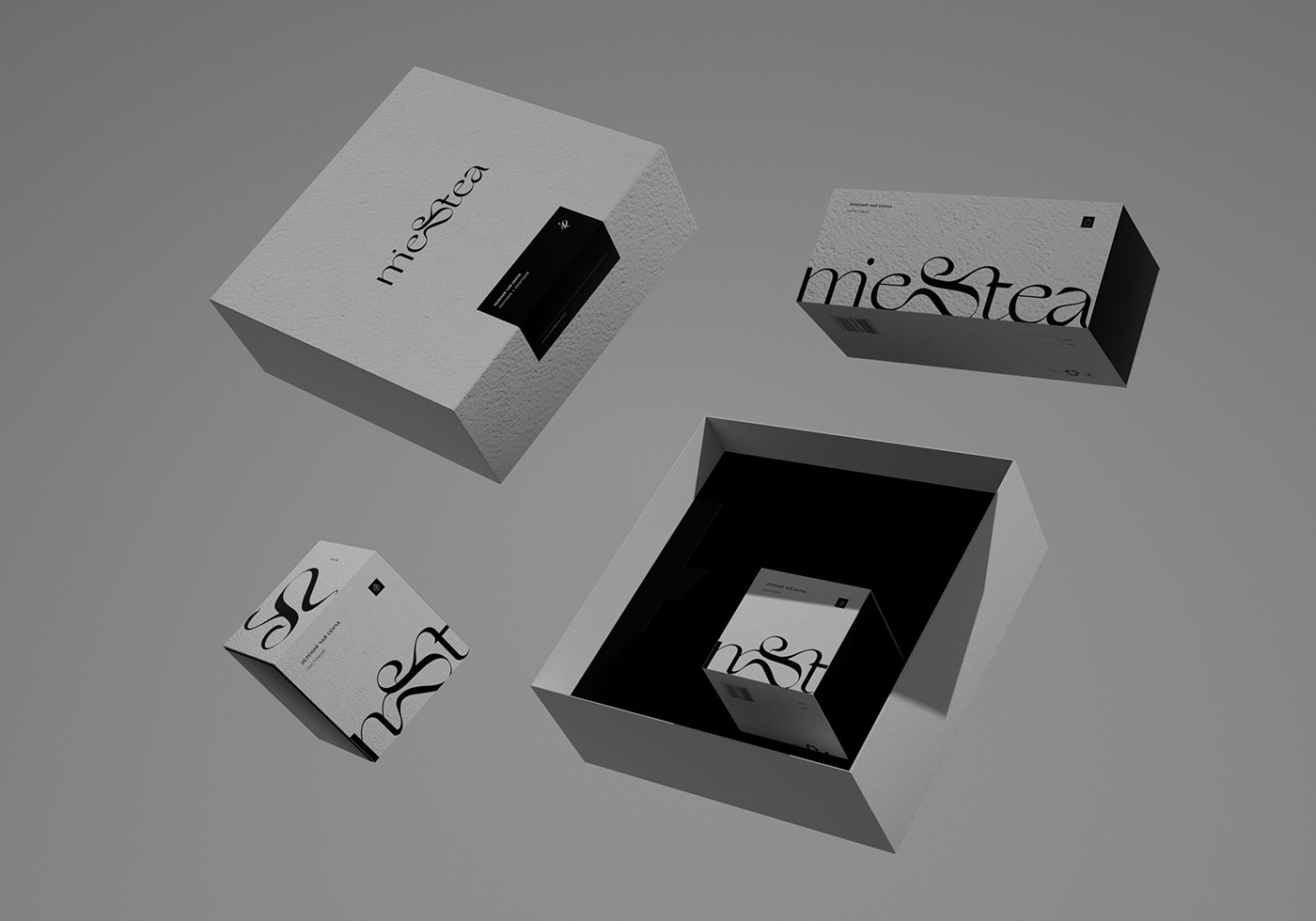
"Mie" prefecture is the third largest tea producer in Japan. The tea region is called Isecha and produces mainly Sencha tea. I set out to create a minimalist, Japan-inspired tea brand with a symbolic logomark and restrained color palette. Unique logo and grey cardboard set the tone for the packaging. The logomark - a combination of the words "mie & tie" - and a simple packaging form emphasizes the spirit of the brand. I had used the 3d visualisation tool for the best material and style representation.
MIE&YOU