Royal Mail 'Rethink'
-- ICON Magazine
-- ICON Magazine
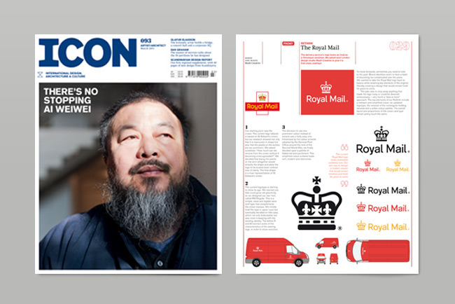
Mash Creative were commissioned by ICON magazine to ‘Rethink’ the Royal Mail identity as part of the magazines ongoing feature.
---
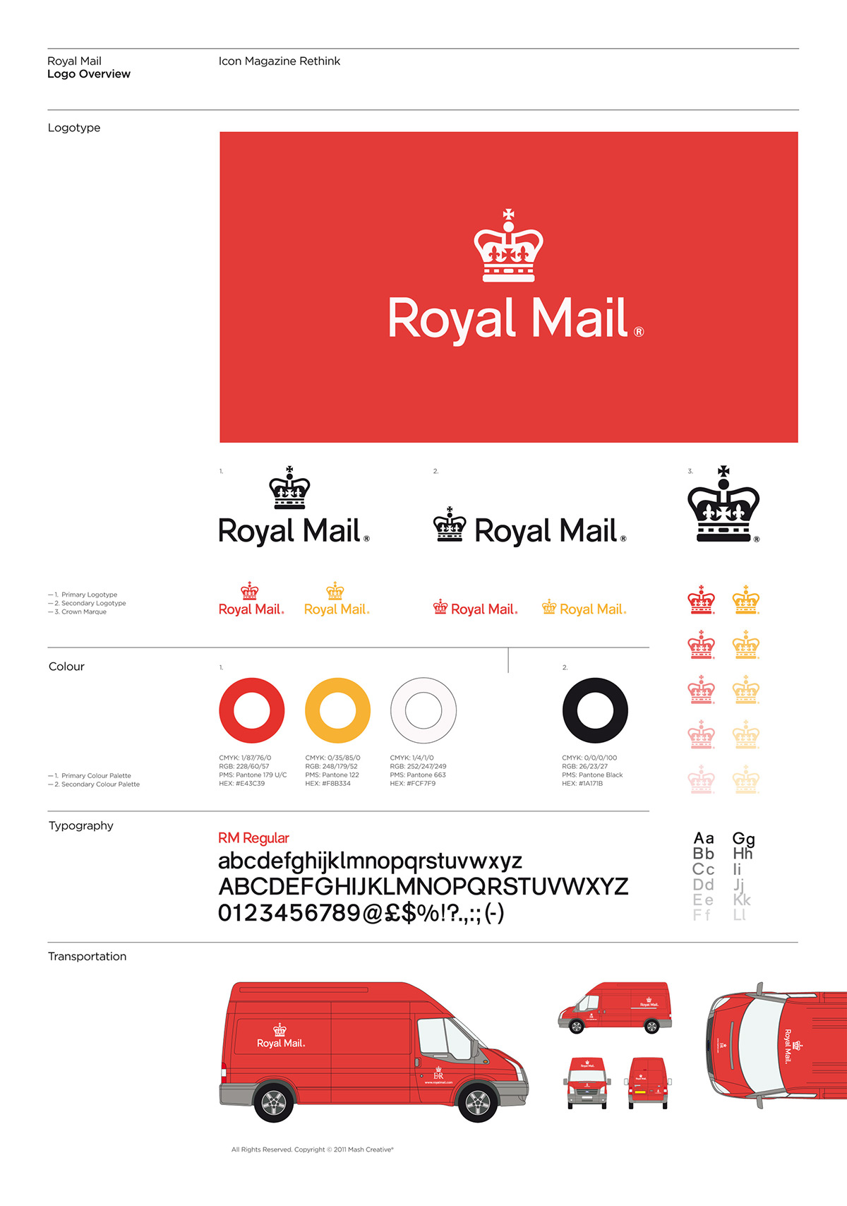
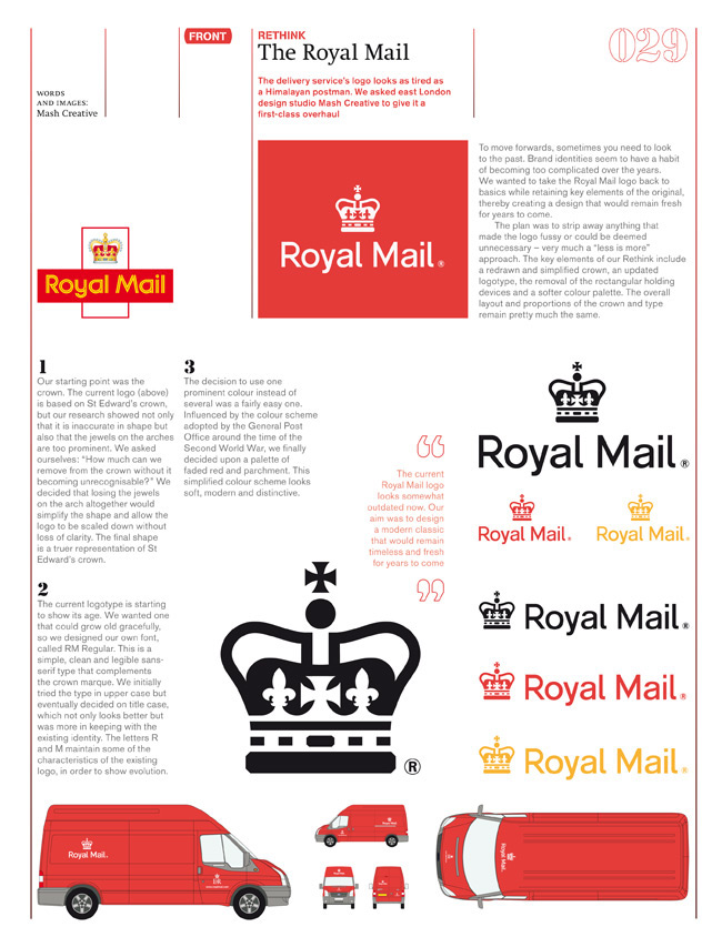
To move forwards, sometimes you need to look to the past. Brand identities seem to have a habit of becoming too complicated over the years. We wanted to take the Royal Mail logo back to basics while retaining key elements of the original, thereby creating a design that would remain fresh for years
to come.
---
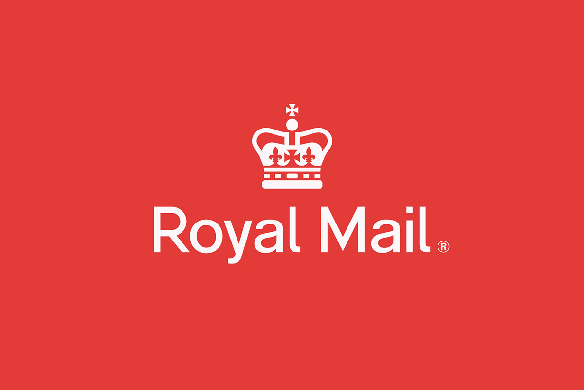
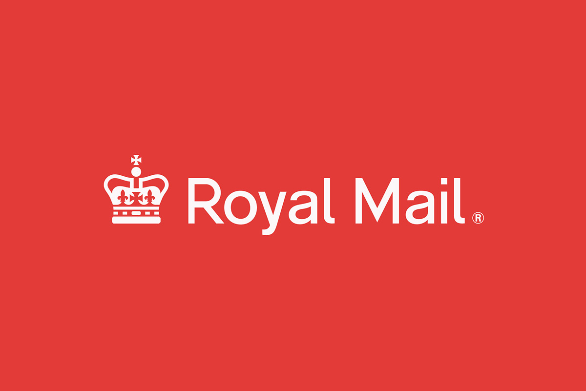
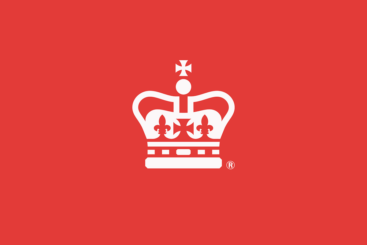
The plan was to strip away anything that made the logo fussy or could be deemed unnecessary – very much a “less is more” approach. The key elements of our Rethink include a redrawn and simplified crown, an updated logotype, removal of the rectangular holding devices and a softer colour palette. The overall layout and proportions of the crown and type remain pretty much the same.
---
Our starting point was the crown, the current logo is based on St Edward’s crown, but our research showed not only that it is inaccurate in shape but also that the jewels on the arches are too prominent. We asked ourselves: “How much can we remove from the crown element without it becoming
unrecognisable?” We decided that losing the jewels on the arch altogether would simplify the shape and allow the logo to be scaled down without any loss of clarity. The final crown shape is a truer representation of St Edwards crown.
---
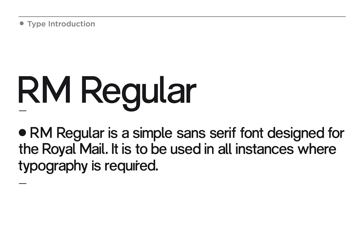
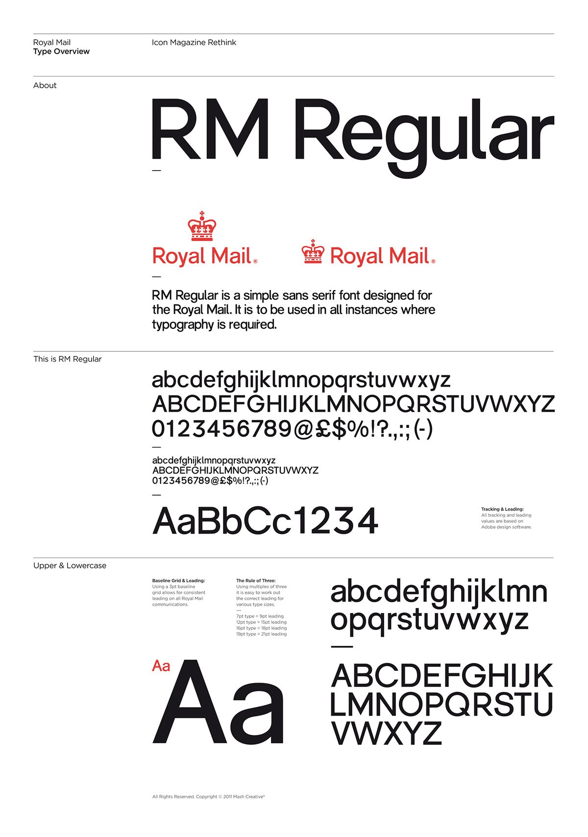
The current logotype is starting to show its age. We wanted one that could grow old gracefully, so
we designed our own font called RM Regular. This is a simple, clean & legible sans-serif type that complements the crown marque. We initially tried the type in upper case but eventually decided on title case, which not only looks better but was more in keeping with the existing identity. The letters
'R' and 'M' maintain some of the same characteristics of the existing logo to show evolution.
---
The decision to use one prominent colour instead of several was a fairly easy one to make. Influenced by the colour scheme adopted by the GPO (General Post Office) around the time of the Second World War, we finally decided a palette of faded red and parchment. This simplified colour scheme looks
soft, modern and distinctive.
---
Mash Creative would like to say a special thank you to Shazia, Jon and the team at ICON magazine
---
To move forwards, sometimes you need to look to the past. Brand identities seem to have a habit of becoming too complicated over the years. We wanted to take the Royal Mail logo back to basics while retaining key elements of the original, thereby creating a design that would remain fresh for years
to come.
---
The plan was to strip away anything that made the logo fussy or could be deemed unnecessary – very much a “less is more” approach. The key elements of our Rethink include a redrawn and simplified crown, an updated logotype, removal of the rectangular holding devices and a softer colour palette. The overall layout and proportions of the crown and type remain pretty much the same.
---
Our starting point was the crown, the current logo is based on St Edward’s crown, but our research showed not only that it is inaccurate in shape but also that the jewels on the arches are too prominent. We asked ourselves: “How much can we remove from the crown element without it becoming
unrecognisable?” We decided that losing the jewels on the arch altogether would simplify the shape and allow the logo to be scaled down without any loss of clarity. The final crown shape is a truer representation of St Edwards crown.
---
The current logotype is starting to show its age. We wanted one that could grow old gracefully, so
we designed our own font called RM Regular. This is a simple, clean & legible sans-serif type that complements the crown marque. We initially tried the type in upper case but eventually decided on title case, which not only looks better but was more in keeping with the existing identity. The letters
'R' and 'M' maintain some of the same characteristics of the existing logo to show evolution.
---
The decision to use one prominent colour instead of several was a fairly easy one to make. Influenced by the colour scheme adopted by the GPO (General Post Office) around the time of the Second World War, we finally decided a palette of faded red and parchment. This simplified colour scheme looks
soft, modern and distinctive.
---
Mash Creative would like to say a special thank you to Shazia, Jon and the team at ICON magazine