


Jot Literary Journal
Publication Design
For this double headed journal, I wanted to create a publication that could potentially last for an indefinite amount of issues. One side of Jot focuses on a writer’s poetry, the other on their prose. Each issue a new author is highlighted. I wanted to bring the voice of long dead but incredibly influential writers into the modern day where their ideas still have the power to change the world.

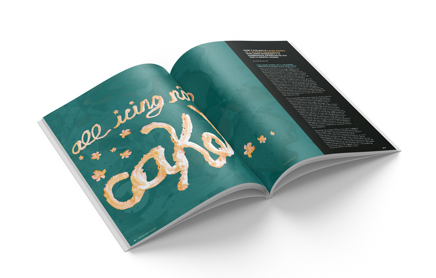
Side 1 of Jot is focused on poetry. My goal was to develop a visual voice that echoed the experimental and bold aspects of poetry. I did this through bright colors, high contrast, and blocky sans type.


Side 2 of Jot is focused on prose. My goal was to develop a visual voice that echoed the elegant and organic aspects of prose. I did this through soft colors, nature illustrations, and serif type.


