


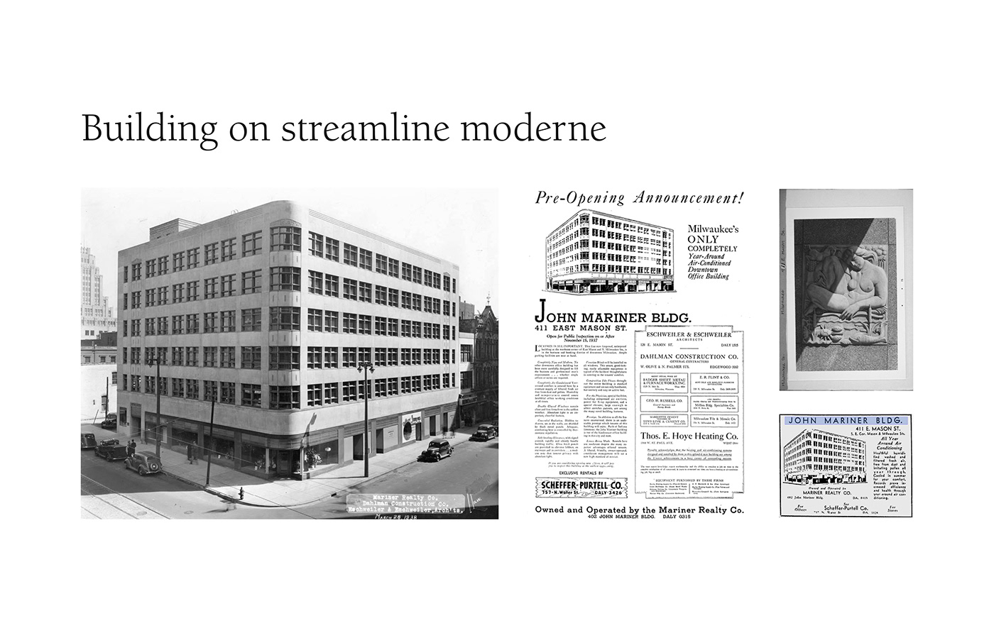
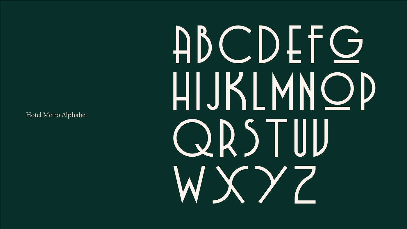
The hotel's building was created during the height of the streamline moderne. Long lines, subtle curves and repetition inspired the brand's overall aesthetic. Not to be confused with art deco, the building had a softness that reflected the time period and we used that as inspiration to include small moments of design to create a more modern brand.


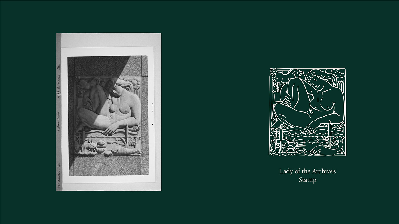
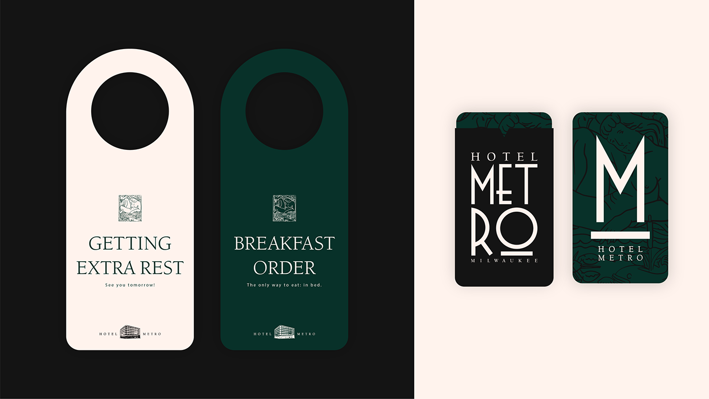
While combing through the historic archives, we found an unmarked piece of art that was associated with the property. Unable to locate the physical location of this piece, we wanted to let her live on in the hotel's branding and created a stamp. Dubbed "Lady of the Archives," she was used as an architectural element that grounded copy or provided texture.
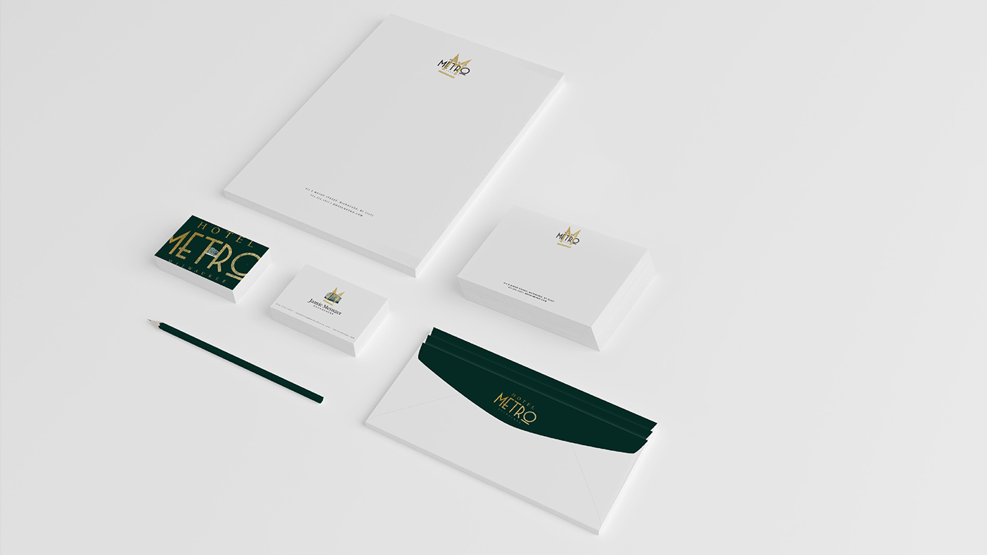
To create a personal touch, we created stationary that had a gold stamp hand-pressed over the logo. We wanted the guests to experience personal touches throughout their stay. These were a small nod to the historic Milwaukee Railroad Company that would hand-stamp passes of railroad passengers during the height of Milwaukee's railroad travel during the time of the building's construction.
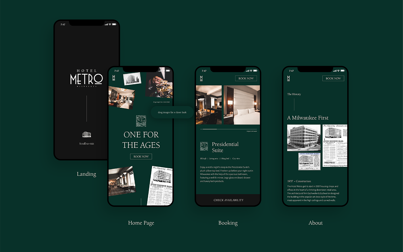
We concepted a website that allowed you to explore the history of Hotel Metro through polaroid-style images you could drag around on the home page. We wanted to create an experience that encouraged people to wander, dig and learn more about the hotel's history.


