Wehome is a high-end property management platform. With about 150 apartments and houses in its portfolio, the company is dedicated to taking care of all the steps and details, including the preparation of the advertisement and production of photos until the decoration and cleaning to receive new guests.
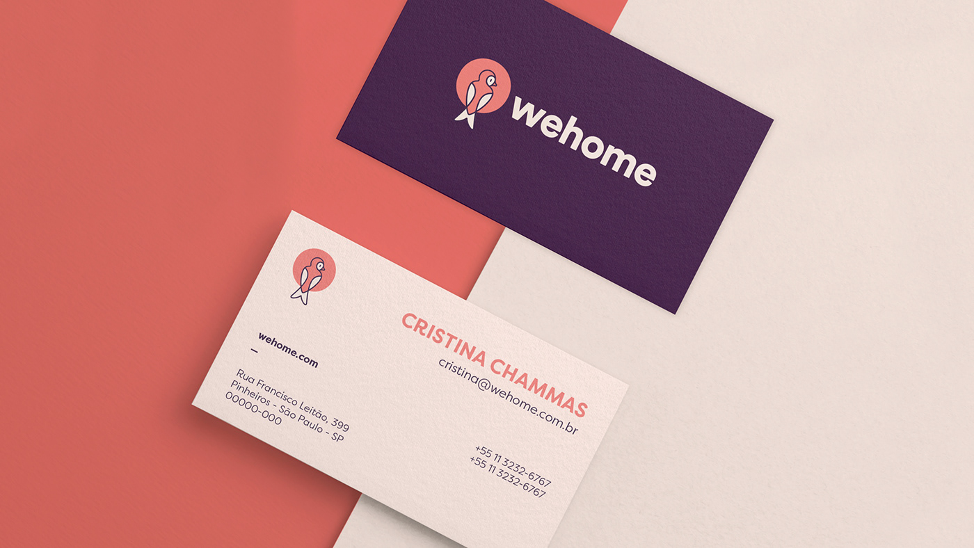
Taking into account the history already built and established with its audience on top of its symbol (a swallow) and color palette, we were approached with the challenge of reviewing the company's brand and visual identity, so that its personality continued to reinforce the relationship of affection and hospitality between the platform and its customers, but that, at the same time, evolved into a more contemporary and solid presence.
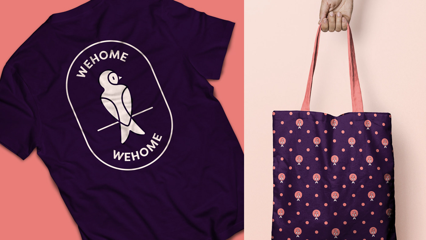
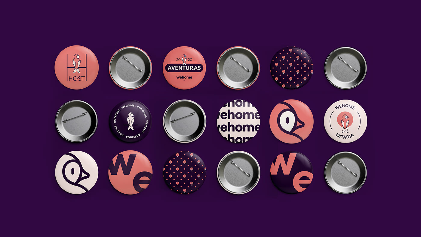
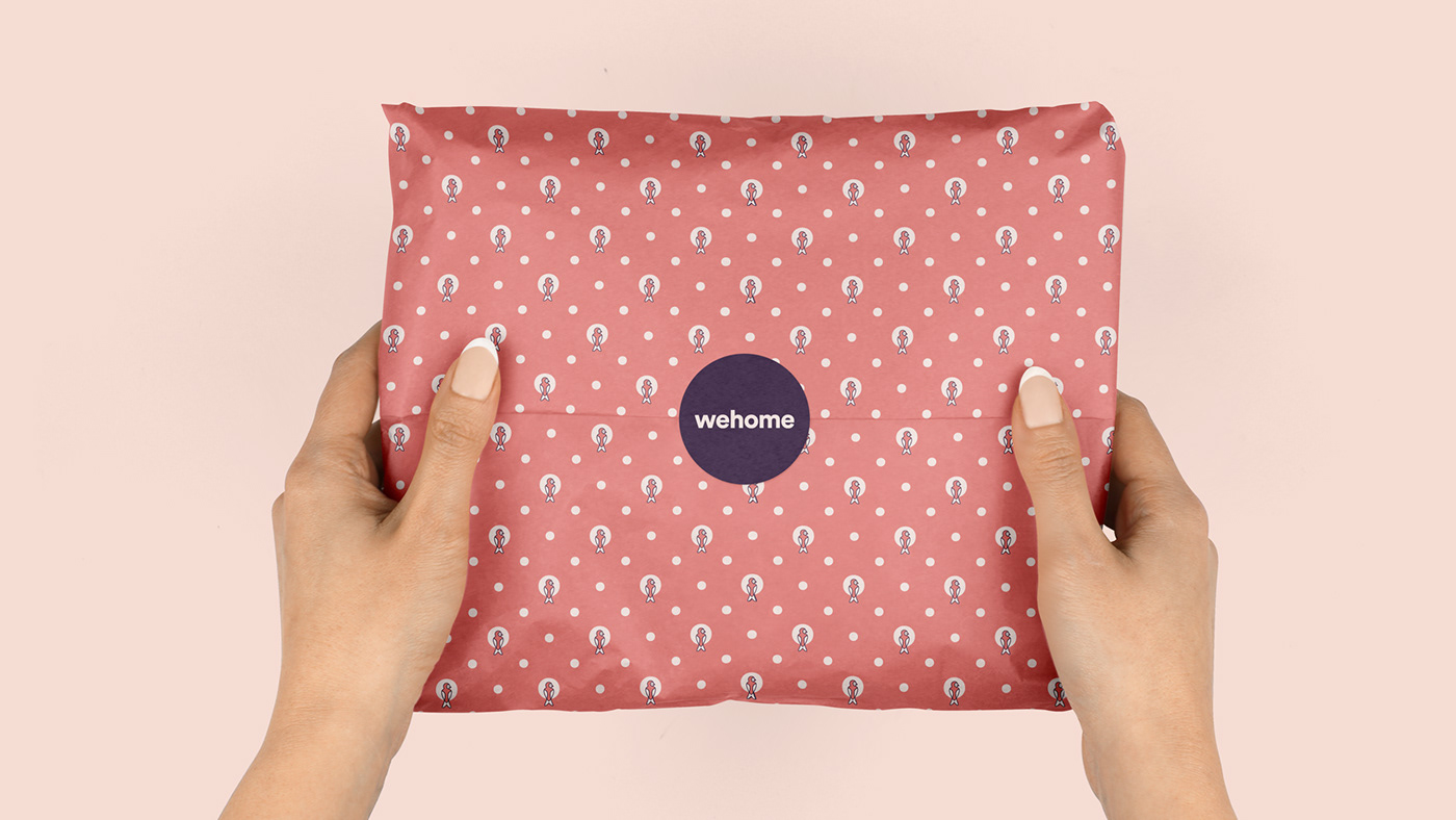
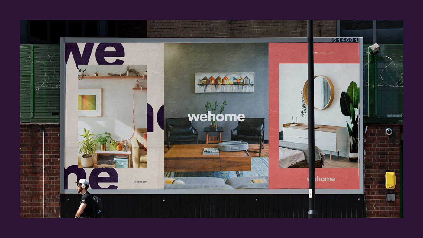
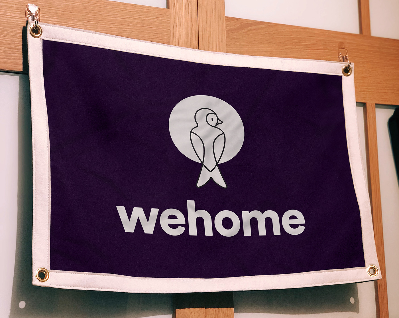
Protecting the entrance from outside the house, or contemplating the view through the window, from the inside, the new design respects the company's history, keeping the swallow as a symbol, but also creates a new narrative, from two points of view that lead users to connect with the brand in a close and true way. In addition to the symbol, we've designed a custom font for the wordmark and revisited the color palette to more balanced and distinct tones. For the identity we created an integrated system that brings different graphic elements and visual moments, allowing the brand to communicate with different intensities and a striking personality.