


Eatery on the Green Brand
Hardly discouraged by the end of their previous business venture, Stackers Diner, the newly married super couple Nicole and Glen Cherlet took over the kitchen at the Revelstoke Golf Course and named it Eatery on the Green. Pleased with the work I did on their Stackers brand, they hired me to handle the new brand.
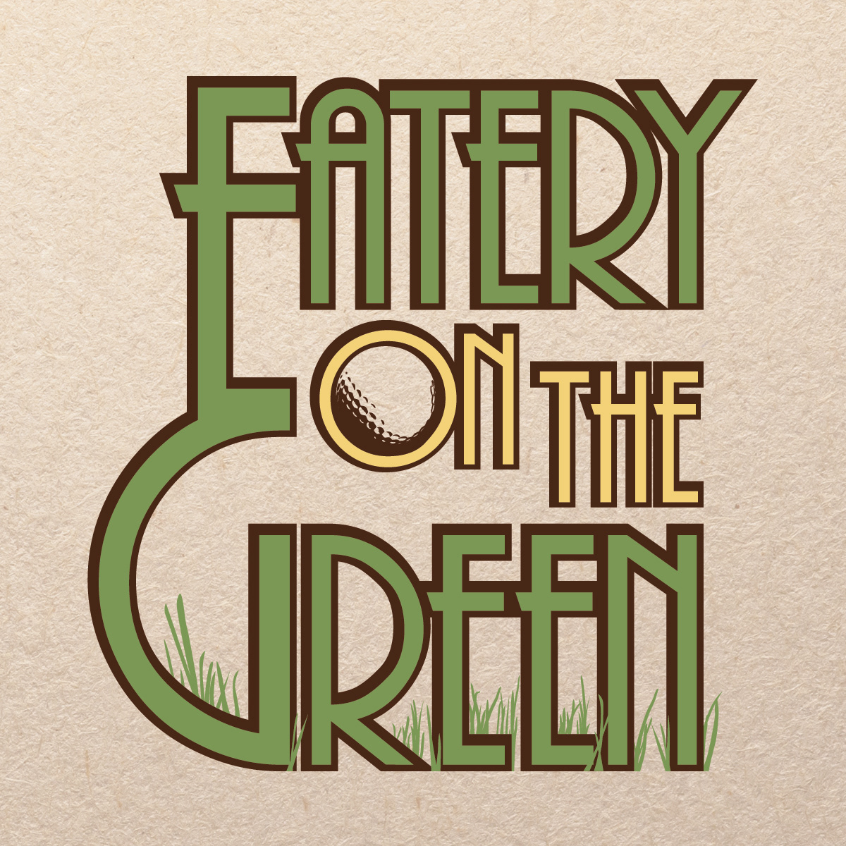
During their brief operation of the Stackers food truck, Nicole and Glen attracted quite a following in Revelstoke. As such, they hoped to keep a bit of the feeling of the Stackers brand alive in the Eatery's design. To that end, I carried over the font and colour palette from Stackers. Given the location of the restaurant within the golf club, they insisted on encorporating the golf theme into the logo, as such the shadow of a golf ball was subtlly implanted within the "O" in "ON" and blades of grass were added around the bottom of "Green" to give the logo a little life and depth.
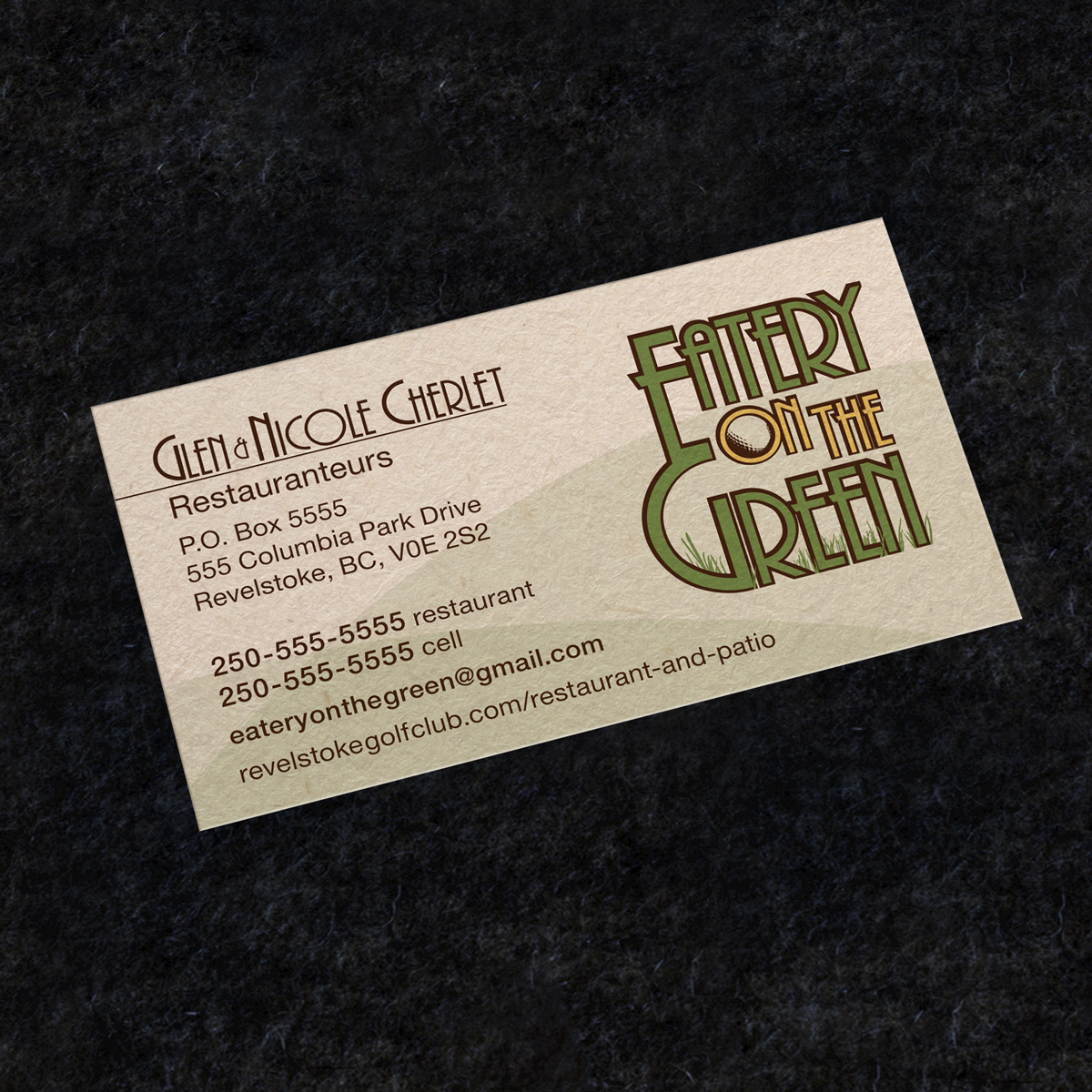
Nicole and Glen needed a single sided business card, and had a lot of information to fit on it, so I created a clean and simple design, with some subtle hill shapes in the background to add visual interest. The dark shade of brown and various shades of green were specifically intended to be printed on recycled paper for an earthy feeling.

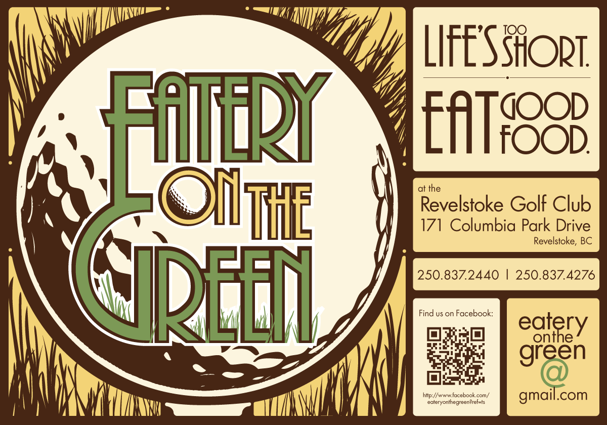
For their grand opening, Nicole and Glen requested a poster be made to put up around town. The poster needed to stand out from other advertisements, establish a general brand for the restaurant, and communicate several important pieces of information at a glance. The couple also had a limited budget for marketing, so a the poster was designed to be printed on from a digital printer, with simple colour palette and a simple, bold design.
As the location of the restaurant was an historic location, the inspiration for the poster design was strongly influenced by Art Nouveau posters of old, applied to a golf theme.
As the location of the restaurant was an historic location, the inspiration for the poster design was strongly influenced by Art Nouveau posters of old, applied to a golf theme.
After a successful grand opening, the Eatery needed a general poster to go up at the Revelstoke community centre. They were happy with the design of the previous poster, so I carried forward the design, but applied it to a landscape format to make it stand out even more among the town's assortment of advertisements.
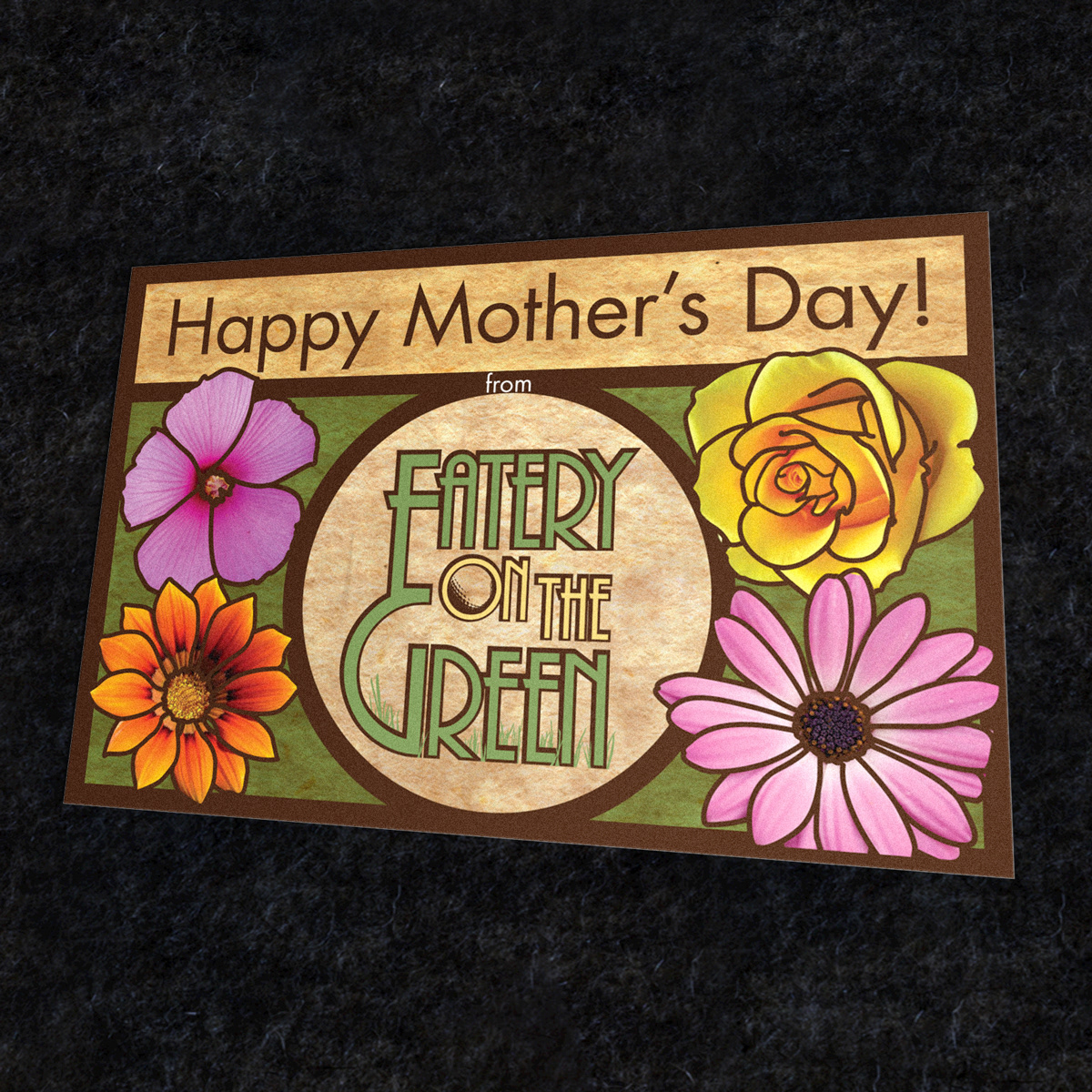
Come Mother's Day, the owners decided to put out gift cards entitling the purchaser's mother to a feast. For this, I carried forth the Art Nouveau style of the posters and added a distinct spring theme with the flowers. The result was the appearance of a stained glass window.
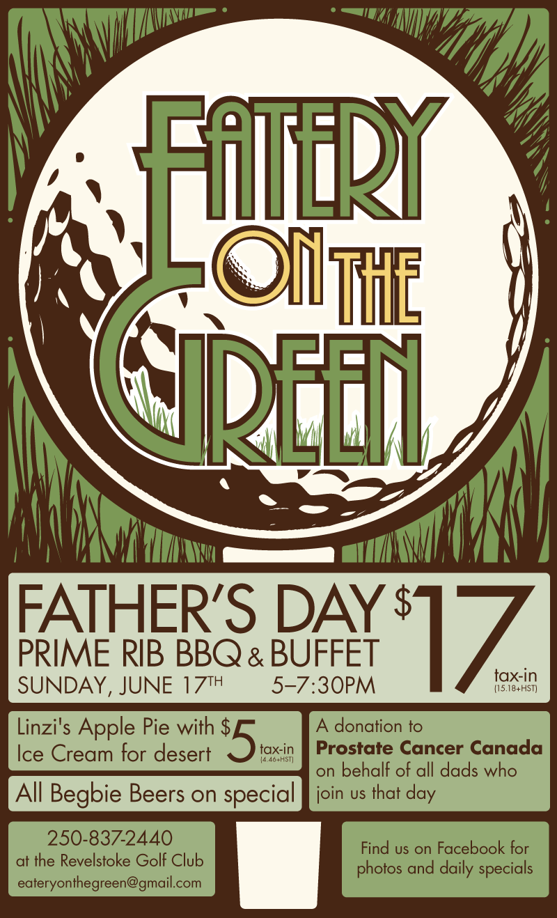
For Father's Day, the couple asked for another poster design. They wanted essentially the same design as the first poster, the colour of which I changed to a green theme to easily allow passers-by to differenciate between this poster and the first.
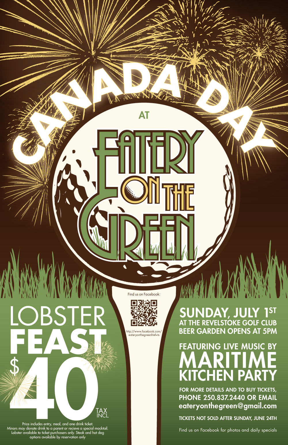
For Canada Day, the couple wanted to do something special, and needed a special poster to advertise. As there would be a fireworks display on the golf course, I used the fireworks concept to add interest and meaning to the poster.

Toward the end of summer, the owners hired me to design a poster for a tropical themed pig roast party they were throwing jointly with the golf course management. As this wasn't exclusively an Eatery on the Green event, the poster needed to look different from the usual Eatery brand.
The entire image was drawn by hand in Adobe Illustrator from observation of a photograph of the golf course.
The entire image was drawn by hand in Adobe Illustrator from observation of a photograph of the golf course.


