


Camaleón - the fragrance that blends with you
This idea was inspired, as its name suggests, in the qualities and characteristics of the chameleon. A reptile with the ability to change the color of its scales according to the environment, its emotions and the place where it is located. This very interesting effect, which has fascinated the human being over the years, is an inspiration for the wide variety of disciplines within the world of design.
'Camaleón' enhances the natural essence of each person, merging with them as a chameleon would do with its environment. The fragrance creates a different smell depending on the person that wears it, which makes our perfume unique and genderless. An exclusive product that blends with the natural essence of each person like the chameleon camouflages with nature.

All these characteristics led us to the physical composition of the product. To begin with, the complete fragrance along with its cap, imitates the position in which we usually find a chameleon in nature: perched on its branch. That is the reason why our product is handled completely backwards.
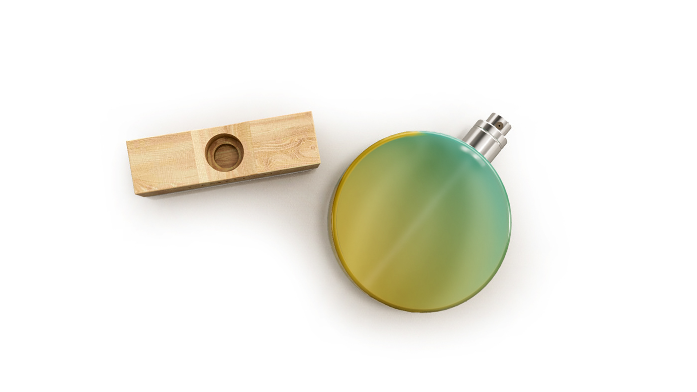
The branch, where normally chameleons are found in nature, is represented by the cap of the bottle as the base. It is made out of wood because it’s the most suitable material to hold the whole bottle straight up due to its thickness and size. On the other hand, a rounded shape was used to represent the bottle itself, as a tribute to all the circular parts of the chameleon's body: tongue, tail and 360º rotational eyes. Both the cap and bottle try to be representative and truthful with all the peculiarities of the reptile, which are what makes it so special.


This perfume is not only focused in the aromatics but also in the user experience when applying it. The need to turn the bottle over to apply it has been inspired by the rotation of its eyes and rolling up of its tongue and tail. The colors of the product are degraded, melting through the bottle with a frosted glass effect, imitating the chameleon’s camouflage in the wild.

The naming of the product was clear from the beginning, since it had a lot of strength and represented everything that wanted to be transmitted. In addition, the chosen typeface was key in the design of our branding. The letter "O" of the word "Camaleón" has an accent mark in Spanish, making a small nod to the shape of the fragrance itself and the accent mark, especially before the unboxing.
The rest of the elements, shampoo, gel and perfumes, are solid and follow the chameleon aesthetic previously mentioned. In this way, we reduce the use of extra packaging in order to be more environmentally friendly. In addition, the solid perfume would come in a metal container, so that the user can transport it freely after its purchase.

Thank you!
MA in Packaging Design - ELISAVA
Project - Fragrance packaging.
Tutor - Pati Nuñez.


