

The Speed of Time
Short Film
Key Art & Title Treatment

The final poster. Keep reading to see how I designed it.
Another poster for brilliant director, William Stribling. I have done work for him in the past with his web series "Stellar People". This time his sci-fi style blends with crime fighting comedy with a 12-minute short/proof of concept, The Speed of Time. After watching the short, receiving some reference photos, and hearing the desired direction, I came up with these four ideas.


As you probably guessed, the winning draft was the close-up face with the lowered sunglasses, an obvious winner to show off the face of the main character, played by John Hennigan(aka. John Morrison) of the WWE. After that was chosen, the next obstacle was the layout of the cast members inside his glasses. I knew the villain's arm was a good frame for the right edge so I kept that consistent as well as that great shot of the arm with the gun reaching over to the left side of the sunglasses. Here are those first arrangements of the cast that would then be drawn over and shaded.


The next hurdle was getting a solid title treatment for the poster that could be used across the short itself and in marketing material. I drew a few stylized titles and made a sheet of fonts that had a good sci-fi feel to them. I knew that neon lights were the desired look but I was looking for anything that could pass as a light-up display, neon or not(ie. pinball panels, beer signs etc...).


I got word that No. 7 was the winning font and although I played with the layout of that font in my draft, I still knew it could go a step further. I pulled the individual letters and skewed the entire grouping to give it some motion.


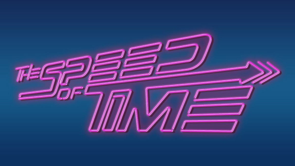
The final title treatment with neon effect added to the font
Put it together and what have you got?


The Speed of Time


