


Voa is a brazilian chain that transforms old hotels into brand new ones with cozy spaces and ready for the digital age. We gave body to the brands’ Transformation purpose by creating a logotype that can be read from multiple points of view, like magic.


Voa means "to fly" in Portuguese - so we decided to turn the letter v into a cute bird character, sketching all kinds of possibilities for him while staying at one of Voa hotels.


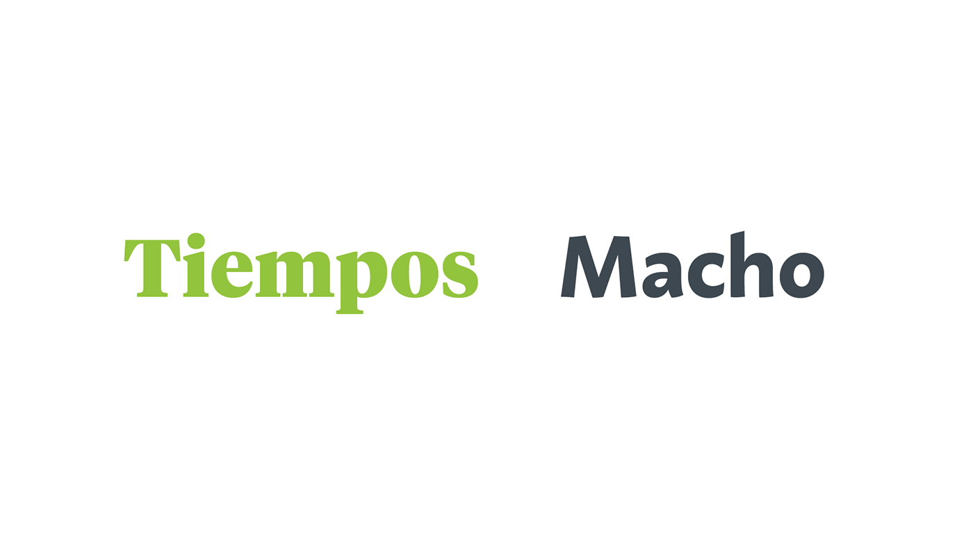
Tiempos Headline Black (Klim Type Foundry) and Macho (Dada Studio) composes the typographical palette. To bring more personality to the set, we created a custom set of numerals based on the logotype.


Credits
Creative Direction: Carlos Mignot
Strategy: BrandGym: Guta Tolmasquin, Davi Joszef
Graphic Design: Rodrigo Saiani, Carlos Mignot, Ana Laura Ferraz, Gabriel Menezes, Aline Caruso, Valter Costa
Lettering & Type Design: Carlos Mignot and Rodrigo Saiani
Architecture: Fingers Design
Lettering & Type Design: Carlos Mignot and Rodrigo Saiani
Architecture: Fingers Design


