


Case Study > Studio Potts
WeDiscover With experience leading Deliveroo to be one of the biggest brands in the world, and the ambition of starting his own paid search agency to solve the same paid search problems for other businesses, Byron Tassoni-Resch - Founder of reached out o Studio Potts for a comprehensive branding service.


The Brief
The challenge was to streamline knowledge, bring clarity to the company's direction, build the brand and create a compelling identity that captures their authenticity. It needed to demonstrate high specialism, bold movements and innovative culture that promises ambitious, leading results to prospective clients.


Our Approach
Throughout the 'Discover' phase, we identified goals, ambitions and competition. Built customer profiles, analysed the target demographic and psychographics to figure out their ideal audience and how they behave as a consumer - identifying their needs and unfilled needs. Enabling us to map out situations in which they need to interact - touchpoints. During the 'Build' period, we used the strategy to inform the creation of the brand. Refined the brand's authentic story, developed its attributes to align with the client's needs, outlined the company's key messaging and devised an appropriate name that captures the essence of the business. Through the 'Connect' stage, we designed the brand visuals. The logo & identity system, relevant assets and guidelines that frame how to use visuals effectively. Compelling and effective designs relative to the WeDiscover brand across touchpoints; business cards, presentation template, social media and website.


Our Solution
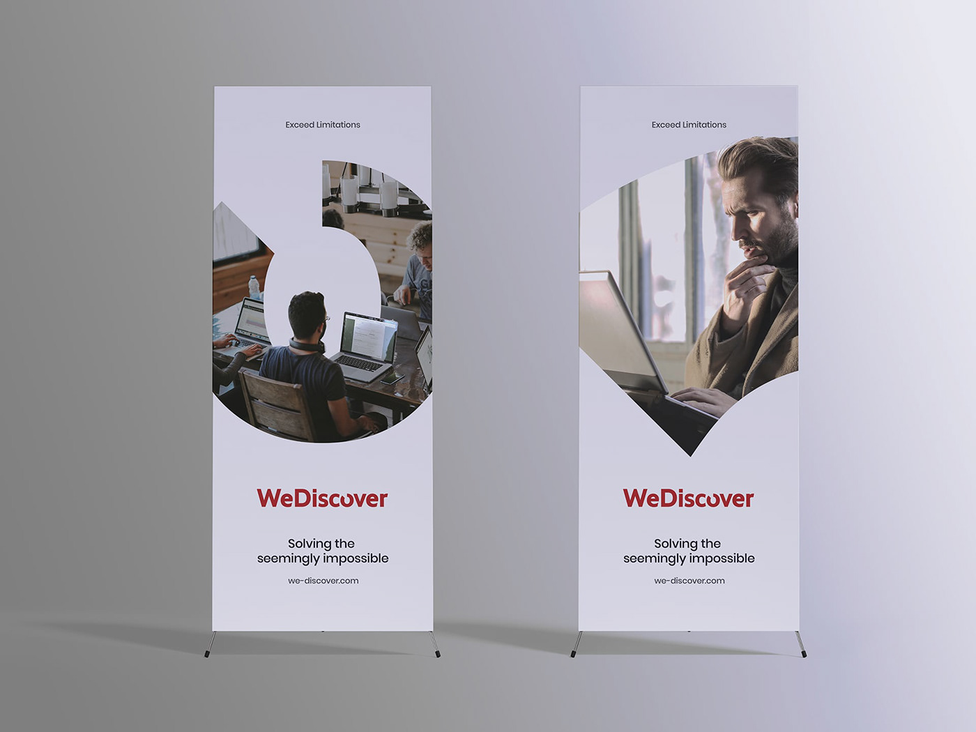
"WeDiscover" captures the brand promise - offering a paid search service, improves the chances of a consumer discovering an organisation, product or service. Discover is the end product of the search service, and the visual identity celebrates this process. The wordmark crafted focuses in on the concept of the company helping its clients reach paid search marketing totality. Within the logo, the 'o' is missing part of its original shape - referred to as the missing piece. This piece runs throughout the company's touchpoints - representing the journey between the company and its clients, collaboratively discovering the missing piece in their paid search marketing with one goal in mind - exceeding limitations. The corporate colour palette of red, blue and white is indicative of leadership, immediacy, stability, expertise and empowerment, reflective of the company's endeavour and target market.

"The process of creating, designing and launching the brand with Studio Potts and Luke has been great. The project was very well organised, each milestone deadline was hit, the quality of the work has been superb. And just generally, Luke is a great guy who has a real interest and passion for your business."
Byron Tassoni-Resch. Founder & Managing Director at WeDiscover.


