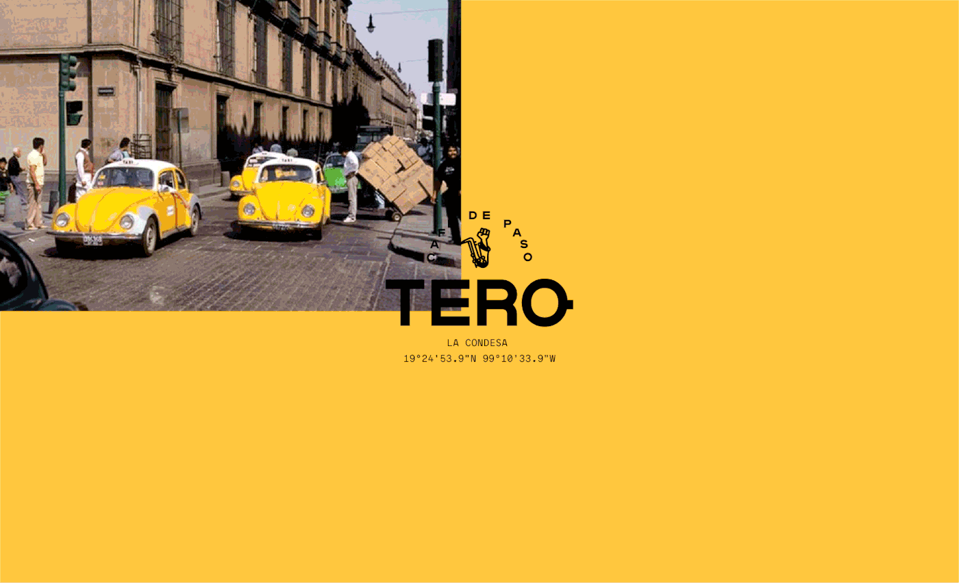
Tero
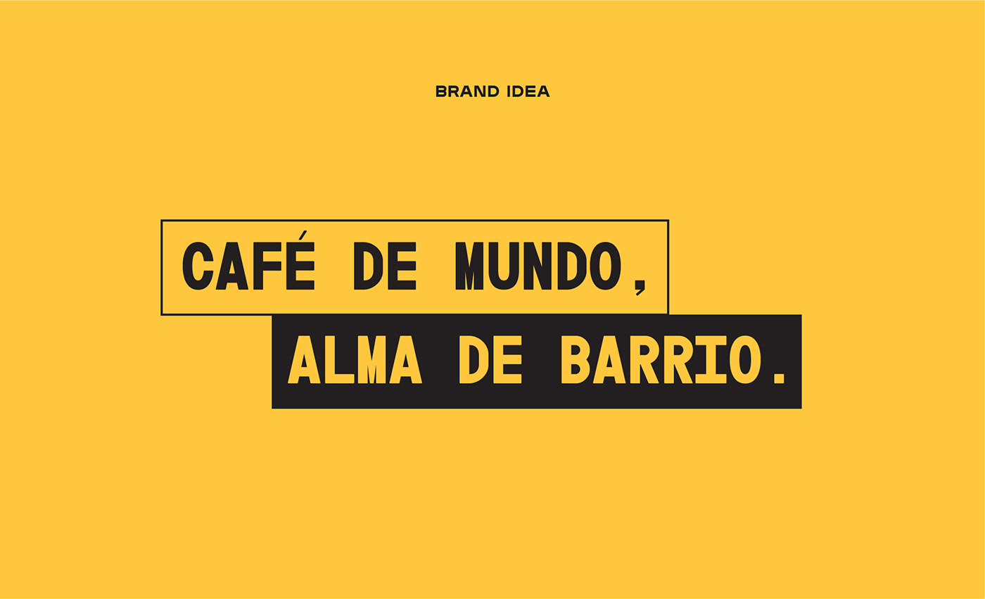
Tero is an on-the-go coffee shop inspired by the distinctive neighborhoods in Mexico City.
Busy cities have busy people, and busy people love starting their day with a great cup of coffee. But if you're busy, you don't have time to be looking around for a coffee shop and even less time to be standing in a line that just won't move. Tero has a coffee shop in every neighborhood in the city so you can get your coffee on your commute to work, your way home or on a Sunday stroll.
Find Tero, get your coffee and keep going. No lines, no hassle, always great coffee.


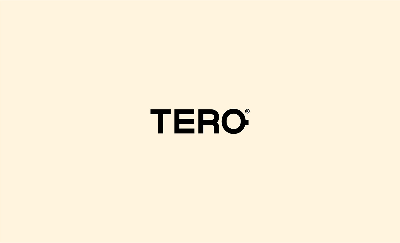
The Wordmark
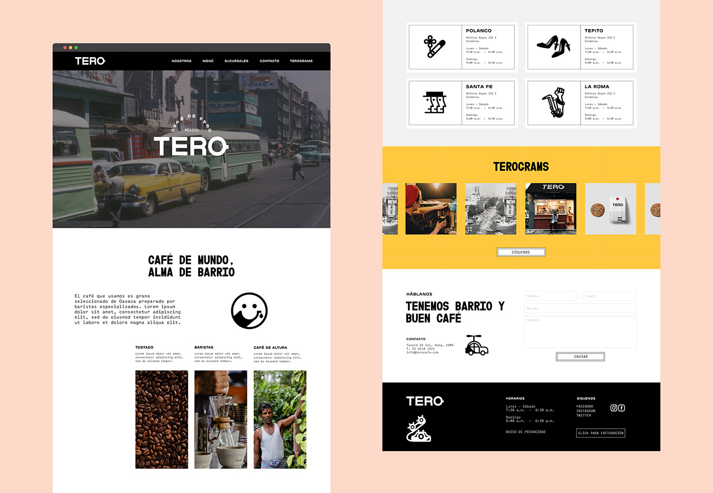
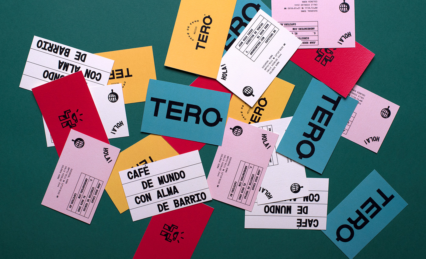
The wordmark for Tero features a bold, strong type that stands out in a busy city. The detail of the letter "O" mimics the way a coffee cup looks from a top view. The logo gives the brand a bold personality and acts as a baseline to counteract the craziness.
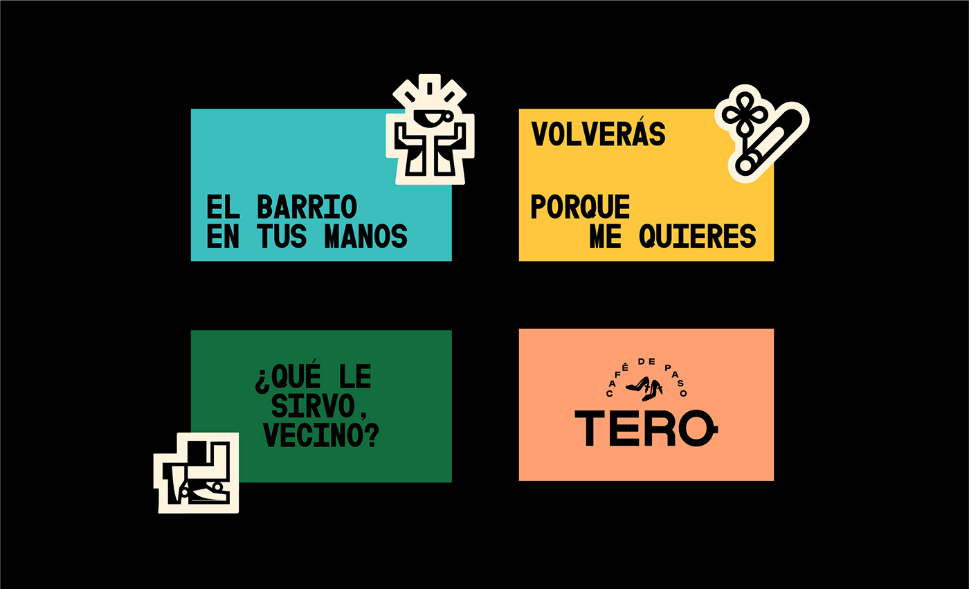
The logo has a different lock up and style depending on each location. We use the tagline within each lockup but change the icon to represent each neighborhood. Each location is also depicted by name but most importantly by their specific coordinates.

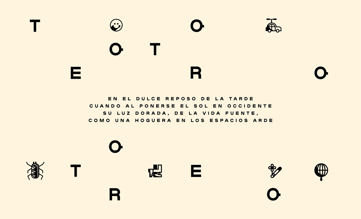
Iconography
Mexico City is a city of rare characters and big personalities. Because Tero is based on this city we needed to create an element that would harness all the quirks and traits. The iconography for Tero is as bizarre as it gets. The set of surreal icons really portrays Mexico's crazy side. Cigarettes, ducks, balloons, cars, heels, Mexico City has it all and so does Tero.

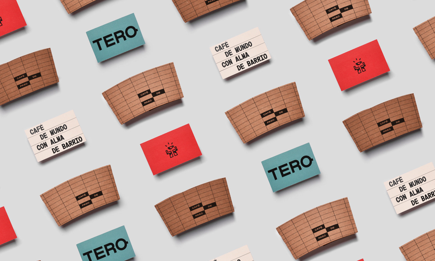
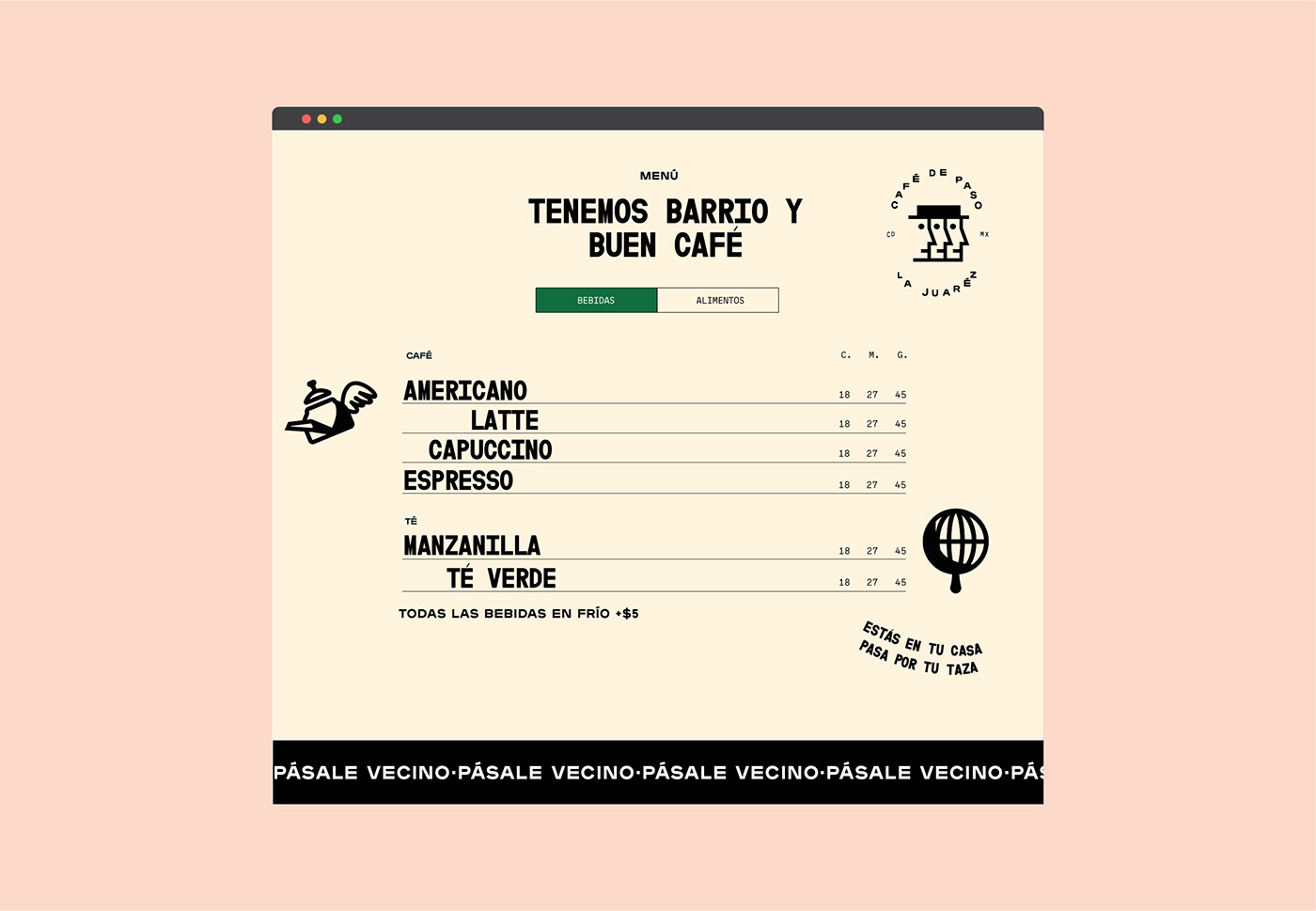
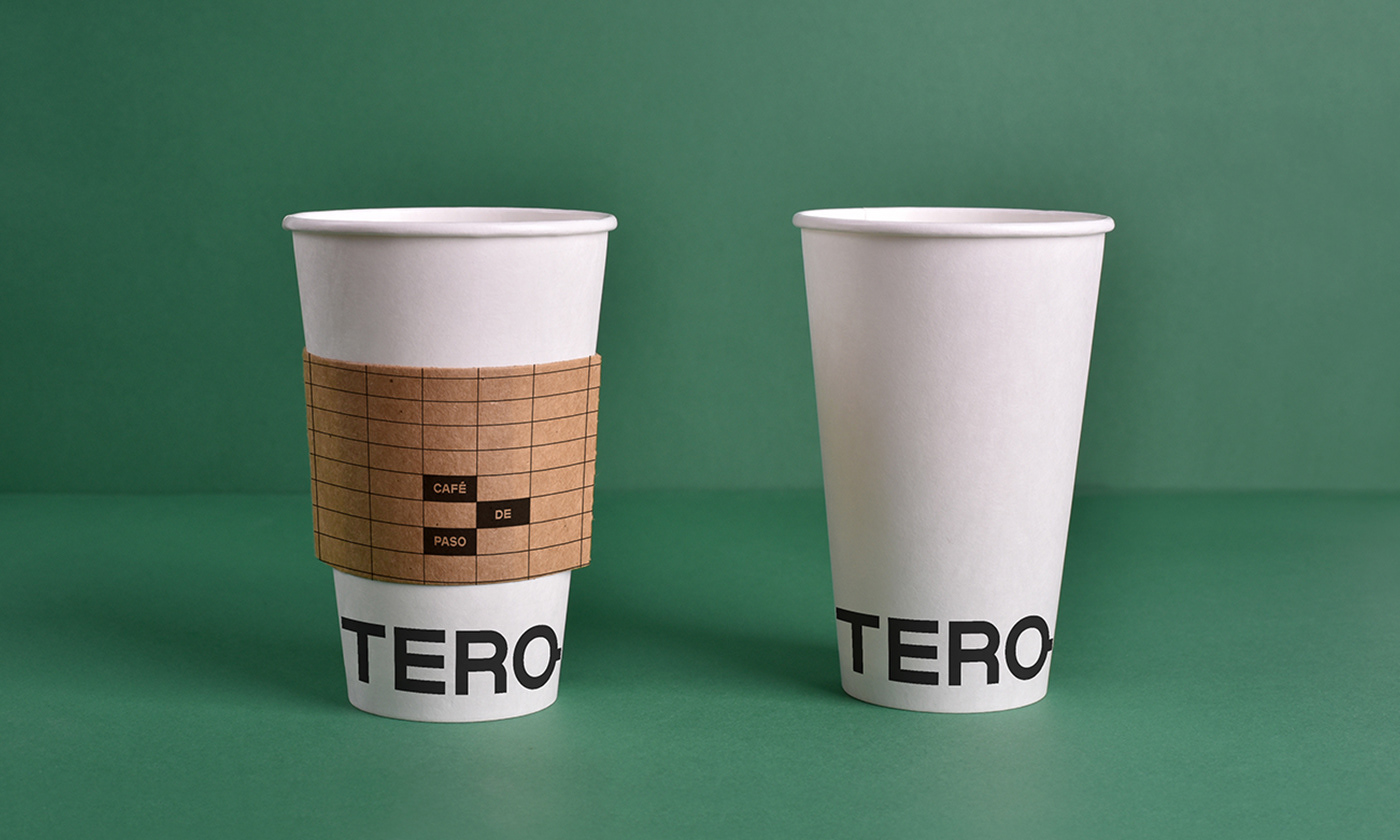
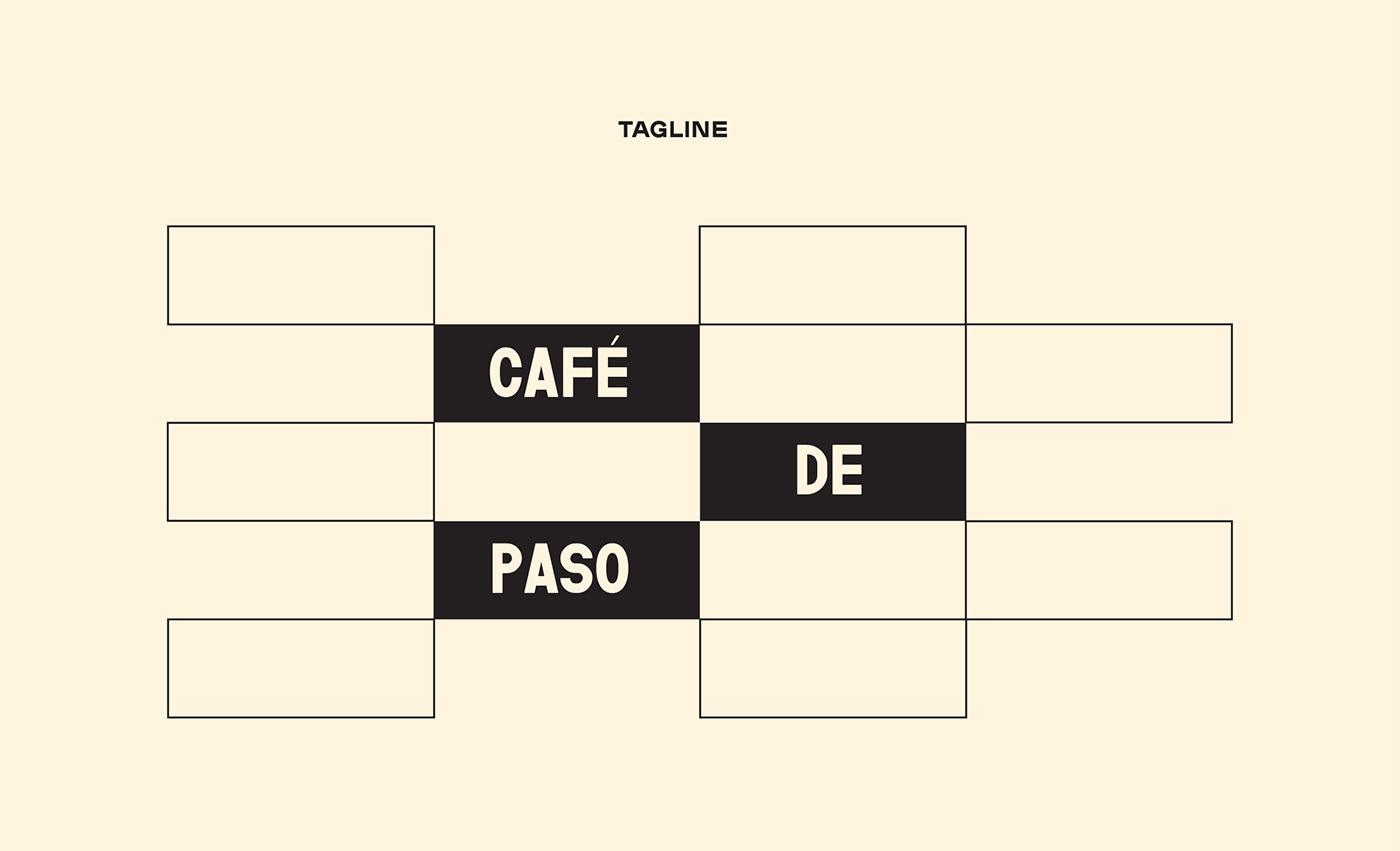
The Grid
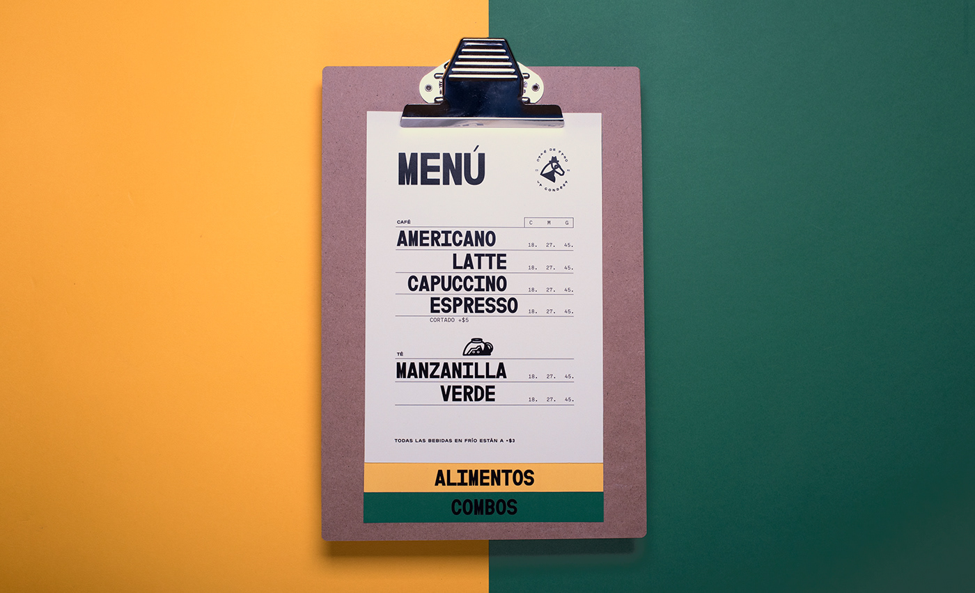
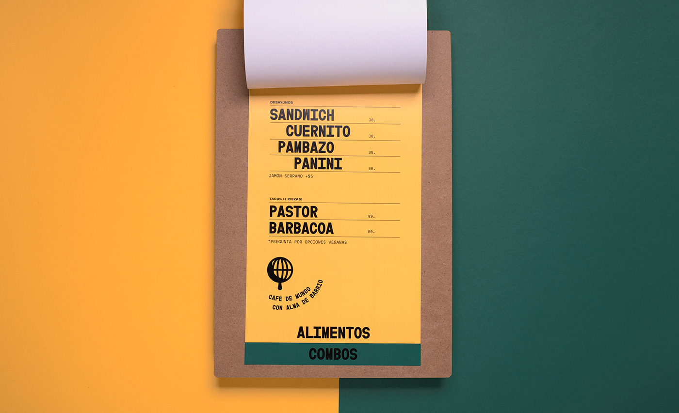
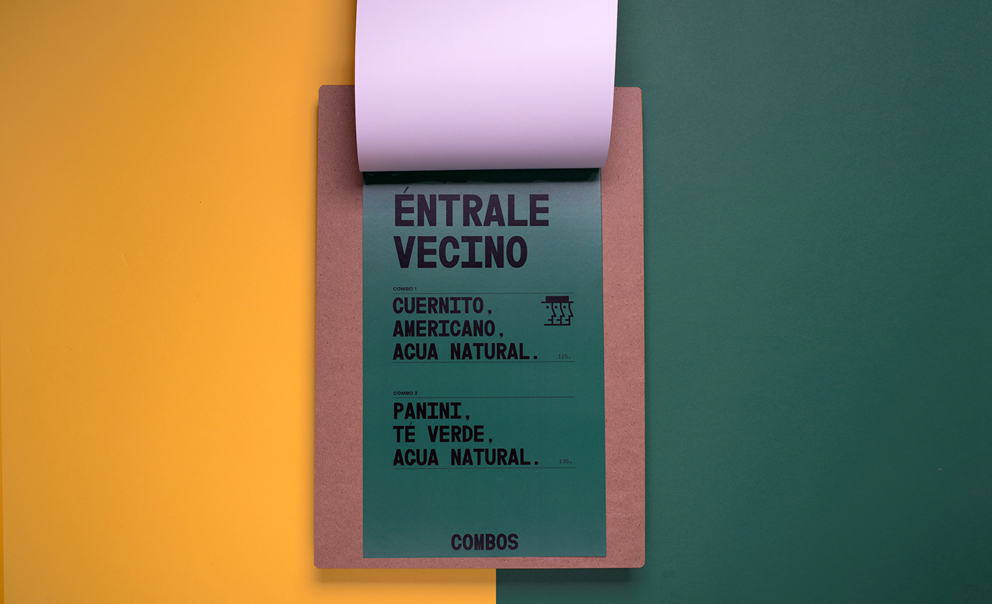
We created a brick inspired grid to take the brand architecture to the next level. It became a modular element that could be used in limitless applications. We used it in packaging, on the menu, as a pattern, you name it! It's easy to use anywhere and makes the brand highly recognizable.

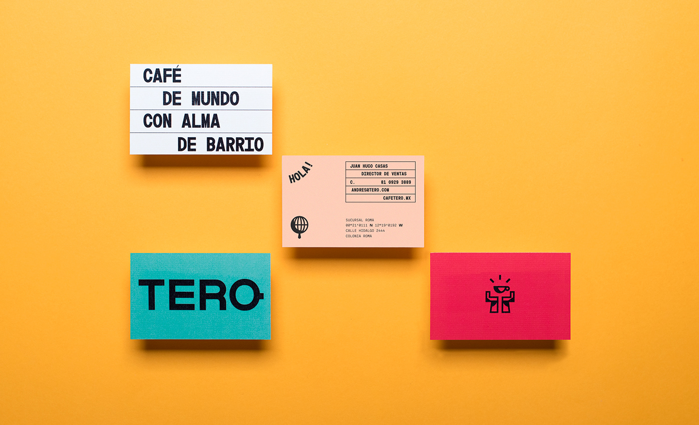

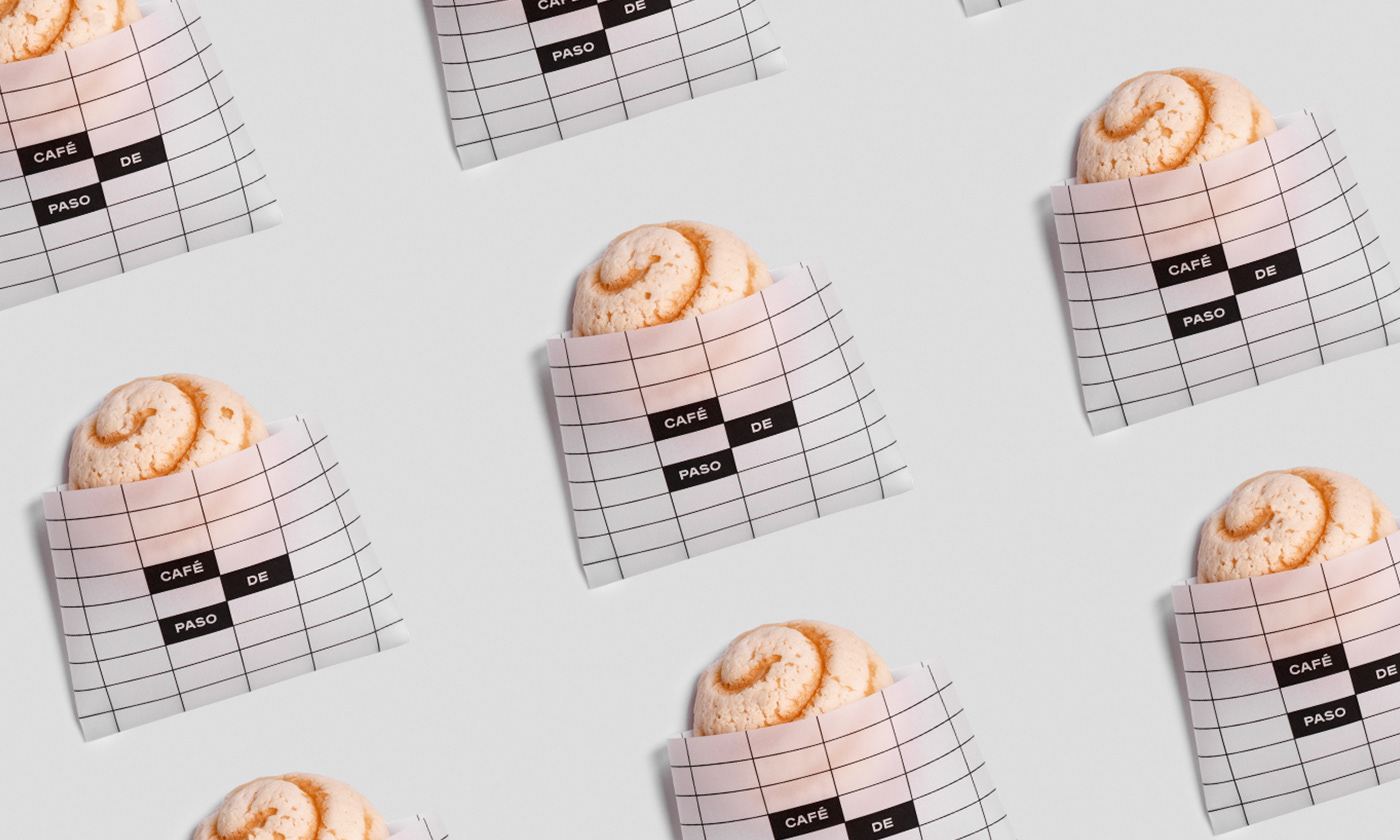
The Tagline
Our challenge was to create a tagline that would represent the brand & its purpose. We decided that direct messaging is key to a new concept. On that note, we created "Café de Paso" which translates to coffee you pass by. A straight-forward, hassle-free tagline that delivers the whole message.

The Voice
What we wanted to create for the brand voice was a familiar tone of the likes of a neighbor or local vendor. We used common sayings and proverbs to add a comical element to the overall feel. We created a voice that is casual and unique but resonates with the essence of the Mexican barrio.