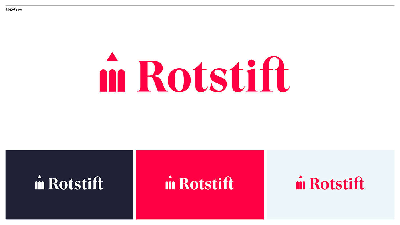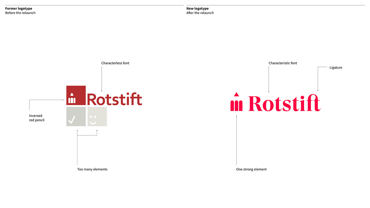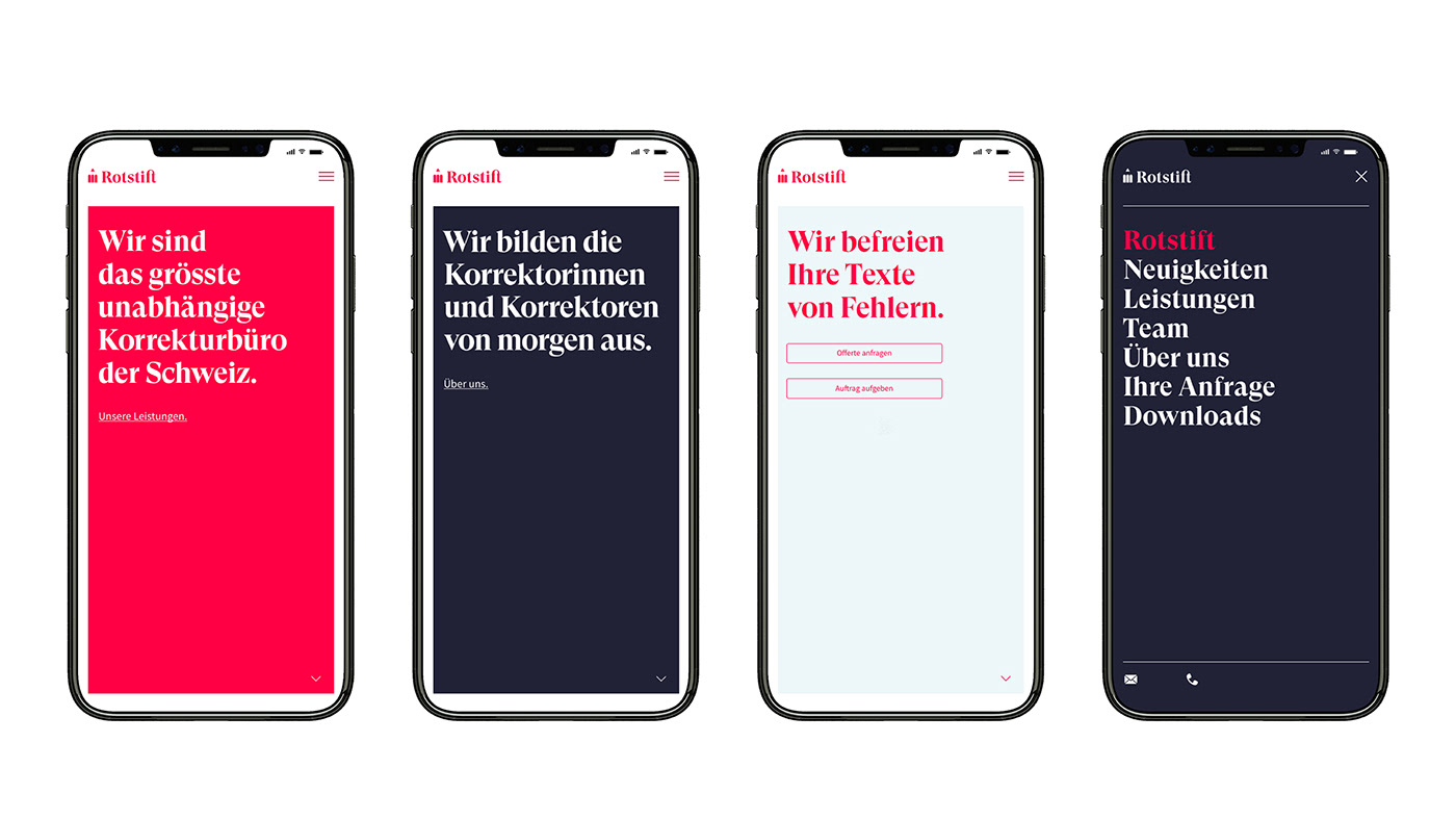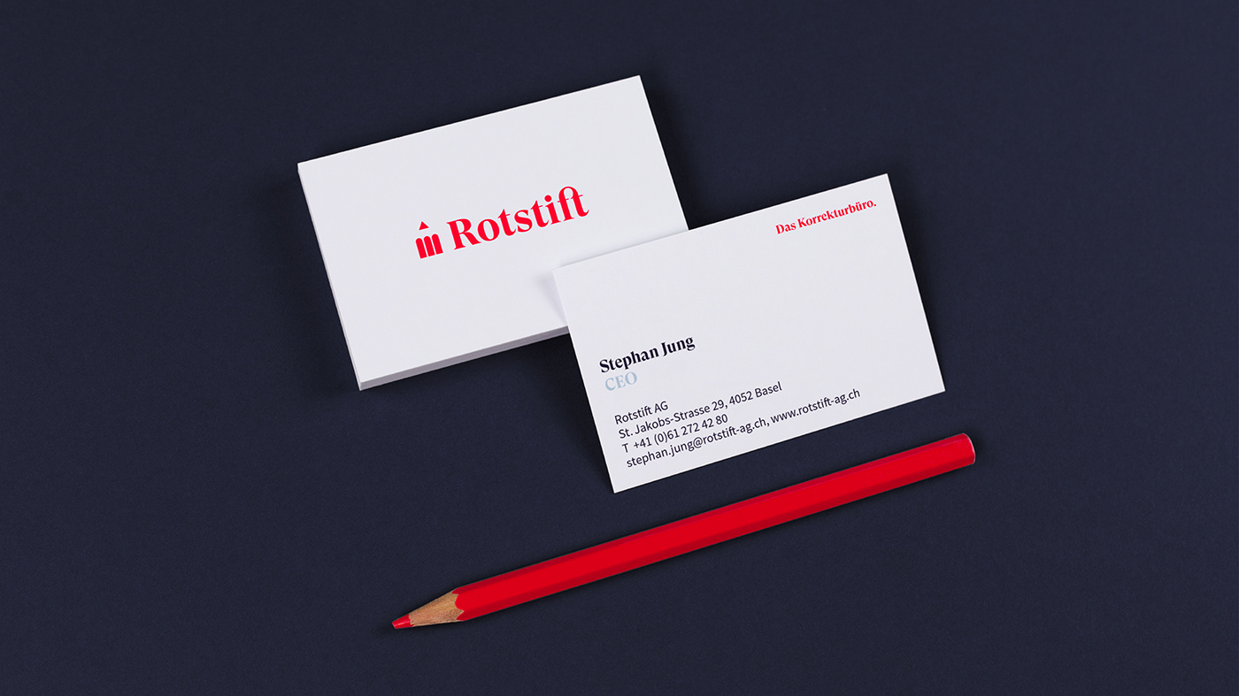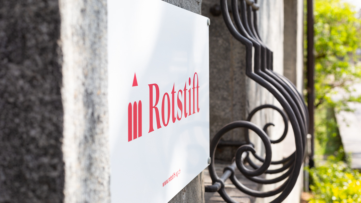
It is an institution: Whoever is writing or publishing in Switzerland knows Rotstift AG – and has thus probably learned a lot about orthography, grammar and punctuation. In close cooperation with the customer SUAN Conceptual Design reworked the brand strategy and sharpened the brand value. On that basis a branding was developed, that vaults Rotstift into the digital age and creates high recognition in web as well as editorial design. The former additional icons around the logo now give way to a distinct, minimal use of forms. The display font GT Super is meant for Rotstift and underlines the digital as well as the renowned. In all communications a refreshed red shade combined with two secondary colors is used. That way, color and typography alone create a corporate identity that provides the long-established company with new charisma.
Project on suan.ch
Project on suan.ch