Niuform.
Branding for the design studio from Lucerne.
Branding for the design studio from Lucerne.
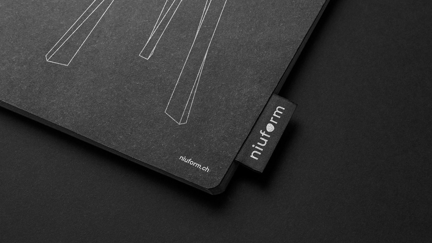
The designer duo of Niuform is known for their successful furniture collection “niu”. SUAN was entrusted with the development of a corporate design that takes up the unusual shape concept of the furniture designs and is at the same time distinct, reduced and concise. In order to meet the design-savvy and quality-conscious target group, a well thought-out appearance had to be developed.
The design focuses on integrating the curved, organic forms of the furniture design into the clear lines of the corporate design. The variable graphic element, which replaces the “o” in the word mark, is always in motion. Combined with the geometric typeface Sharp Sans, an exciting interaction is created, just as in Niuform’s products. Additional elements are deliberately omitted. Black and white, clear, contrasting, striking. That is Niuform.


